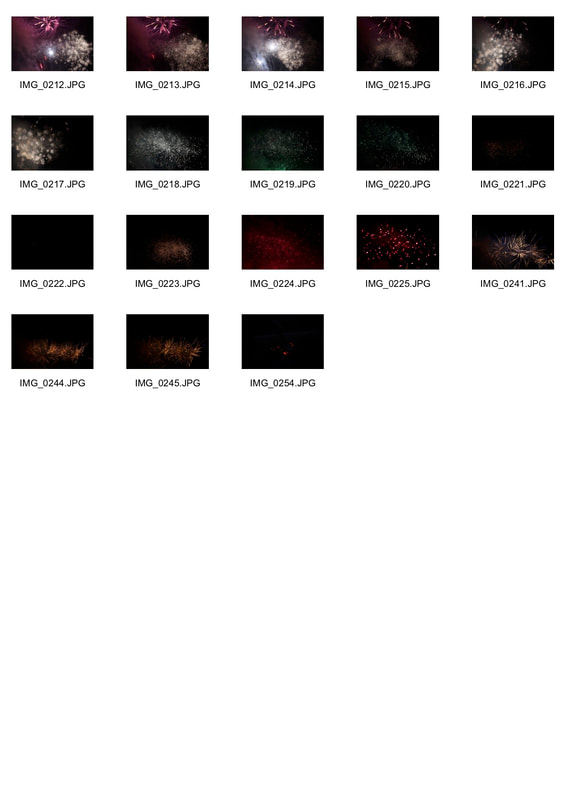
I made a pintrest board to give me ideas for structure photography.
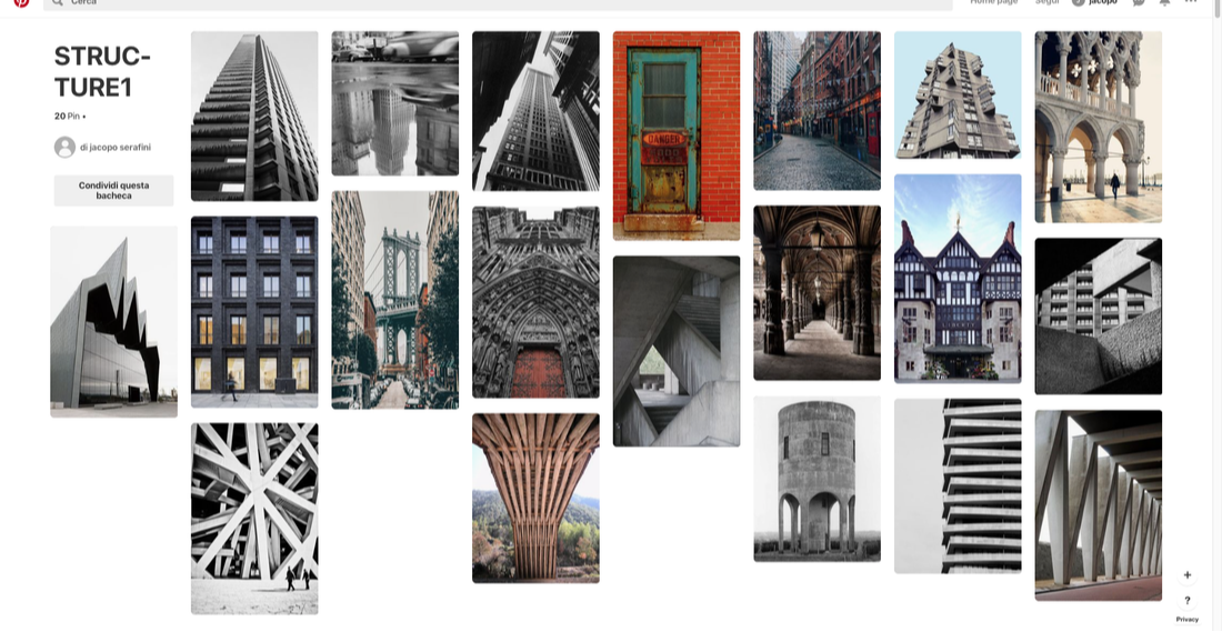
Architectural structure.
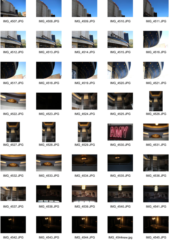
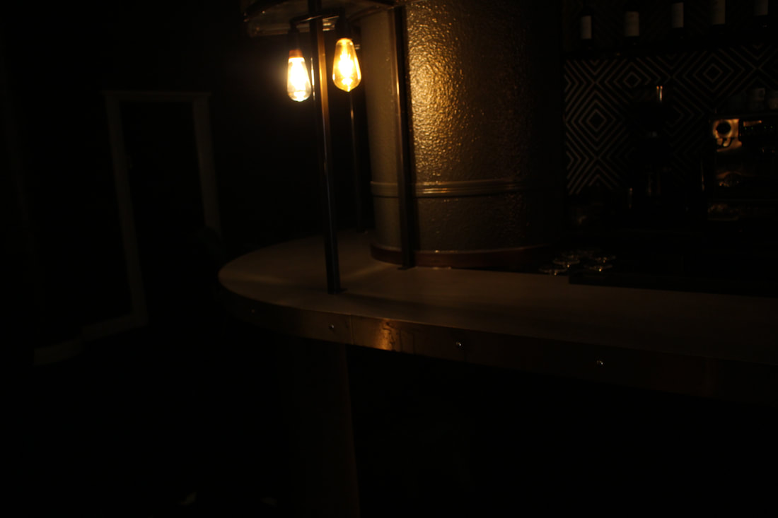
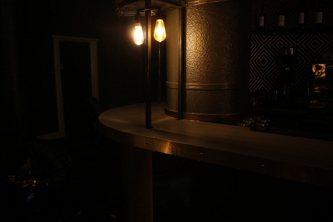
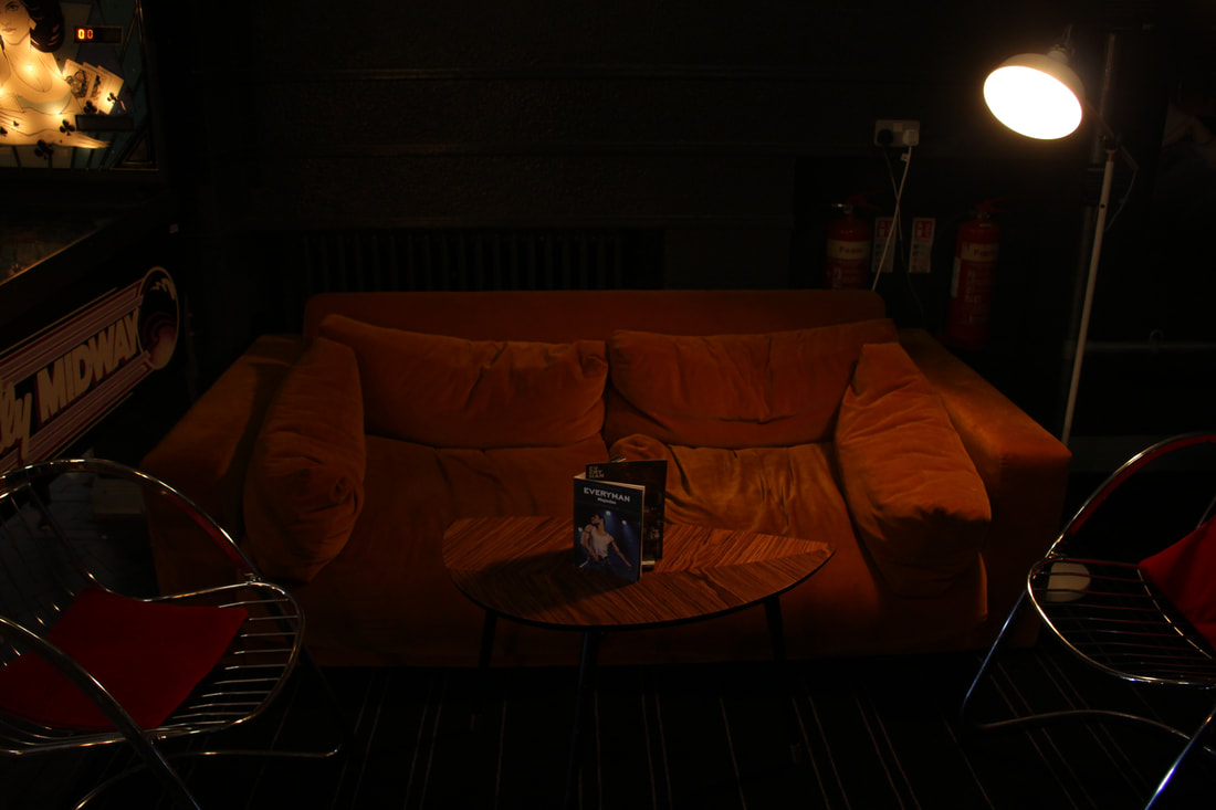
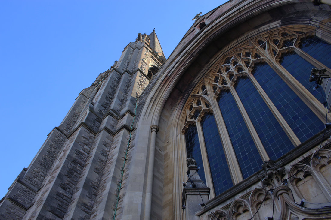
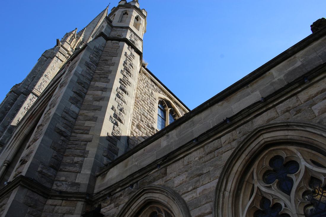
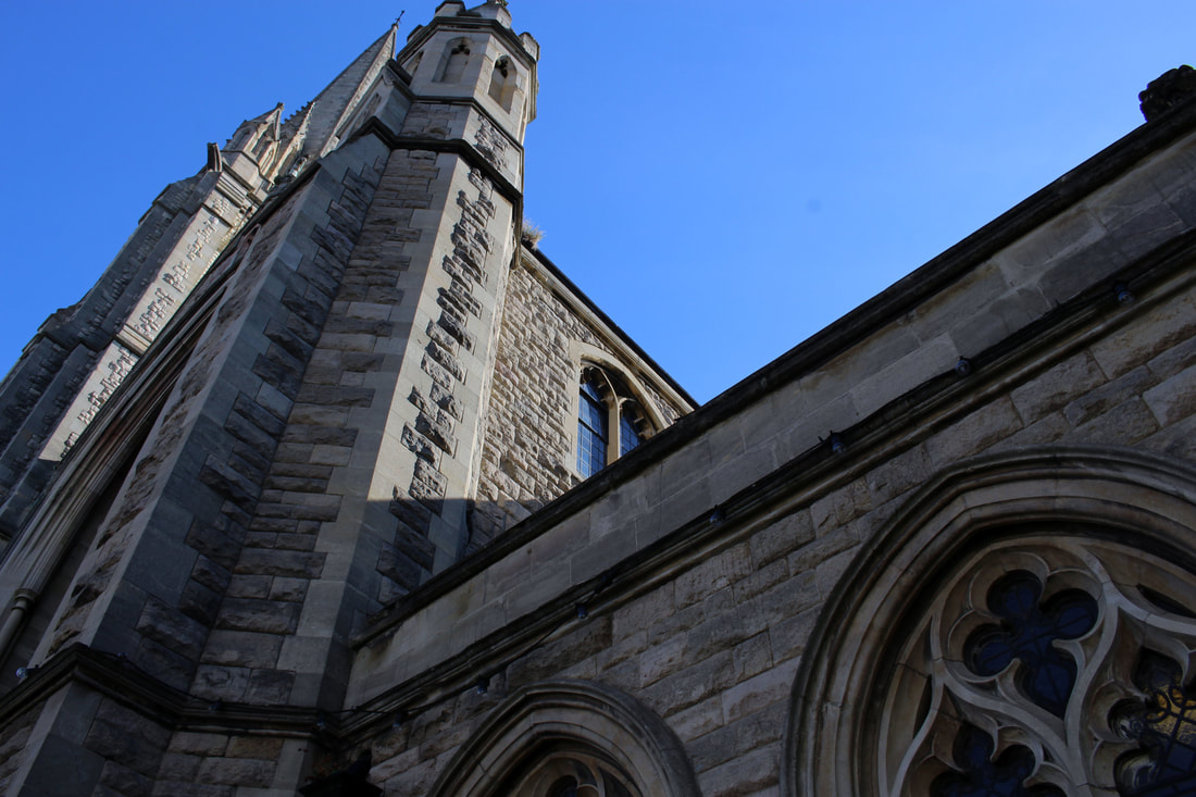
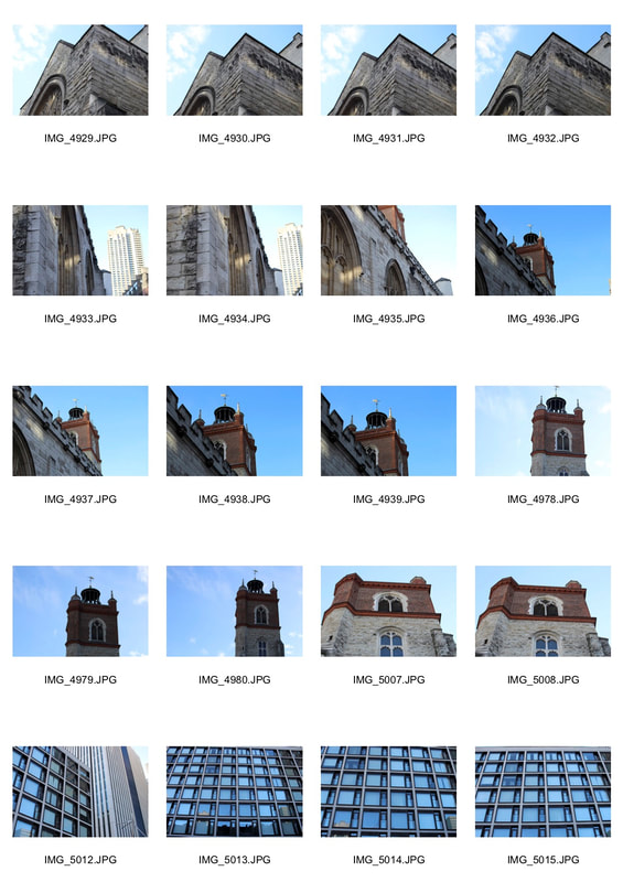
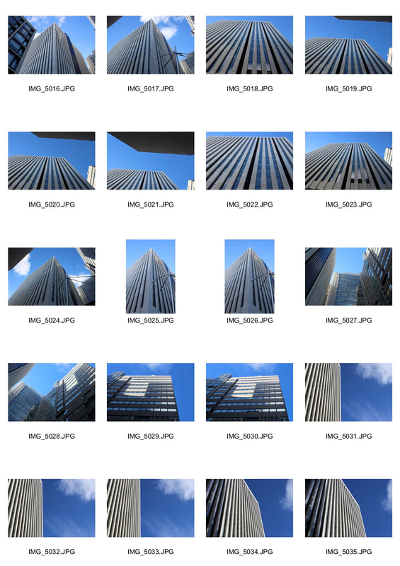
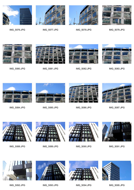
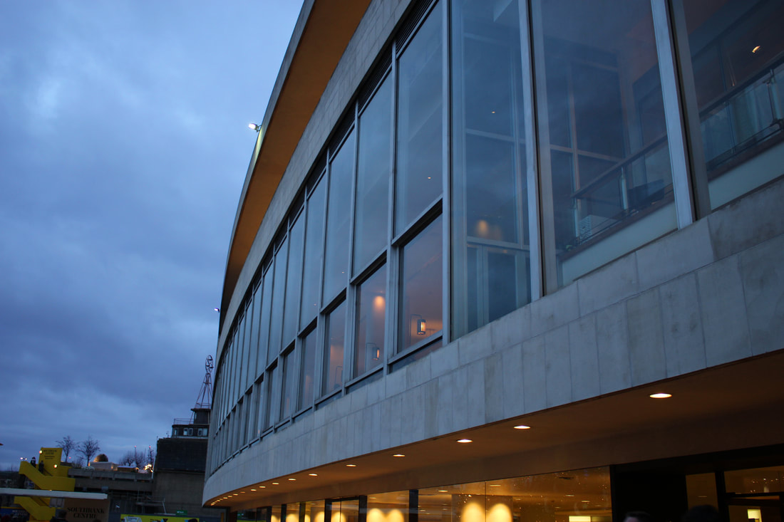
we went out to photograph two buildings, St James Church and Everyman cinema. We picked these two buildings as they have very complex and unique shapes. the church has a tall and sharp look with many detailed patterns and stained glass. The cinema has a more rounded look on the outside with a curved outer and cylinders on the inside.
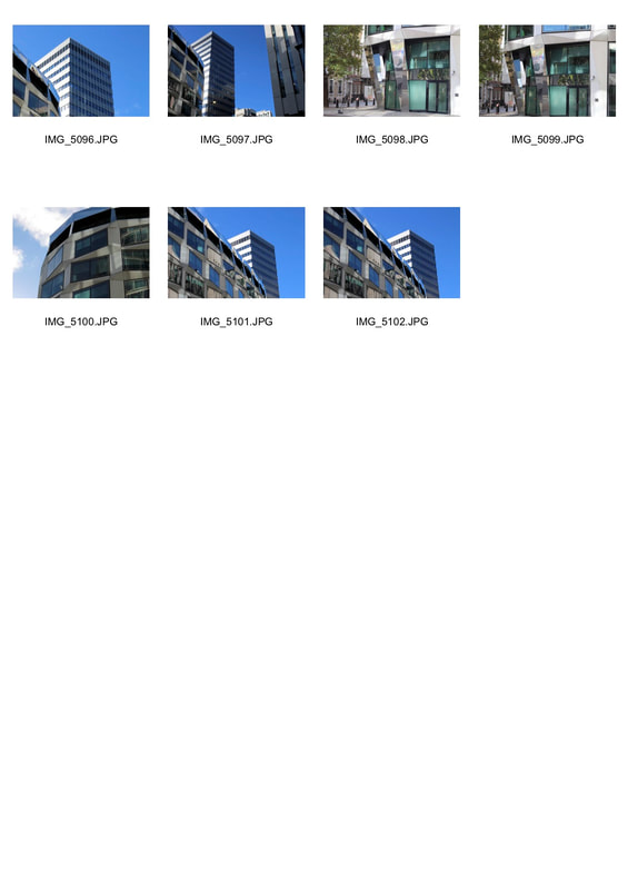
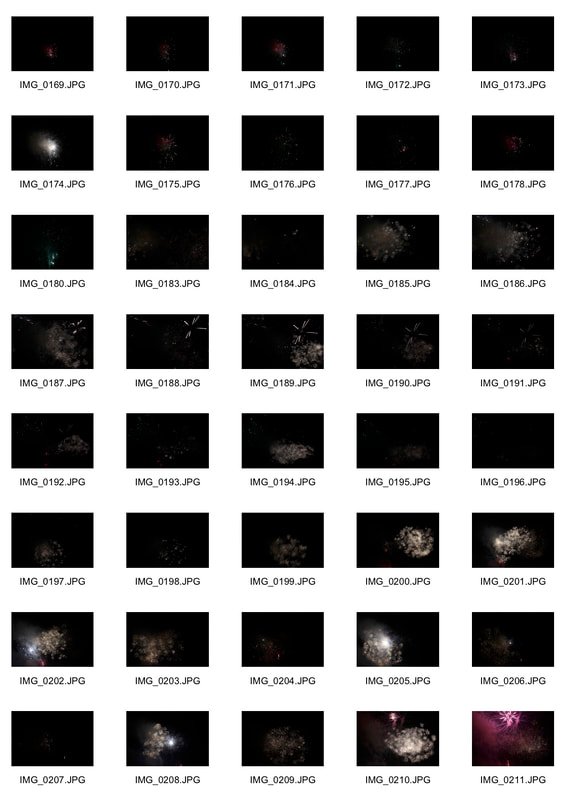
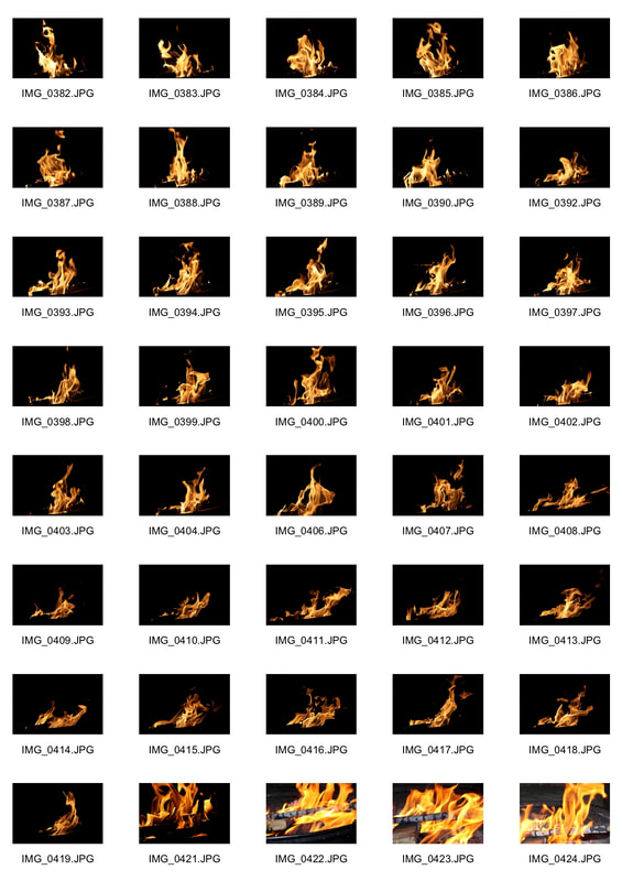
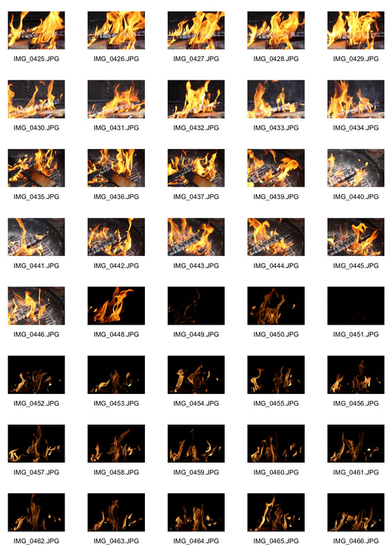
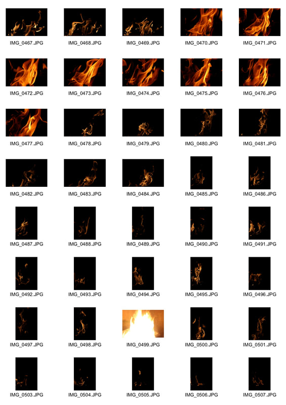
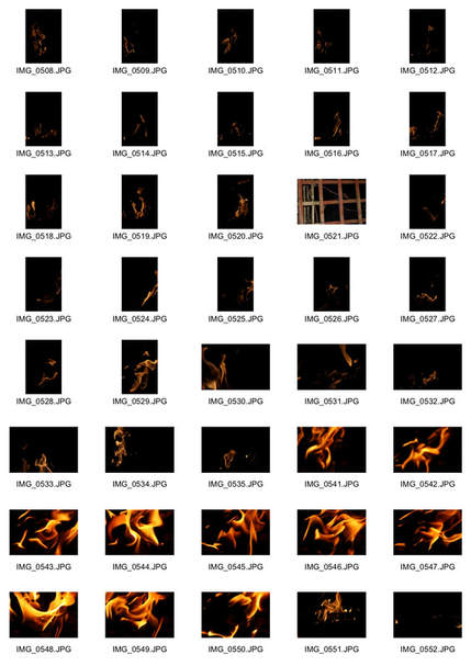
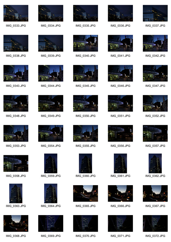
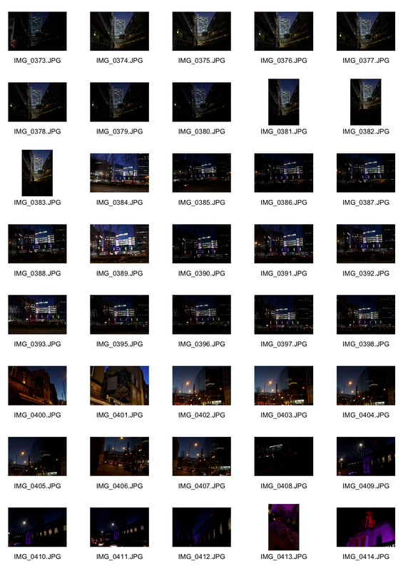
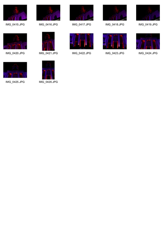
Contact sheet
|
|
My selected pictures and edits.
Original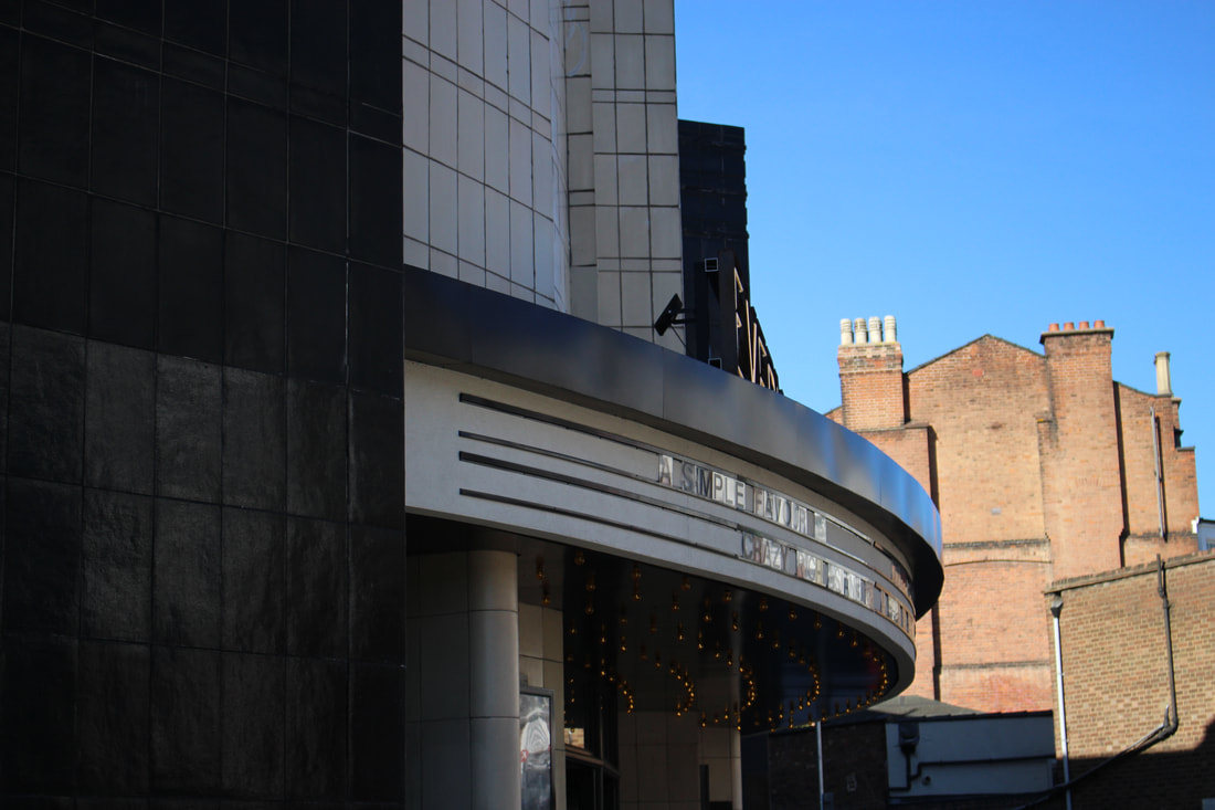
|
Edited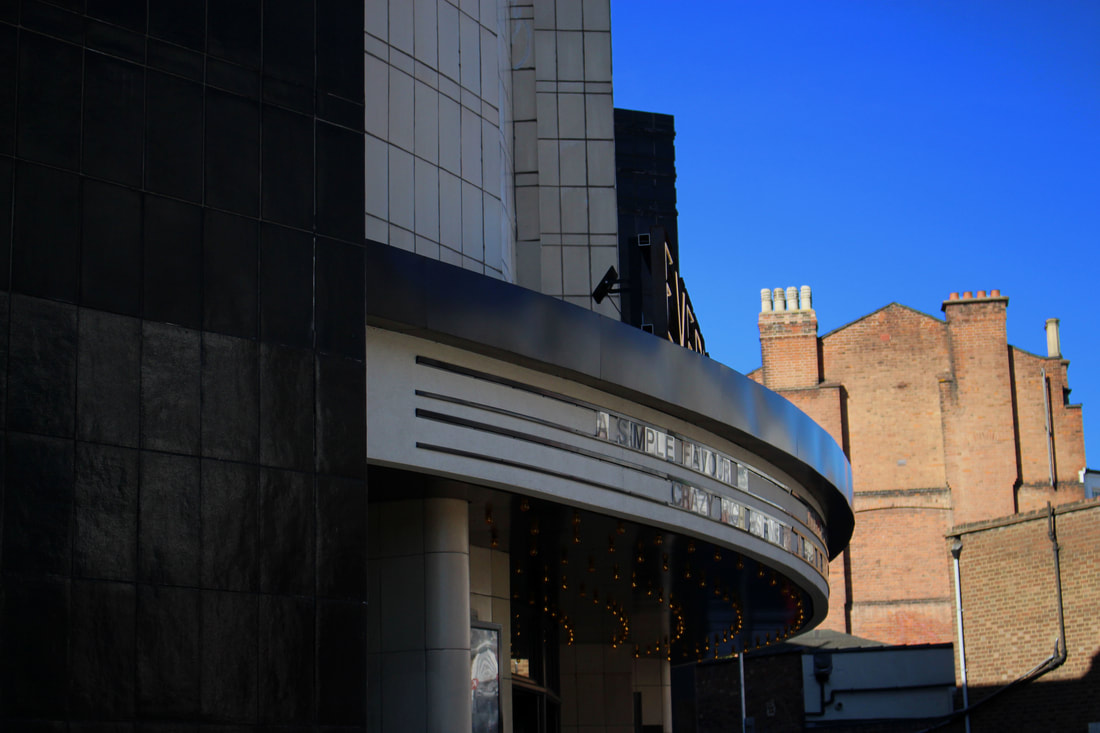
|
To improve this image i darkened it slightly to give it a more sinister look. I also increased the saturation of the sky to make it look more blue and clear.
|
|
For this image, I adjusted the brightness by increasing it slightly as the original was too dark. I also rotated the image slightly so that it was completely straight. I liked this image because of contrast between the light and the darkness.
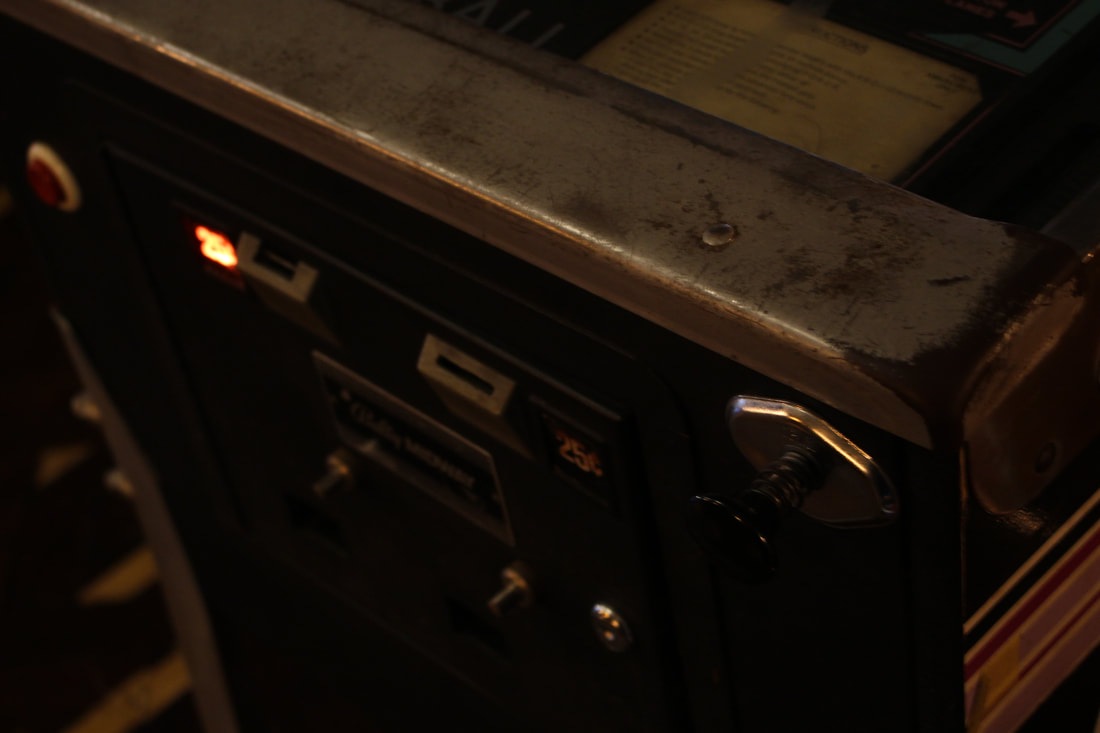
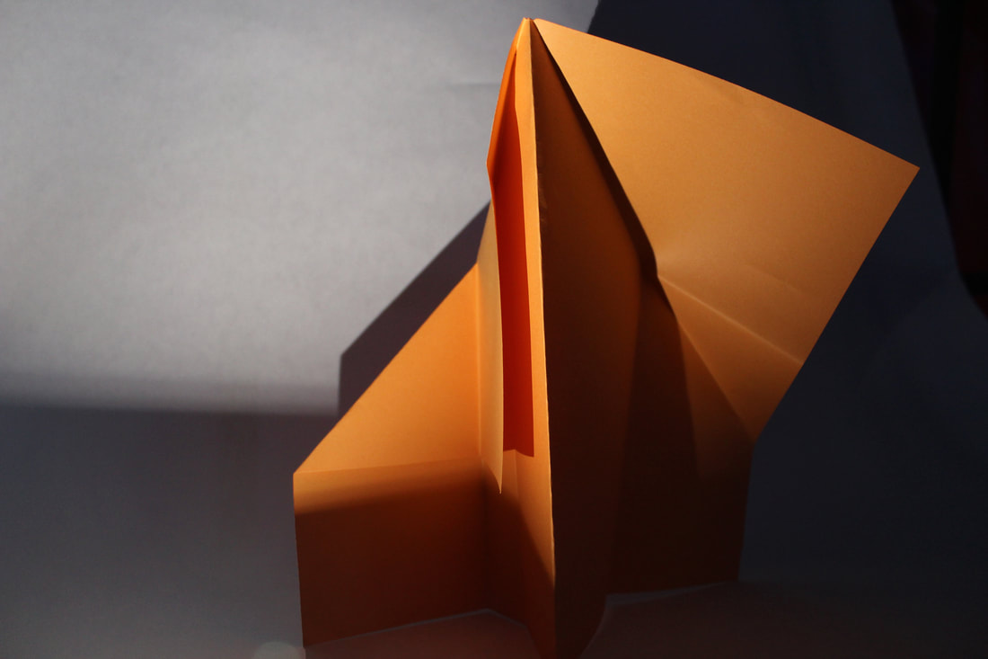
In this picture the main focus of the photograph is the edge of the machine. I like this alternate viewpoint of the machine however it would have looked better if the image was sharper.
|
|
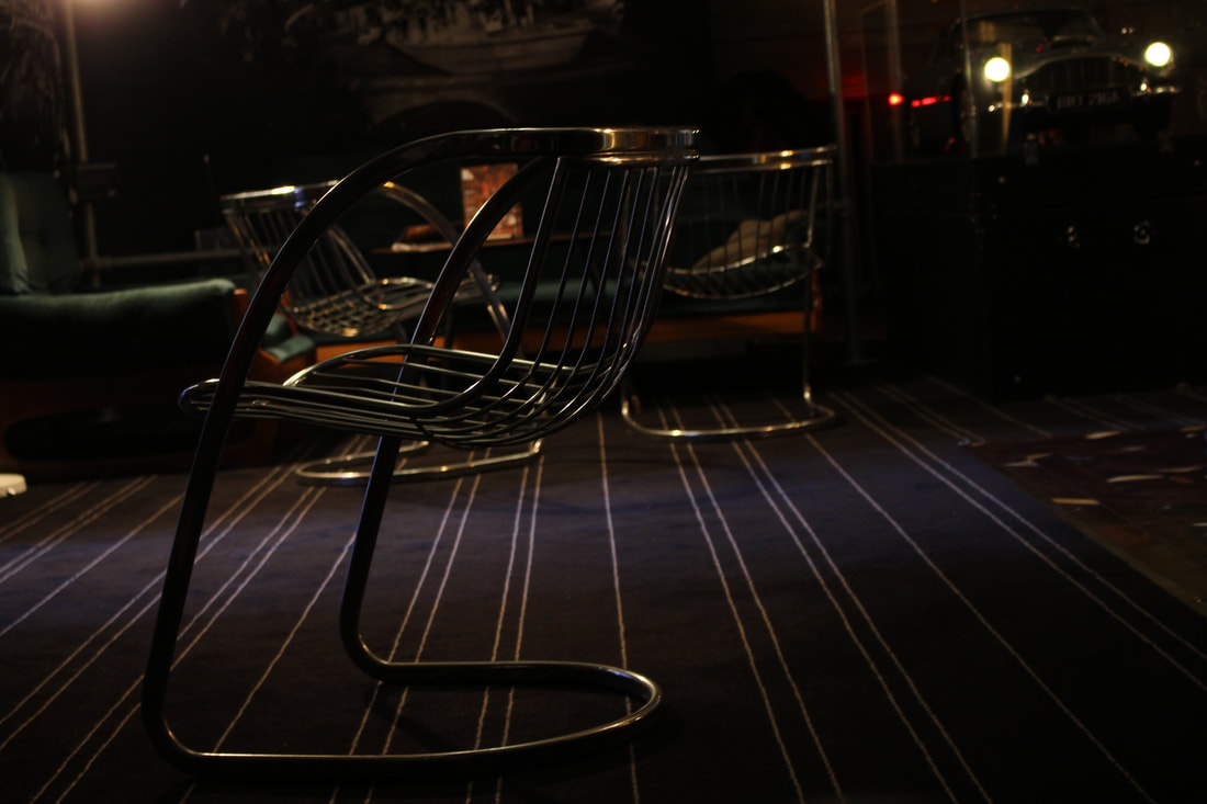
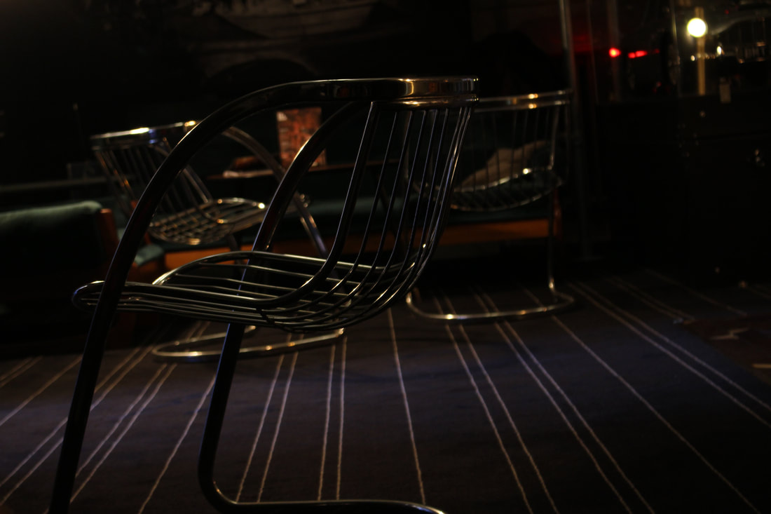
For this image I cropped some of the surroundings out and zoomed in more. I liked the unusual shape of the chair and the lighting.
St James Church
|
Original
|
Edits
|

|
|
|
|
|
|
|
|
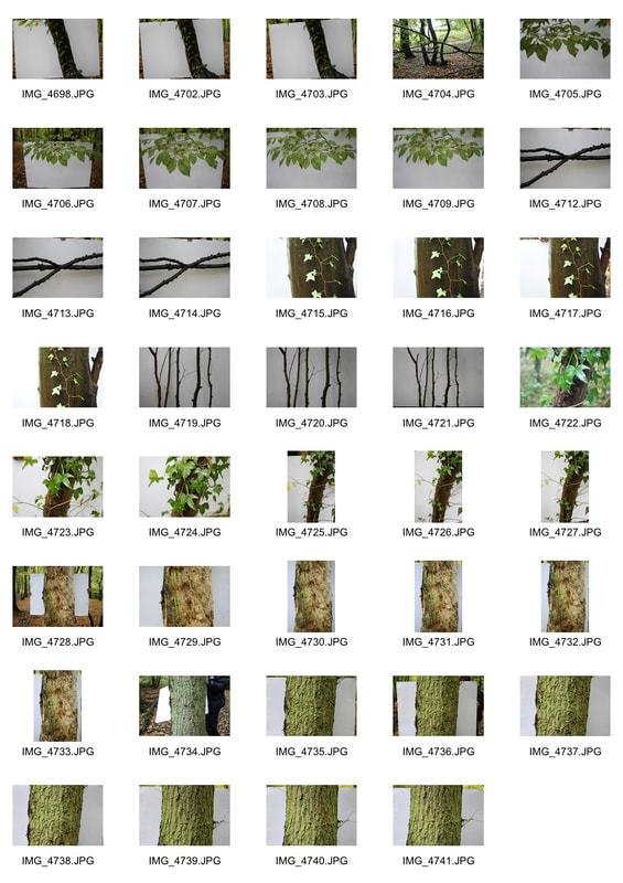
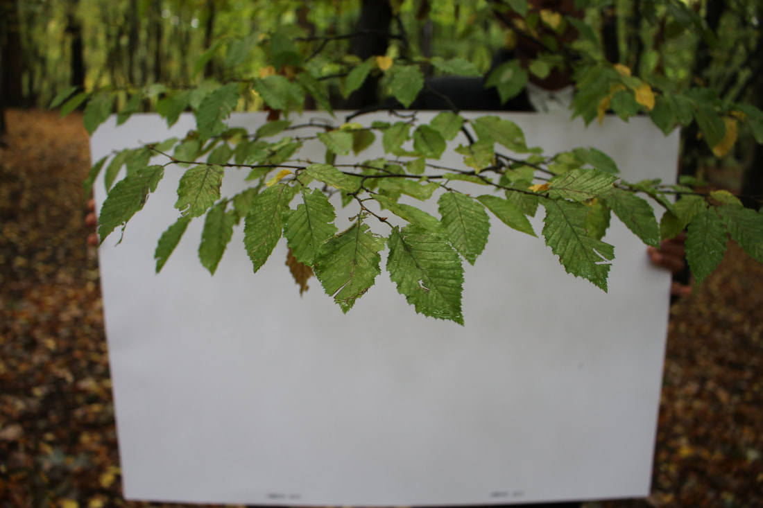
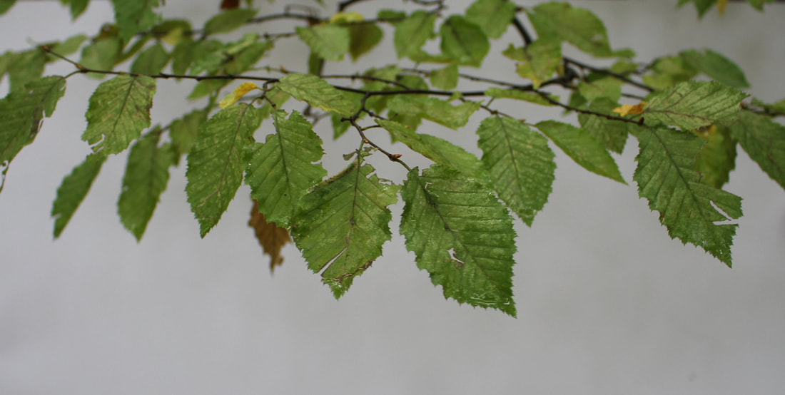
Structure In Nature
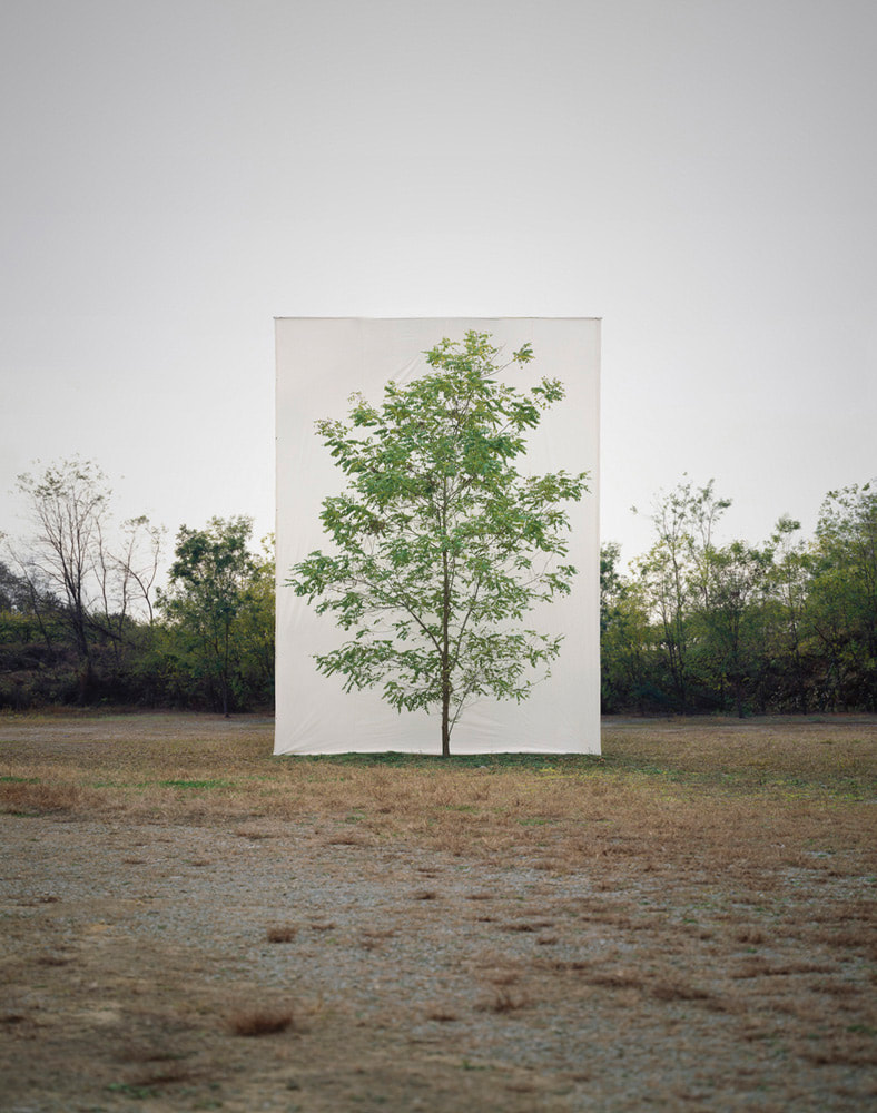
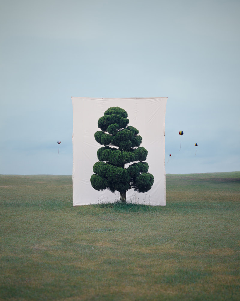
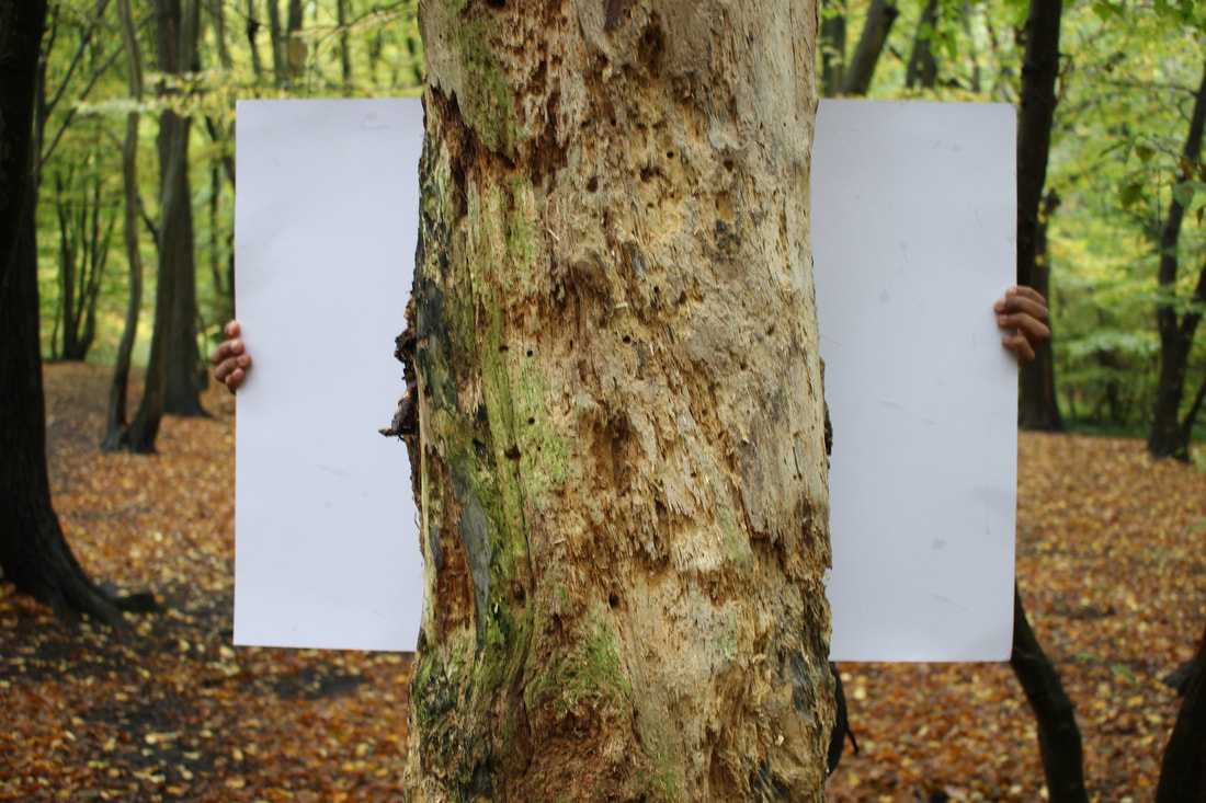
Myoung Ho Lee is a South Korean photographer who had a project which separated nature and isolated nature. This is interesting as nature is usually associated with its surroundings so when the background is taken away it drives the attention completely on the composition and colour of the tree. Myoung Ho Lee creates her piece of work after selecting the tree and getting a team to place a white board behind the tree.
|
|
My first response.
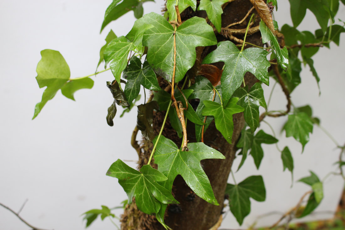
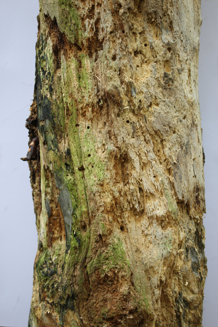
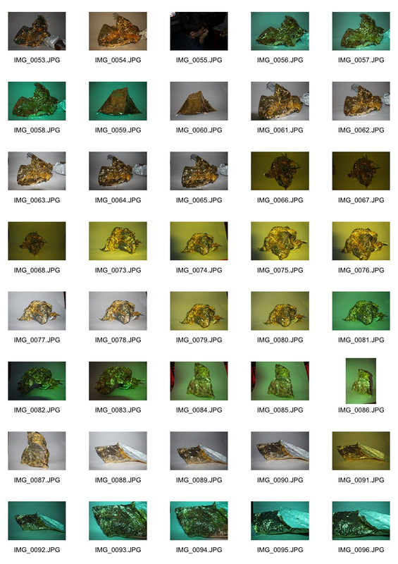
We could not isolate whole trees like Myoung Ho Lee, so we did the next best thing which was to isolate parts of trees and plants by holding a white card behind it and then photographing it. This is the contact sheet of all of my pictures.
These are my chosen images. On the left are the pictures with the background and on the right they are completely isolated.
|
|
|
|
|
|
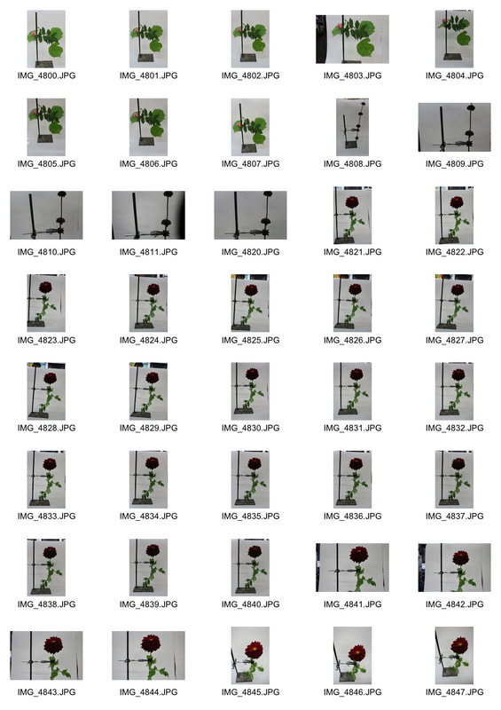
Sanna Kannisto- Field works
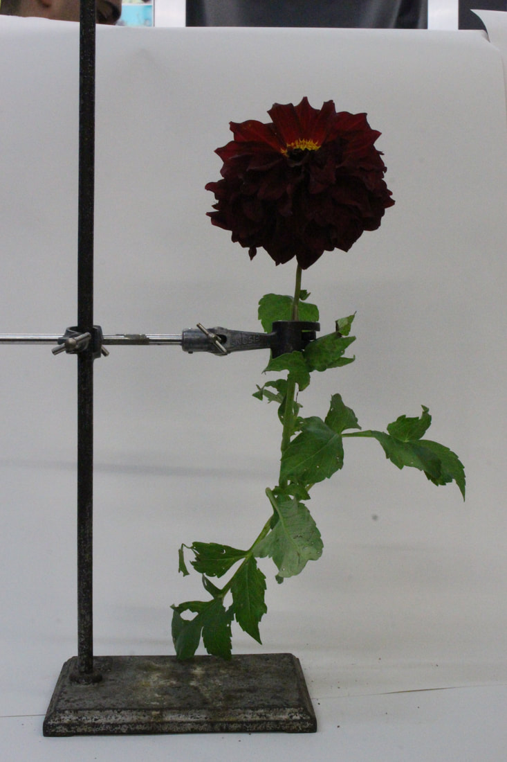
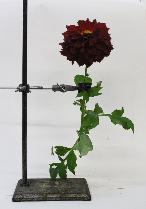
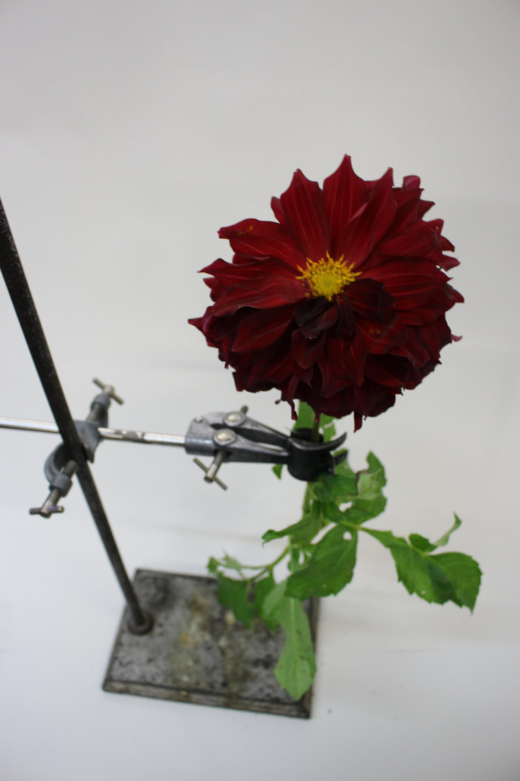
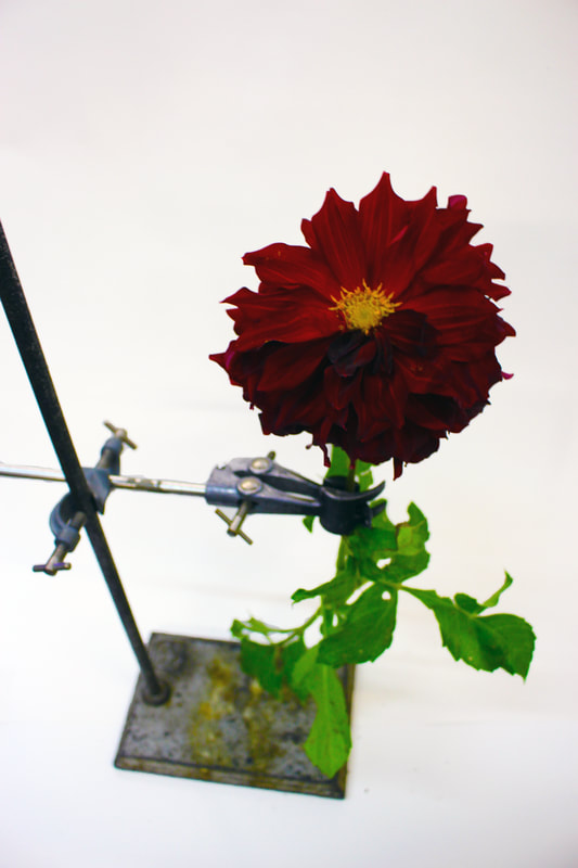
Since 1997, Finnish photographer, Sanna Kannisto has spent several moths in the rainforest of Peru,Brazil, French Guyana, and Costa Rica. Her goal was to create a project to mix science and art. In the project, 'Field works' she mixes scientific research with the art of photography. She uses a clamp to hold in place the different plans she wants to photograph and isolates them on a white background before capturing the photograph.
Contact sheet of my first attempt.
|
|
|
Original
|
Edited
|
|
|
In this task, the objective was to capture nature in an isolated environment, away from its natural setting. This was done by photographing the plants on a white background.
There is also a very strong divide between nature and man made items in these photographs; the straight lines and rigidity of the metal clamp strongly contrasts the delicate and colourful plant. |
In these next photos I decided to take a different approach, I photographed from the top down. I also made my settings f/4.0 with a shutter speed of 1/30. The low number on the aperture meant that the background was blurred, drawing attention to the colourful top part of the plant. I also increased the saturation, brightness and contrast in photoshop.
Original
|
Edited
|
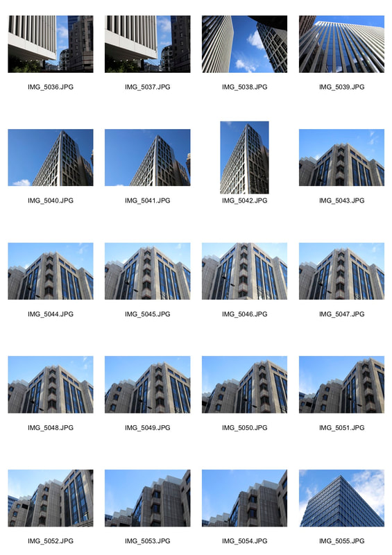
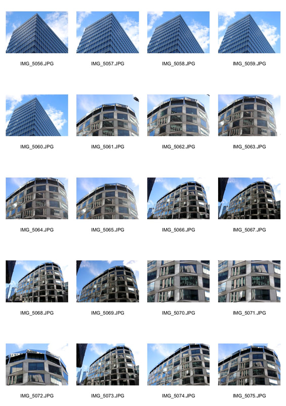
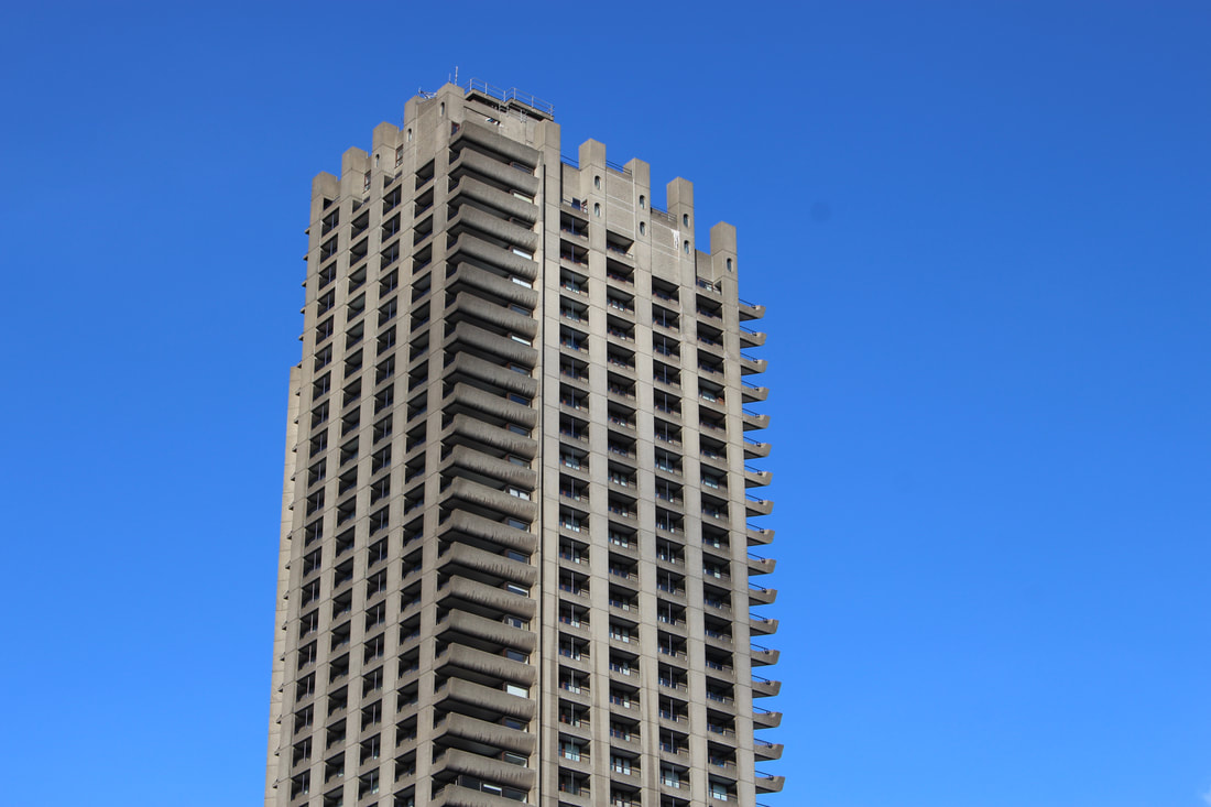
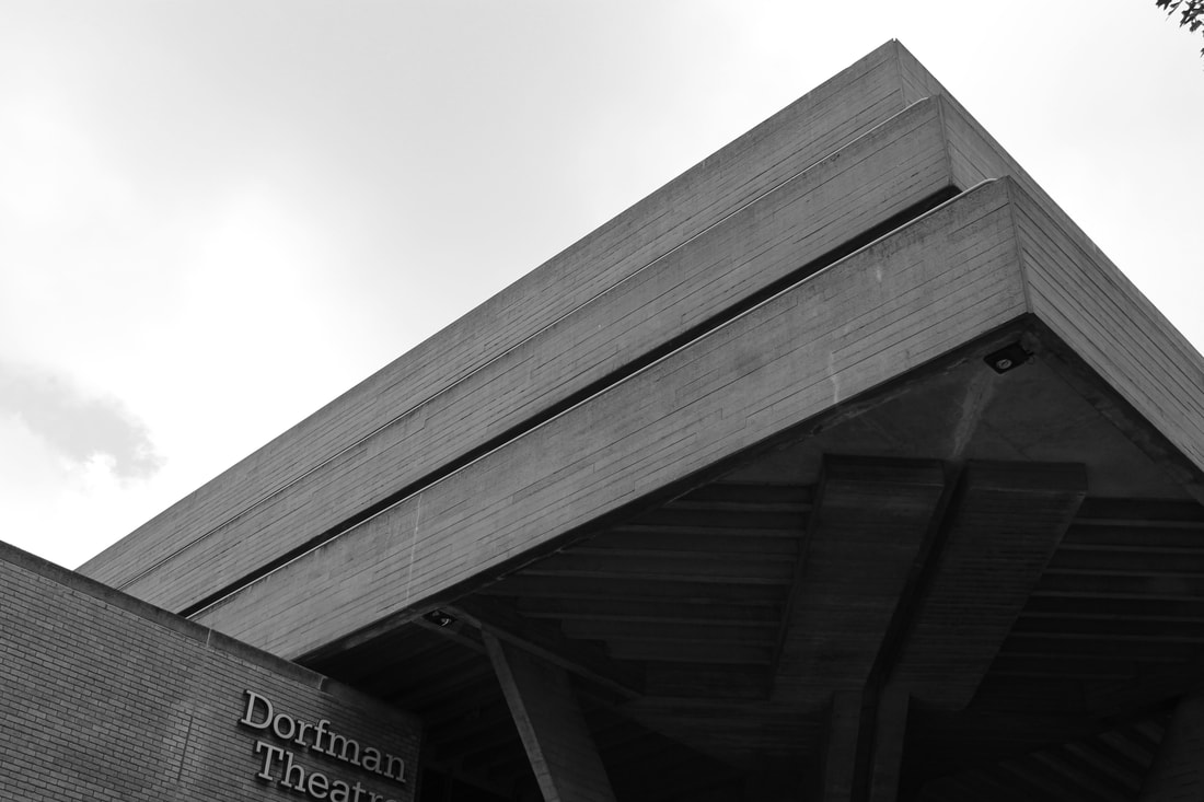
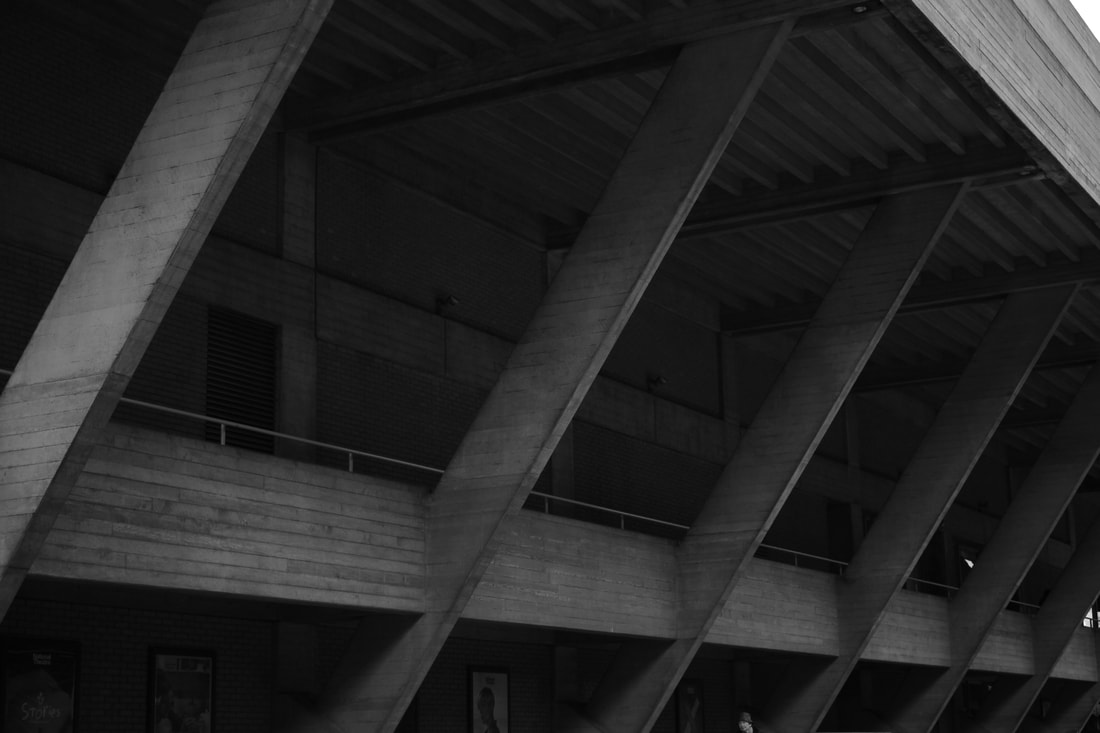
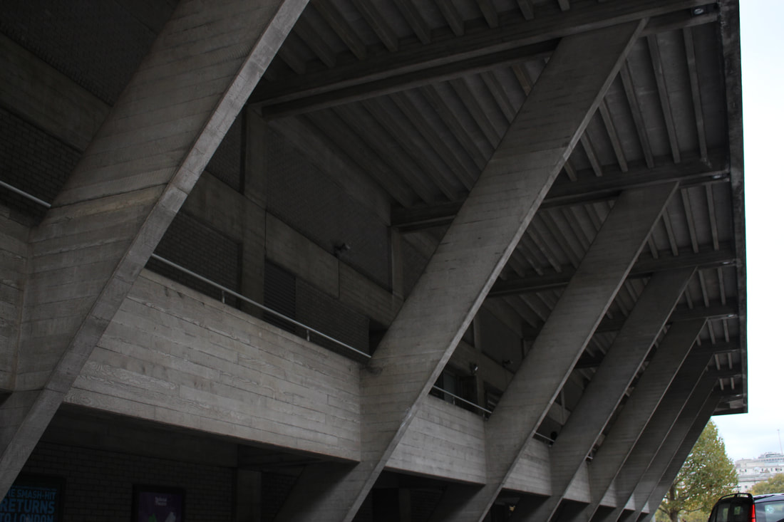
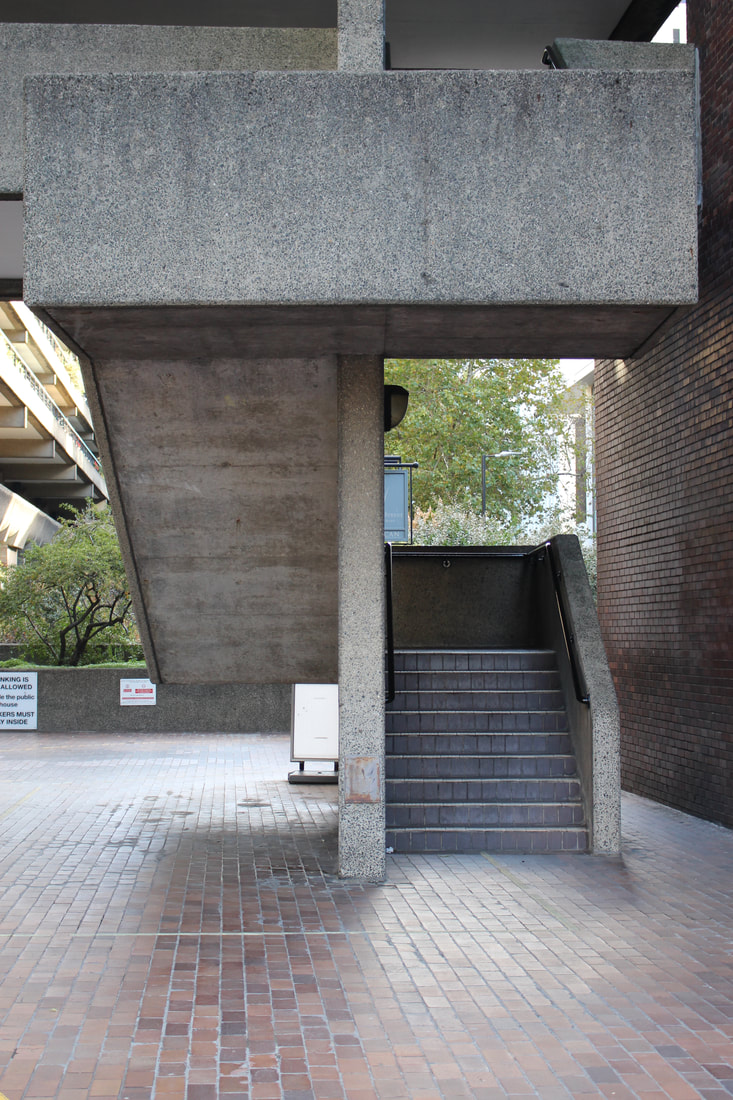
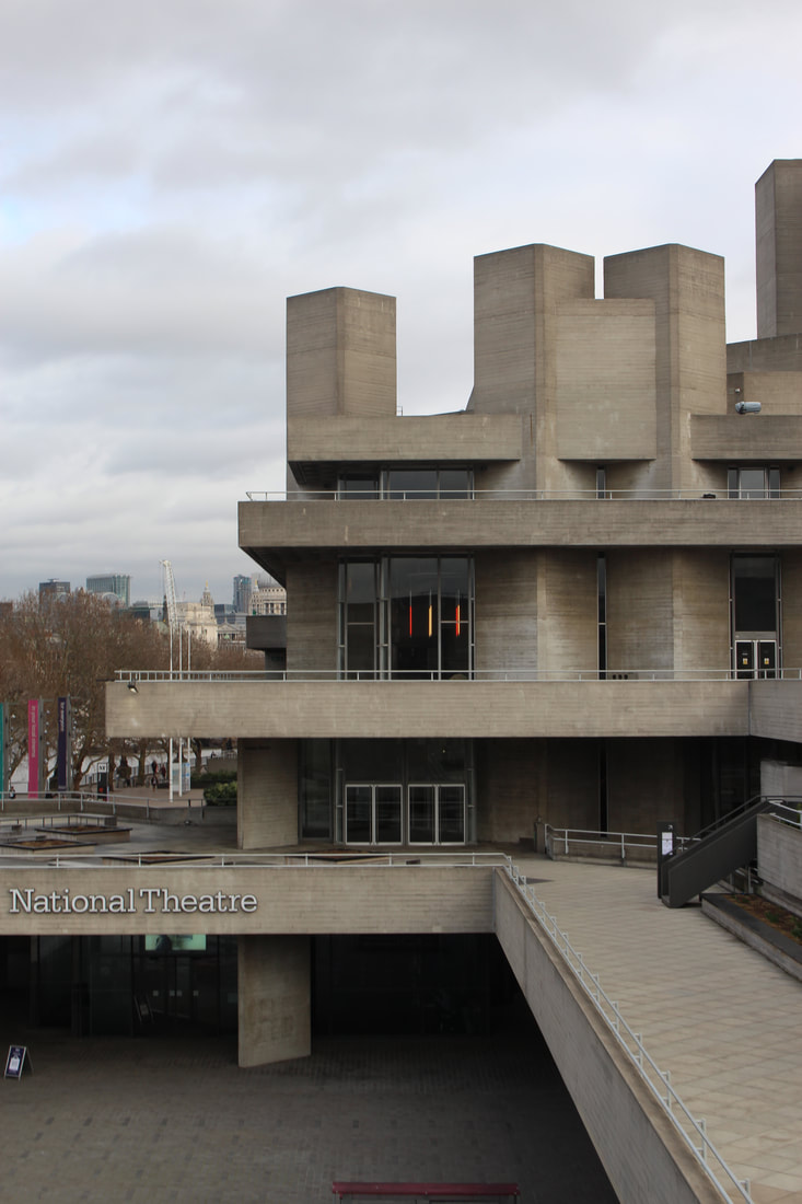
Brutalism
'Brutalism is an architectural style of the 1950s and 1960s characterised by simple, block-like forms and raw concrete construction' - Tate. After the war, lots of houses had been bombed down. People needed to build houses fast for people to live in. The brutalist structures are mainly built woth concrete as it was cheap and quick to use. The work butalism came from the French work 'Bréton brut' which means 'raw concrete' and was created by Le Corbusier. These types of buildings stand out, with strong lines throughout.
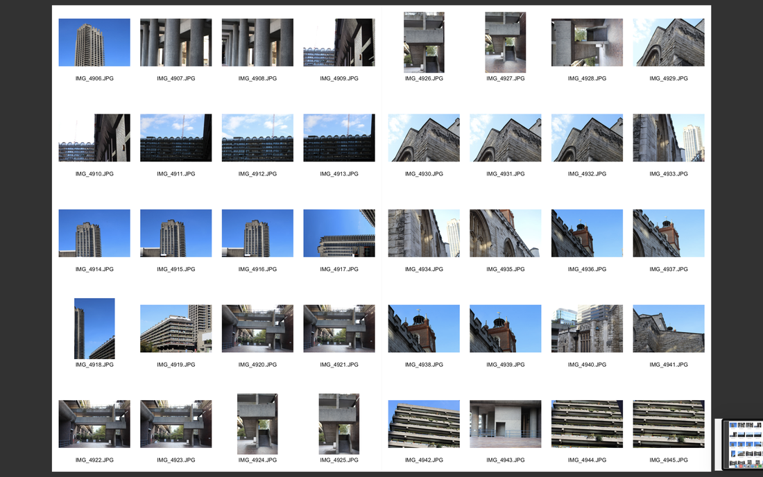
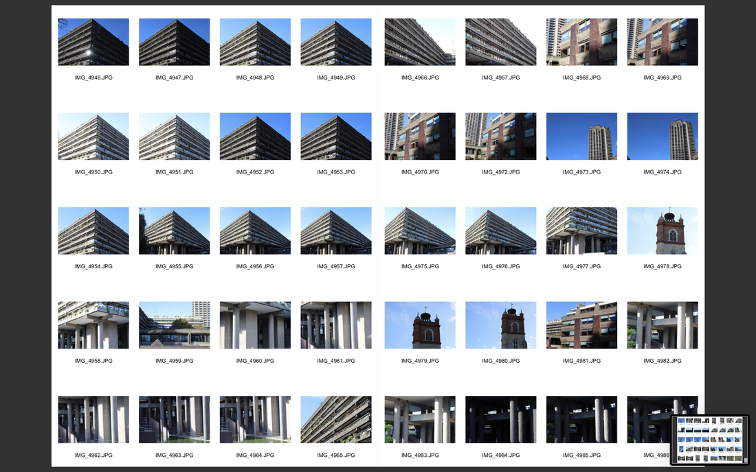
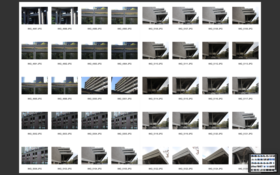
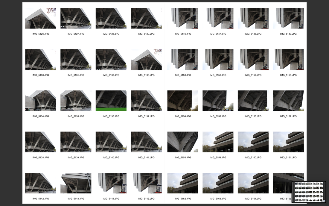
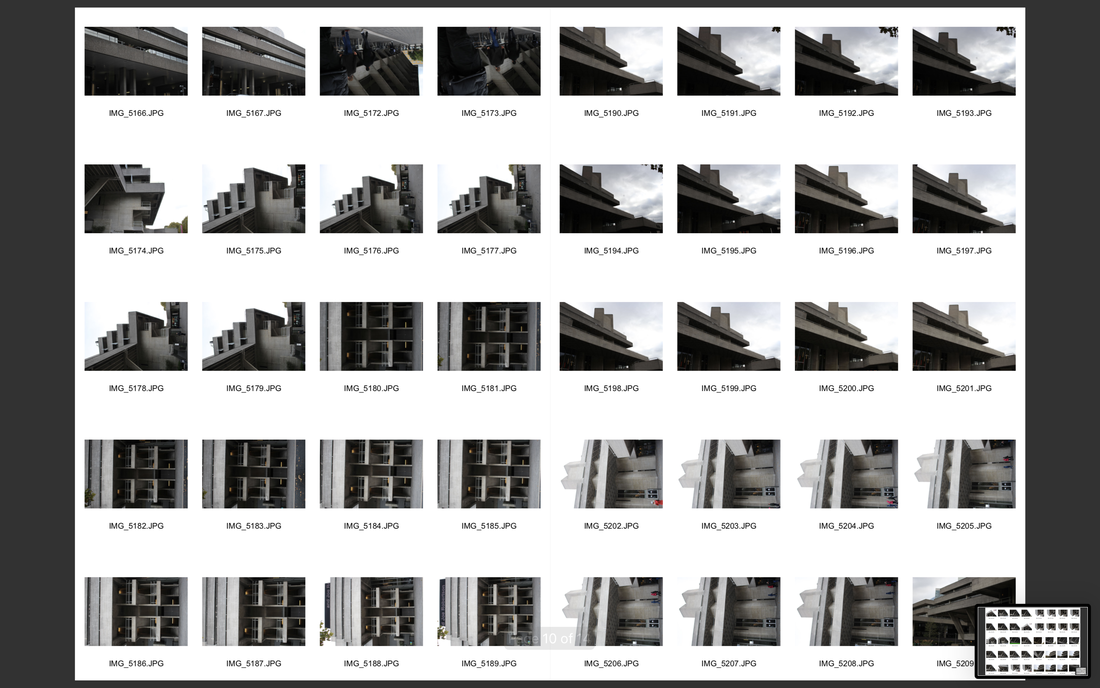
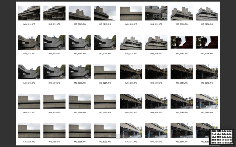
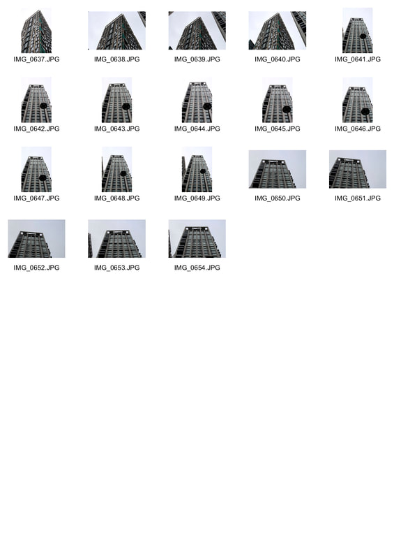
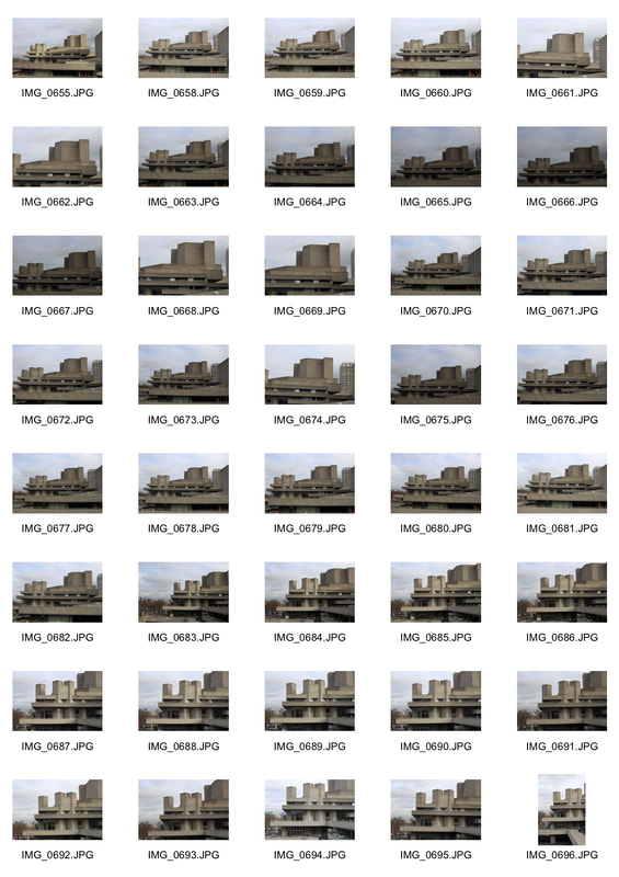
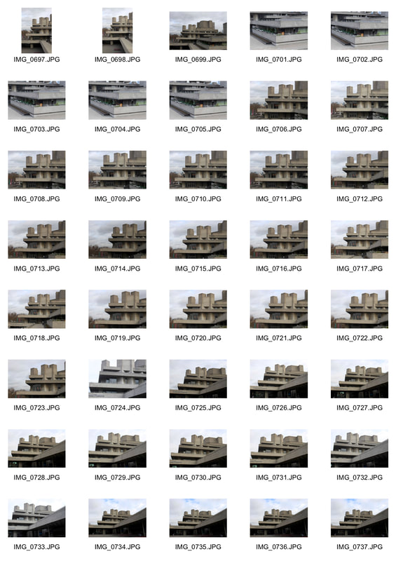
Brutalism contact sheet
|
|
|
|
|
|
Best brutalist pictures
|
Unedited pictures
|
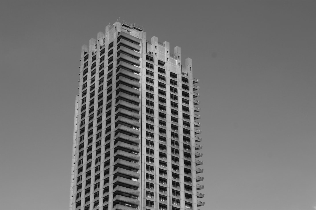
Black and white pictures
|

|
|
|
|
|
|
For most of these images, the sky was cloudy and so appeared grey. The buildings themselves were mostly grey as-well which meant that when turning the pictures black and white, some pictures didn't change much. Taking away the saturation of the pictures allows for all of the focus to be on the building itself which draws attention to the strong use of straight lines and sharp corners. The combination of the shape and the size of these buildings, makes the structure stand out and seem powerful.
THOMAS DANTHONY
Thomas Dathony is a French artist based in London and Barcelona. His work is often narrative and mysterious due to the darker colours used. He makes these images in collaboration with the Black Dragon Press. He creates these images by using photoshop and simplifying the colours.
|
|
|
My attempt
Original
How I created my work.
EVOL
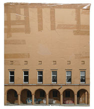
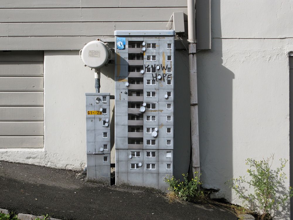
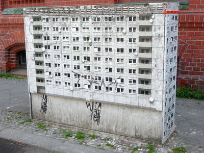
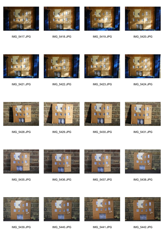
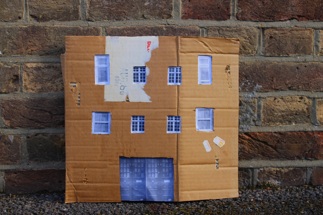
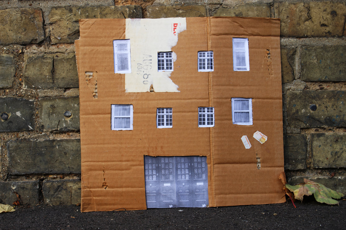
EVOL is an artist based in Berlin and photographs his work locally. EVOL transforms everyday features from our landscape into miniature concrete tower blocks using paint. He paints directly onto things in the city to create his work. EVOL also uses cardboard and sticks printed images of windows and doors to make them look like buildings. In this style of work, the artist really has to think about composition and attention to detail. He has a particular interest in post-war architecture.
|
|
|
My attempt.
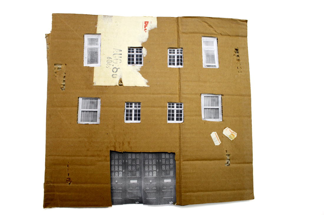
This is my image by itself. I photographed it on a white piece of paper and then increased the brightness of the paper in photoshop to make it brighter.
I placed my cardboard around the school and photographed it. This is my contact sheet.
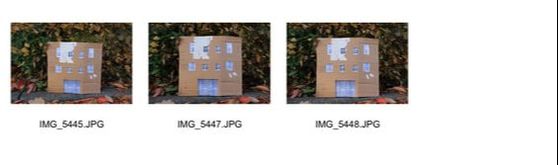
Best pictures.
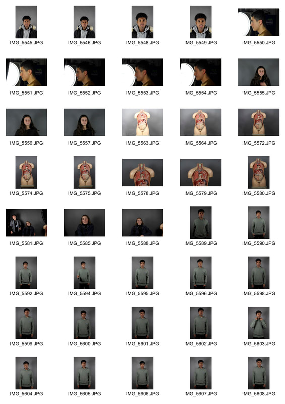
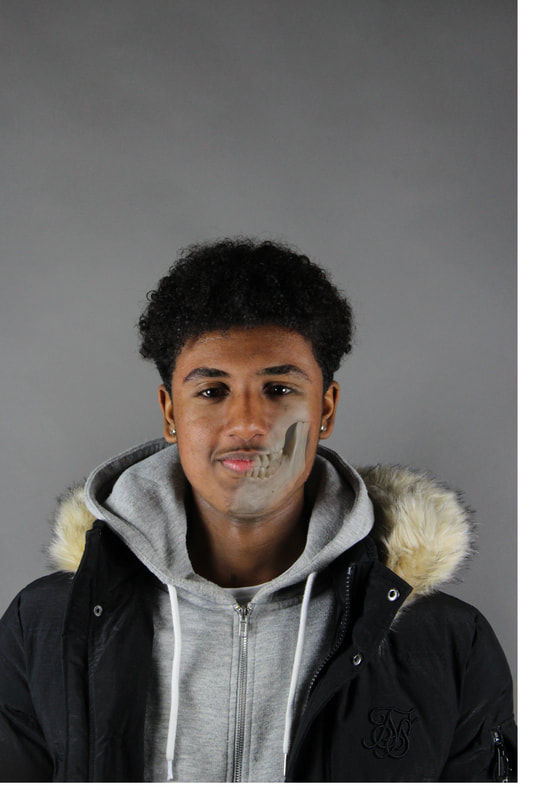
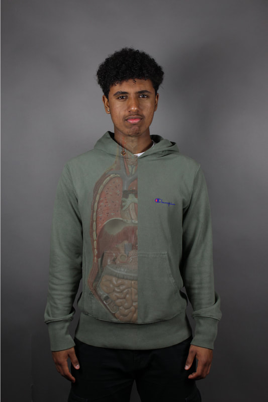
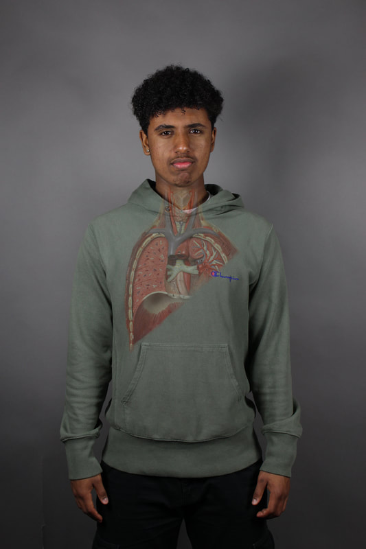
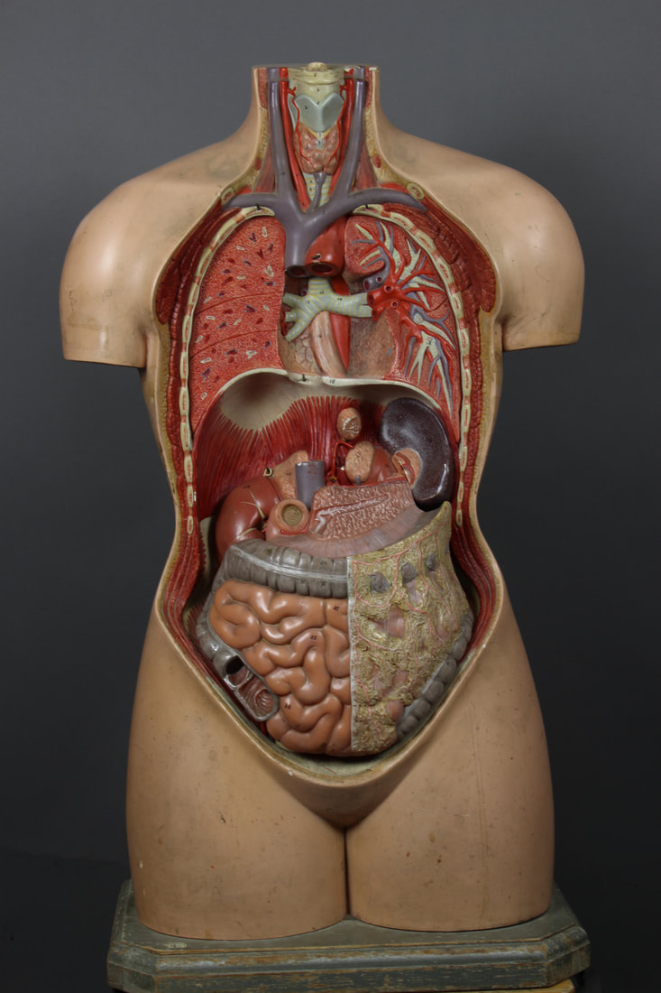
Structure of the Body
For this task, I merged people's bodies with the artificial skeletons and organs in photoshop.
Contact Sheet
|
|
|
|
I found that having the lungs or skeleton more rubbed out made the picture look more realistic. Next time, I could try and isolate only certain organs or bones instead of having a whole section.
|
|
|
|
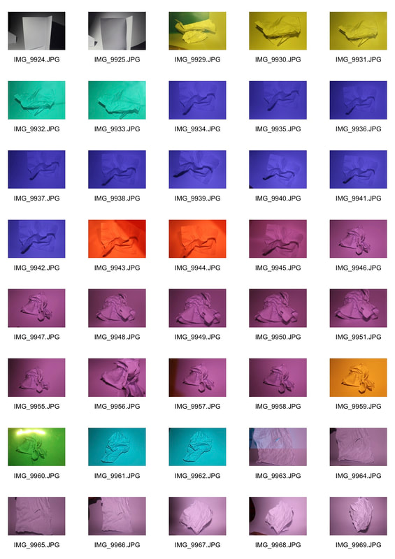
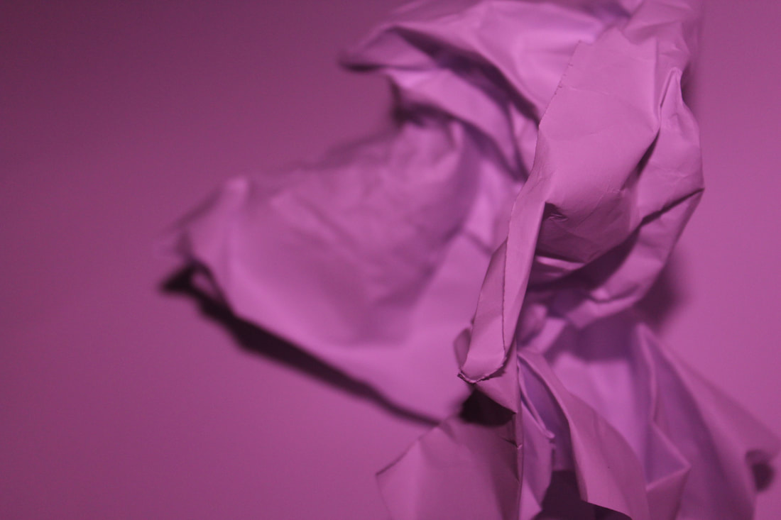
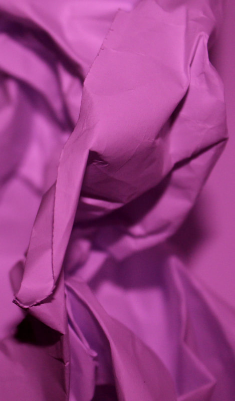
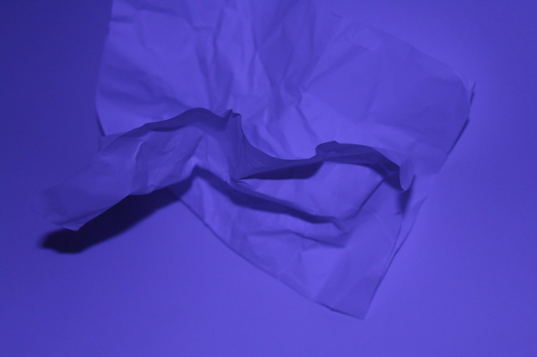
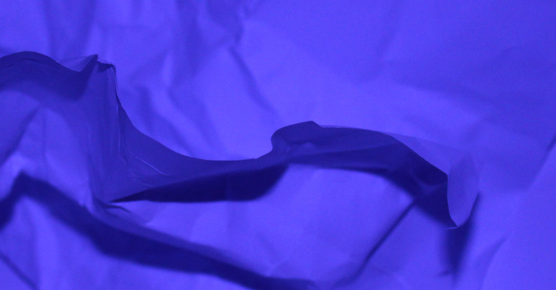
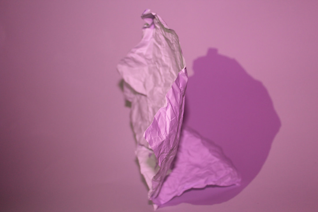
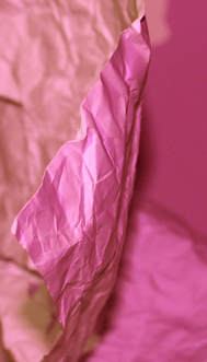
Paper
The objective of this task was to create an interesting picture through the use lights and a piece of paper. Since the main focus of the image was a plain piece of paper, it is not very interesting and therefore I had to work with things such as lighting, shape and colour to create interesting effects.
As I took more photos, I realised that the more interesting ones were the ones where the paper had more creases in them resulting in more shadows and ultimately, a wider range of colours. By crumpling the paper more, the image gains different textures.
Having a piece of paper different to the colour of the lighting also worked well as it shows contrast.
Having a piece of paper different to the colour of the lighting also worked well as it shows contrast.
|
|
|
|
|
|
|
|
|
|
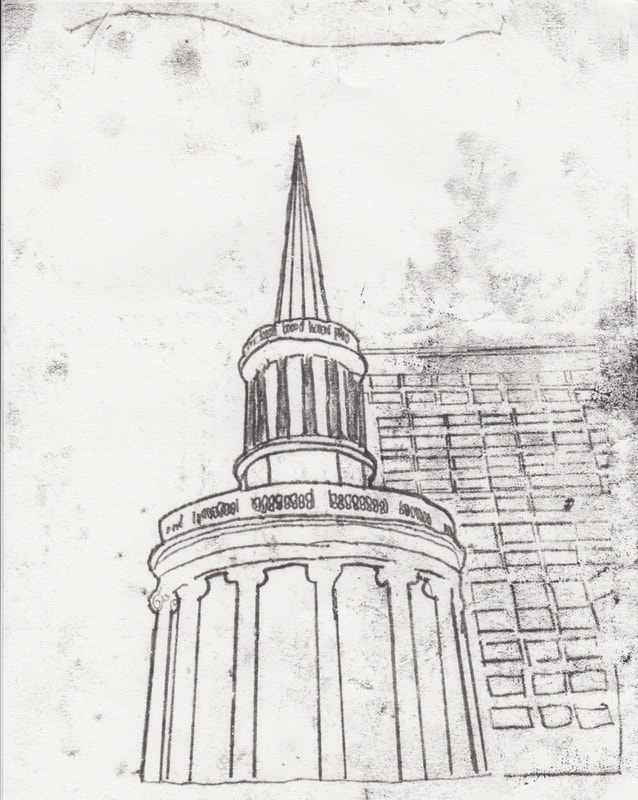
Mono Printing
For this task, I used the technique of mono-printing. This consists of:
- Printing the image which you choose to trace.
- Covering the back of the image with paint by spreading it with a roller.
- Make sure there isn’t too much ink on the back of the image by rolling the front of the image onto a piece of scrap paper to remove the excess paint.
- Place a blank piece of paper behind the printed image and stick it down with tape to make sure the images don’t move.
- Trace the image using a pencil.
In this image, I leaned with my wrist on the paper too much and this shows as there are traces of paint in unwanted areas. This makes the work seem messier. I used a ruler to create some of the straight lines in the picture to make the image more accurate.
|
|
For this image, I decided to stick some sugar paper onto the blank piece of paper prior to tracing to create a different effect. This would add texture and colour to the image. However, when I chose the colour of the paint, I chose orange which turned out to be too light and so the image isn’t clear.
|
|
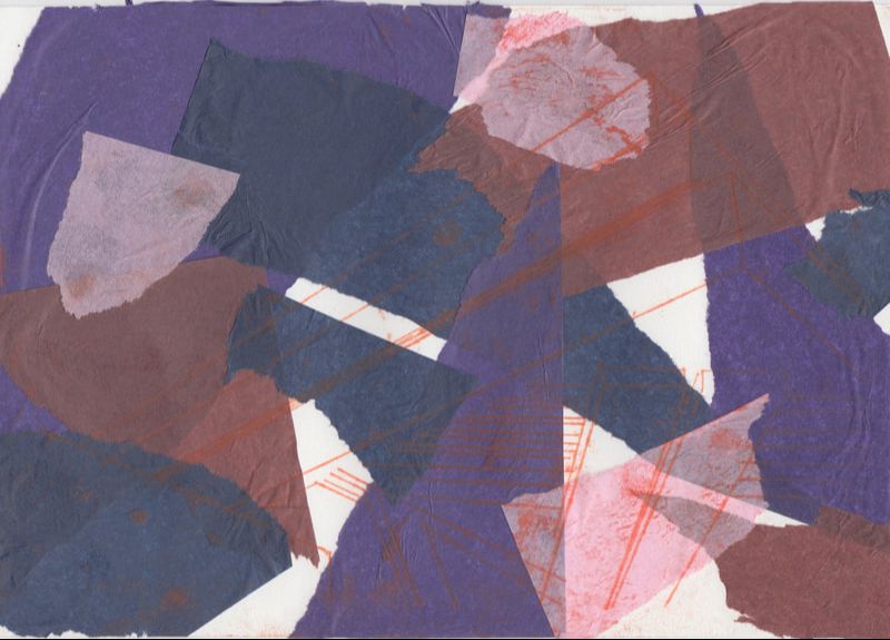
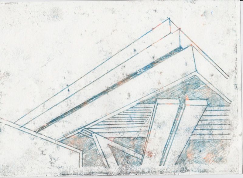
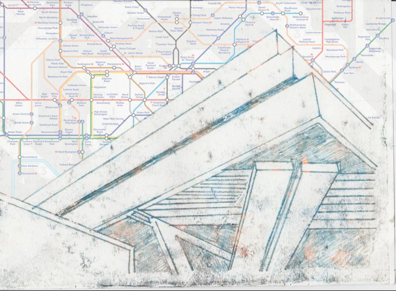
For this last image, I chose to add different colours of paint on the back of the image so that when I traced it, it would have numerous colours. This last image came out well as I had previously practiced tracing this image. I decided to stick with a plain white background as it looked much cleaner overall. I used shading techniques to show where the image was darker, I did this by drawing lines close together.
I added in a map of the tube in the background. This is almost like a double exposure.
3 Strands
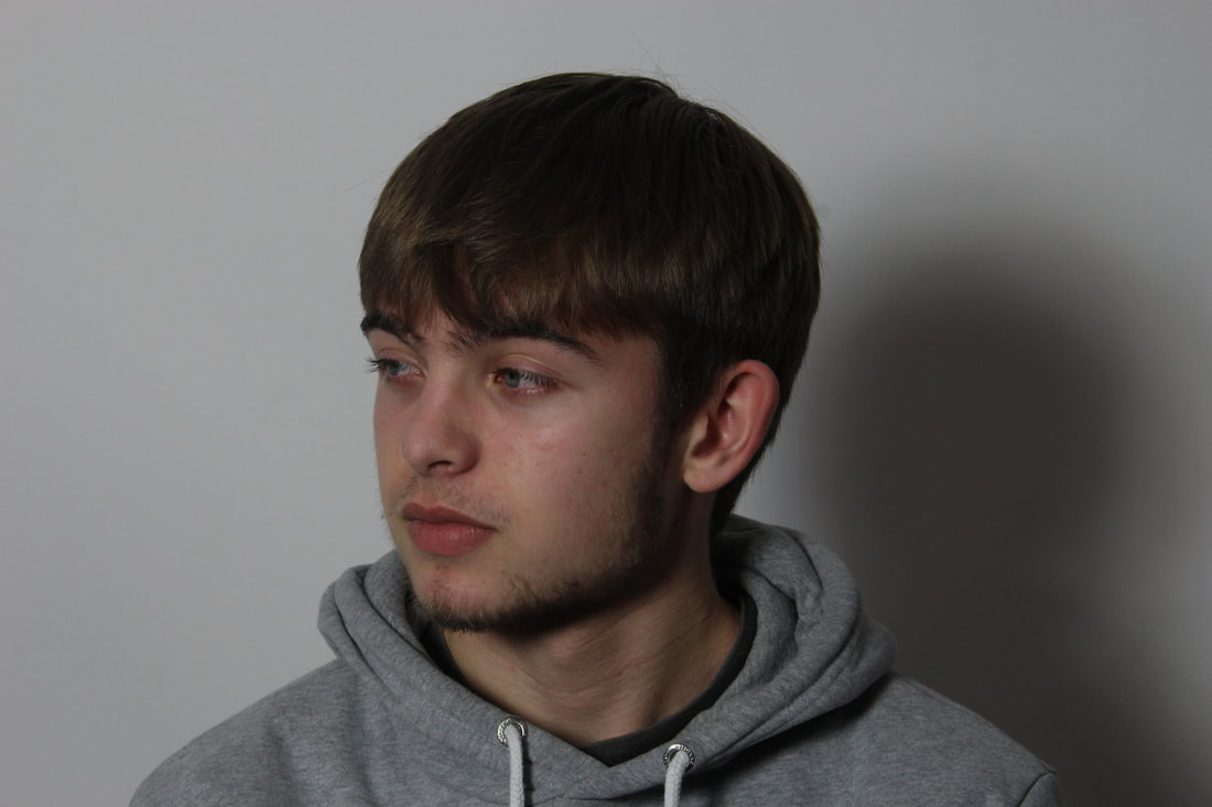
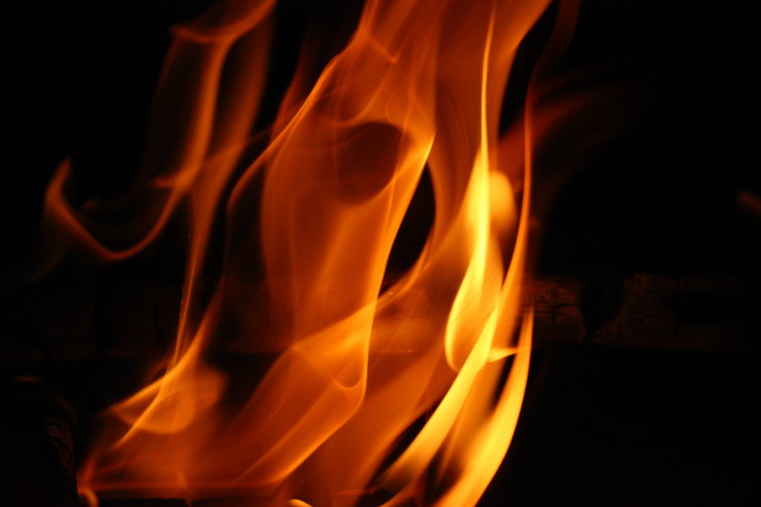
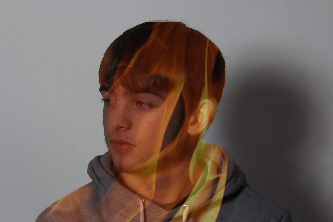
Strand 1: Double Exposure
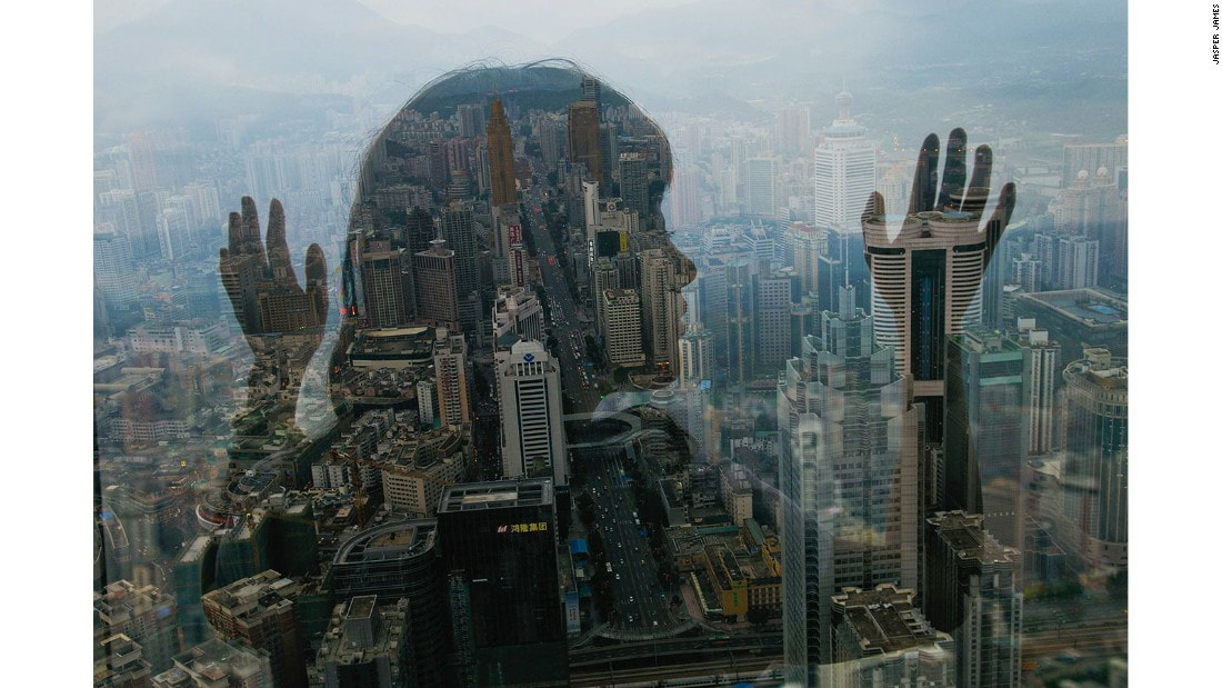
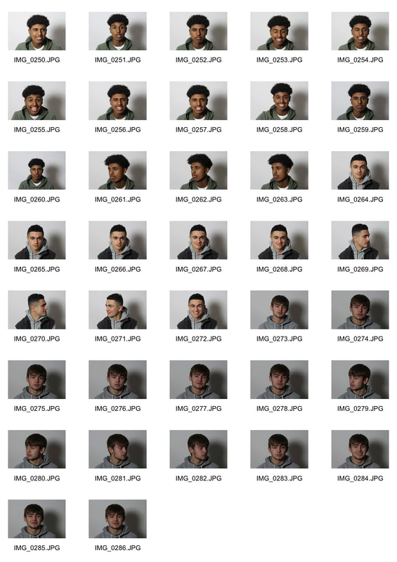
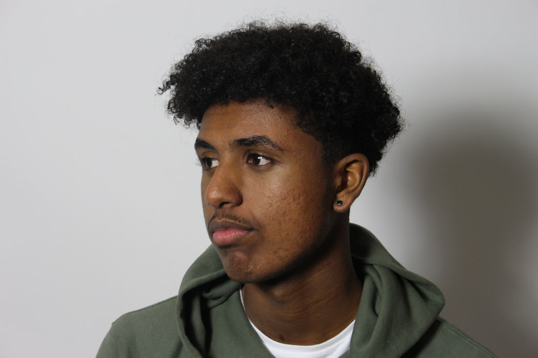
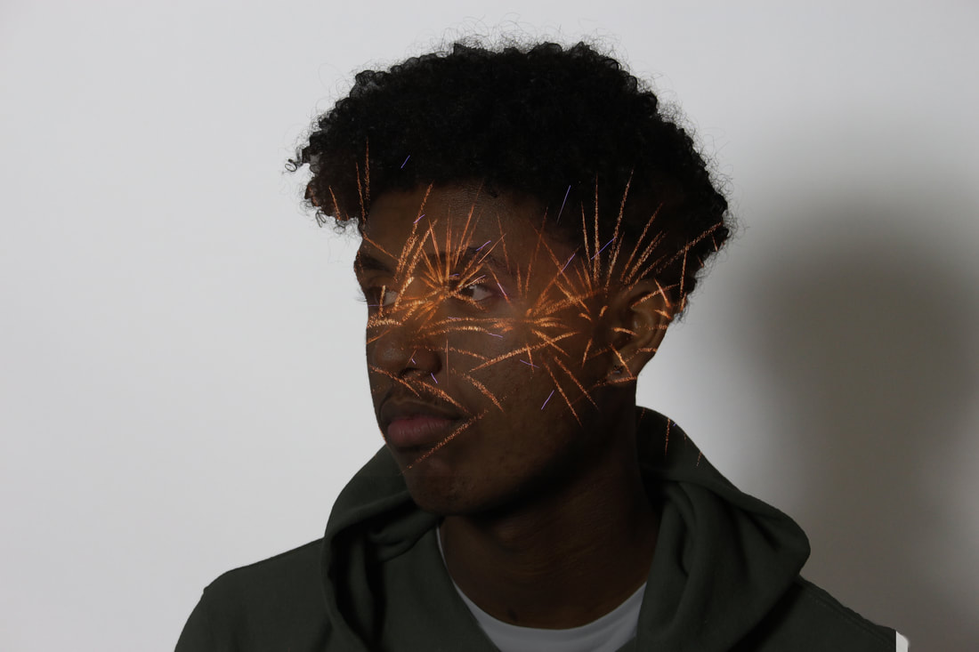
Andre de Freitas
|
|
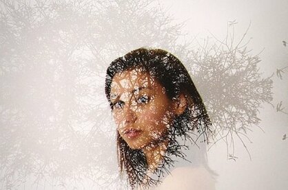
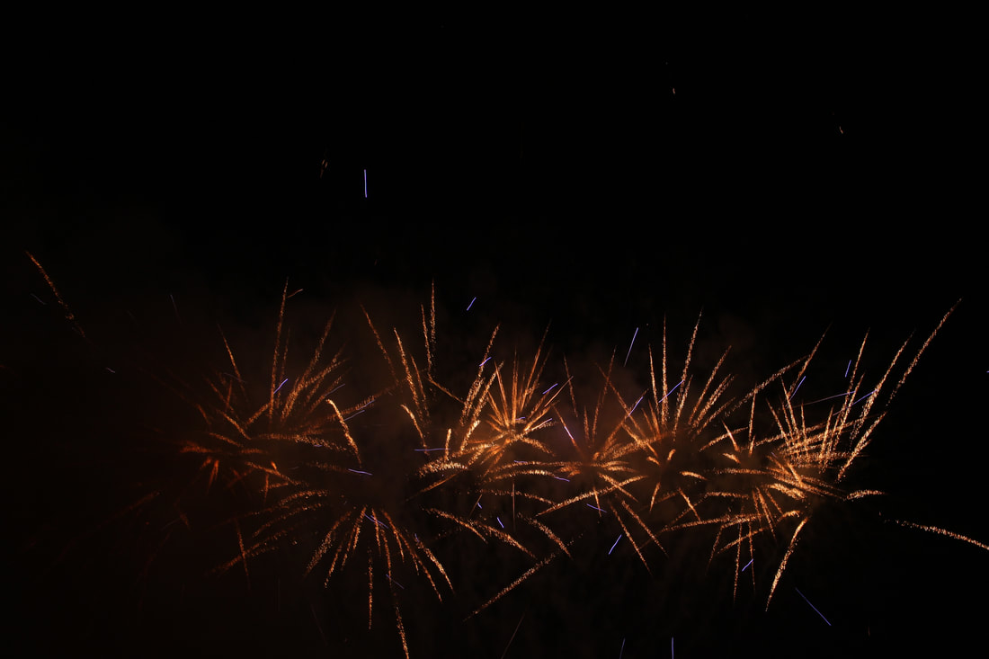
Andre De Freitas creates double exposure pictures to blend two pictures into one. He does this by taking two pictures and blending them together using Photoshop. He wanted us to consider how the two pictures link in together.
This links into the theme of ‘structure’ as it links the facial structure of the model and the emotions. The use of the second photo further emphasises the structure of the face.
'Hello, my name is Andre De Freitas and I'm an illustrator and occasional photographer born and raised in Lima, Peru. I studied in Full Sail University and got a Bachelor’s Degree in Computer Animation. But oddly enough, the concept of stillness captured my imagination, and I focused more on illustration. Instead of just drawing, I tried to imagine myself taking photos of my subjects. That way the illusion of stillness would be a little more believable, almost like a photograph. After that, my insertion into the world of photography was almost based on instinct'.-Andre De Freitas.
|
|
|
|
|
|
|
|
|
|
|
|
|
|
|
|
|
|
|
|
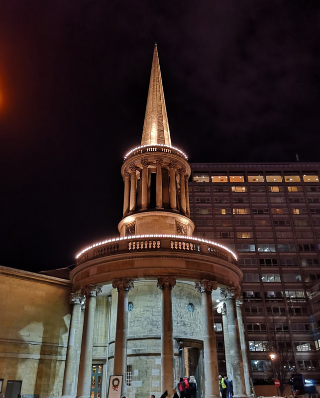
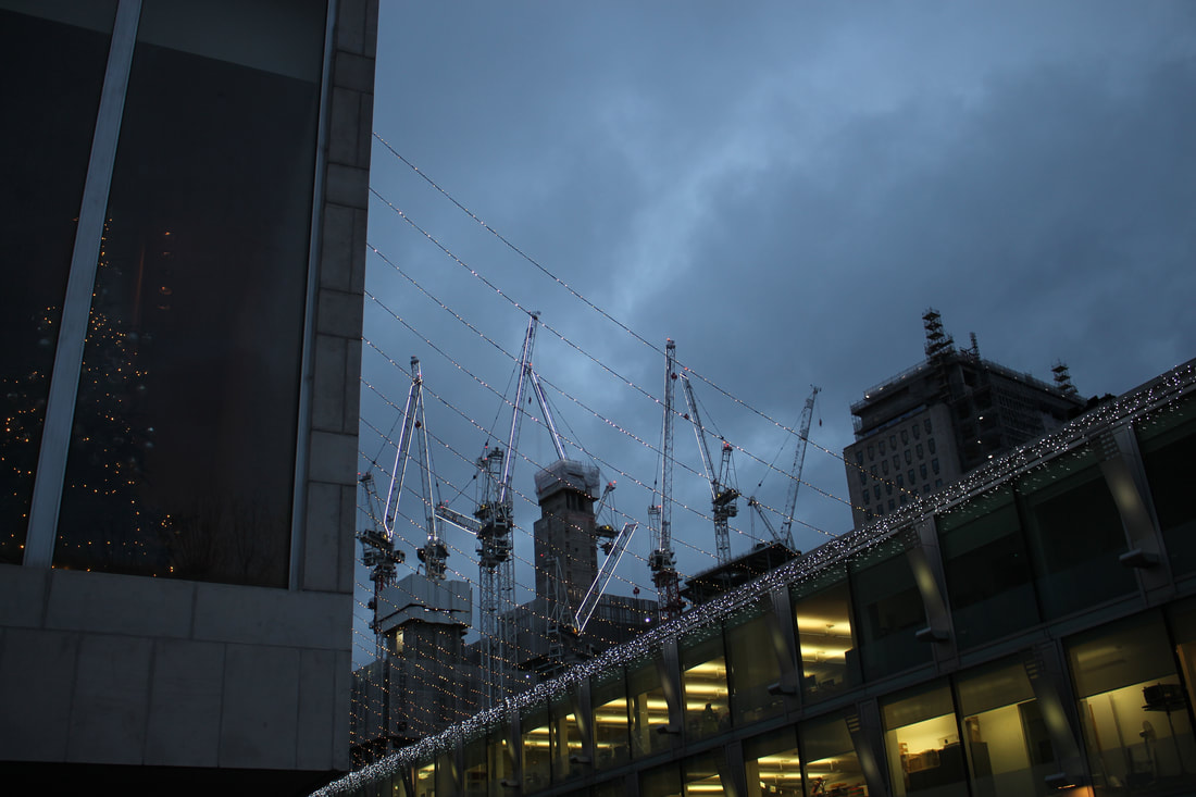
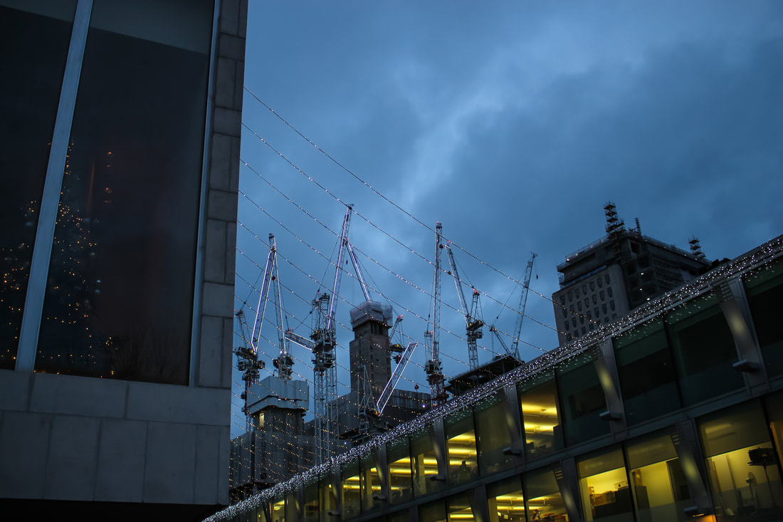
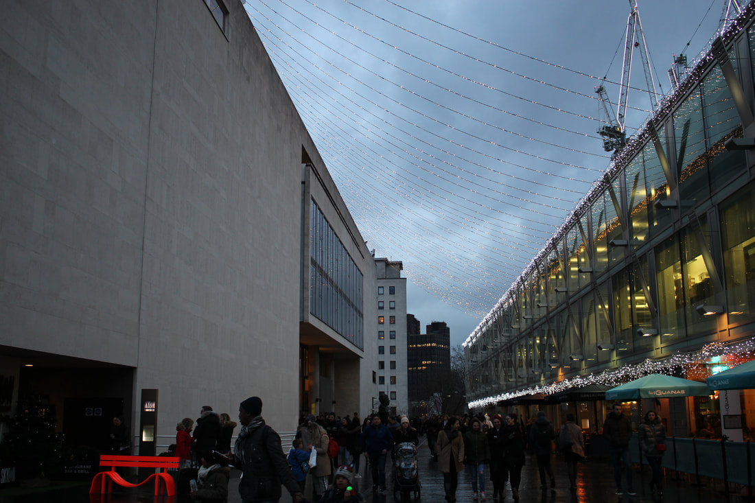
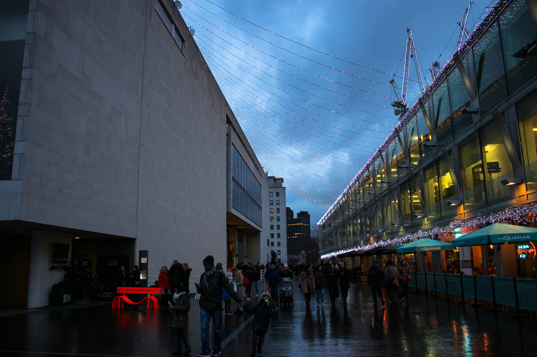
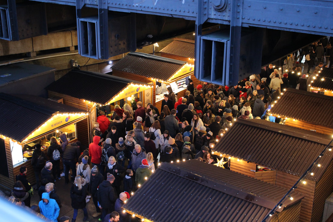
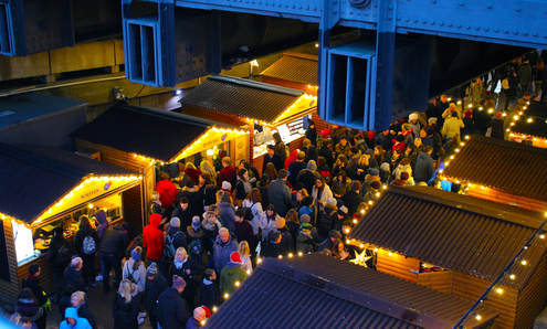
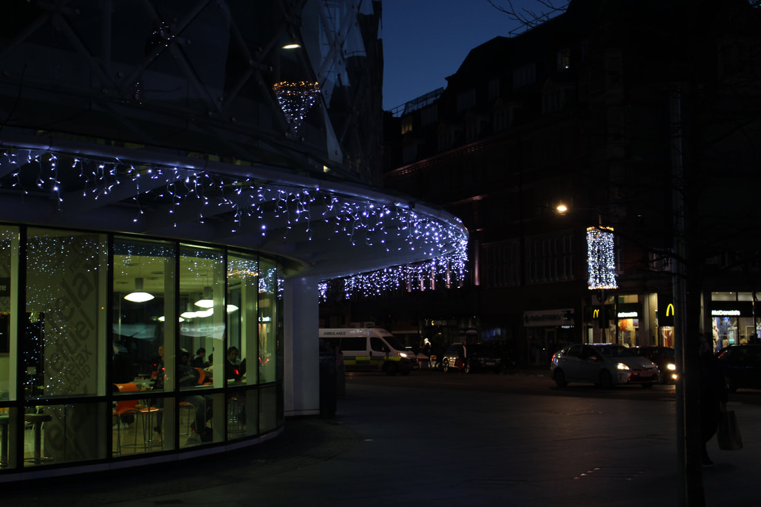
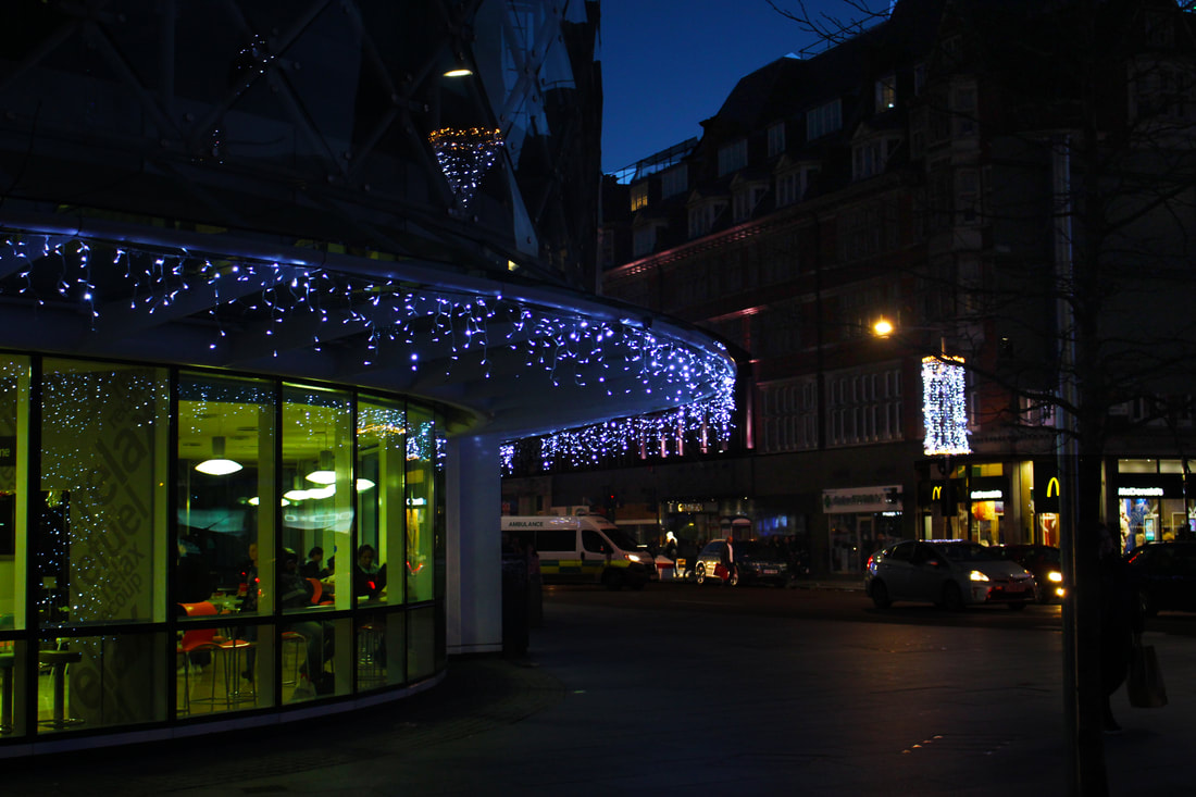
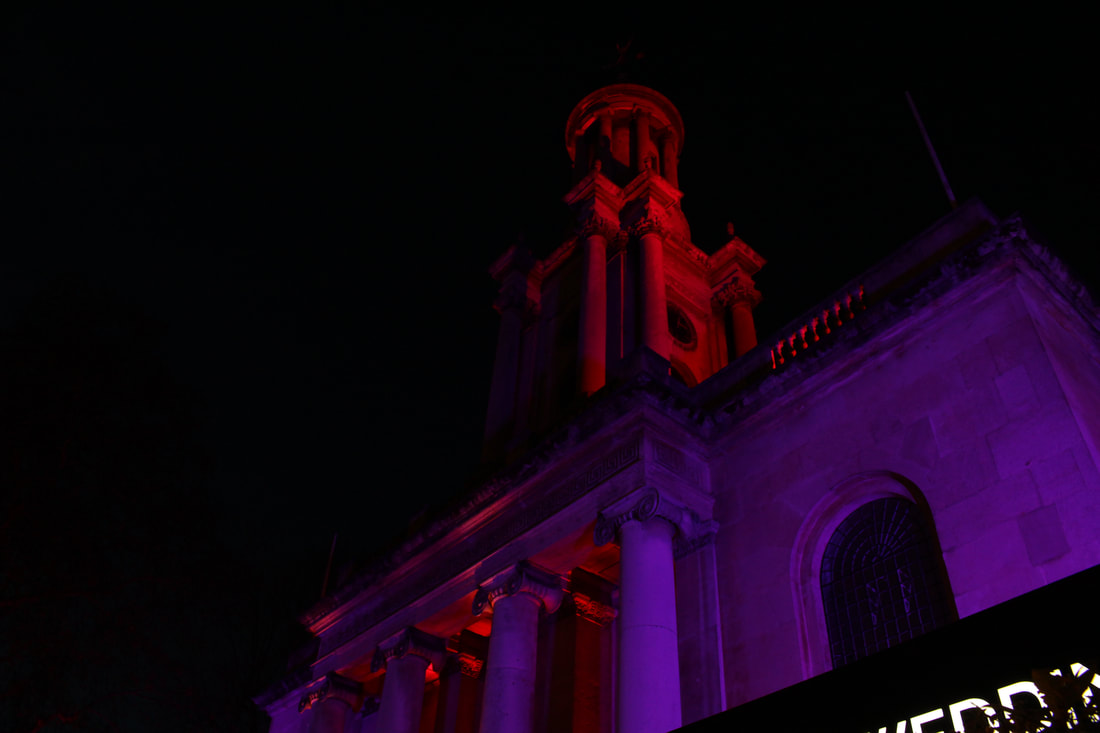
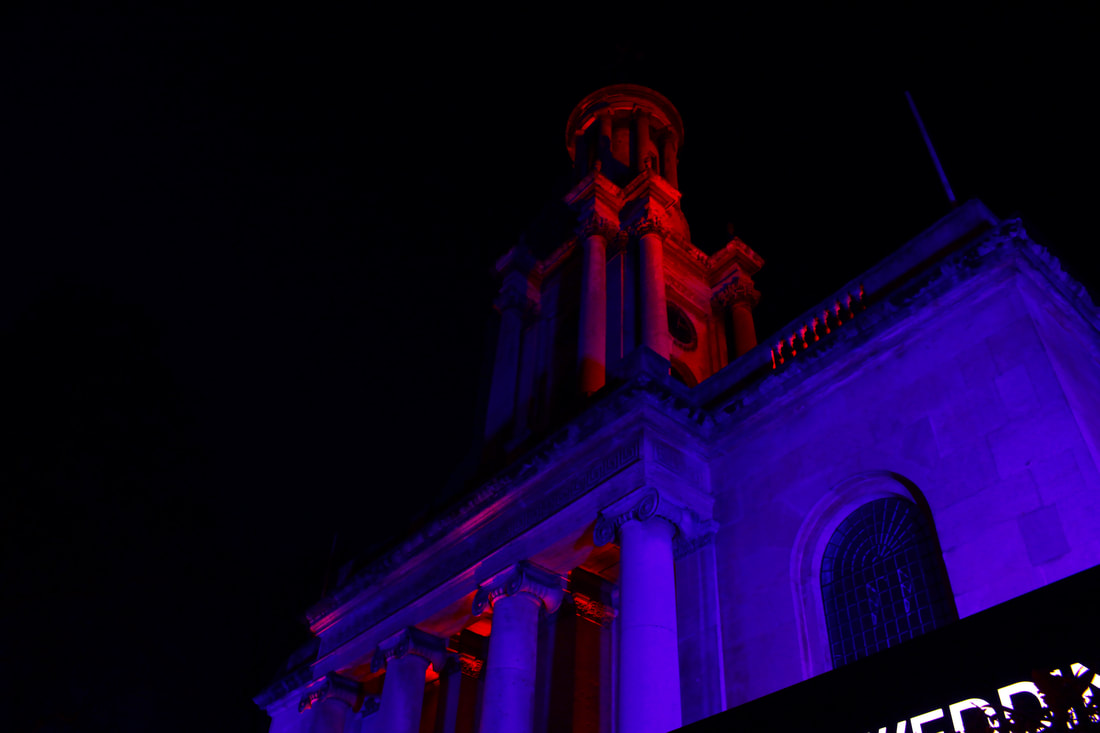
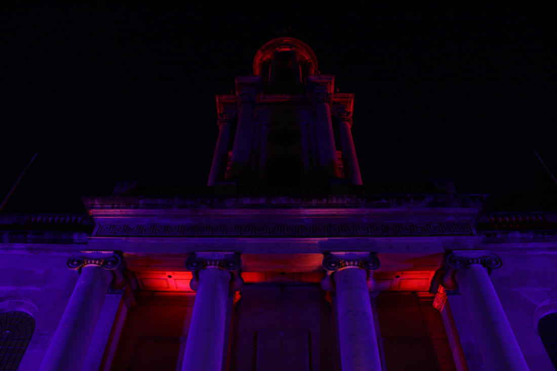
Strand 2: Night Lights
I chose this strand because I wanted to photograph the structure of buildings under the reflection of lights. I chose this strand as it represents the theme of structure through the buildings. I didn’t want to shoot any regular buildings so I decided to narrow down my selection to buildings with Christmas lights or reflections as they are more eye-catching and interesting to observe.
|
Original
|
Edited
|
|
|
|
|
|
|
|
|
Second Attempt
Contact sheet
|
|
|
|
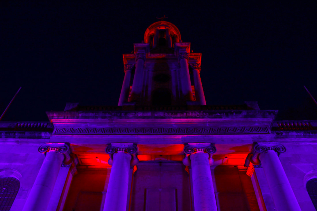
I liked this image as there is a strong contrast between the darkness of the picture and the bright Christmas lights. This drives the focus of the picture on the areas of brightness such as the Christmas lights and the shop window which was a neon green colour which again, contrasts with the darkness of the sky and buildings in the background. I also increased the brightness and the saturation slightly to make the colours pop more.
|
|
For these edits, I edited the colour balance so that the reds and the blues would pop more. I also increased the brightness and decreased the contrast for the main buildings but I made the background completely black by lowering the brightness, this was done so that the main focus of the photos was the building and not the background.
|
|
|
|
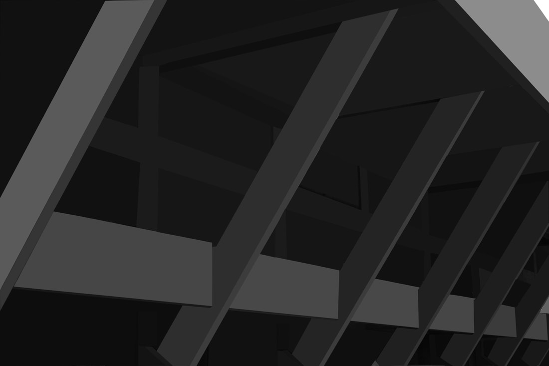
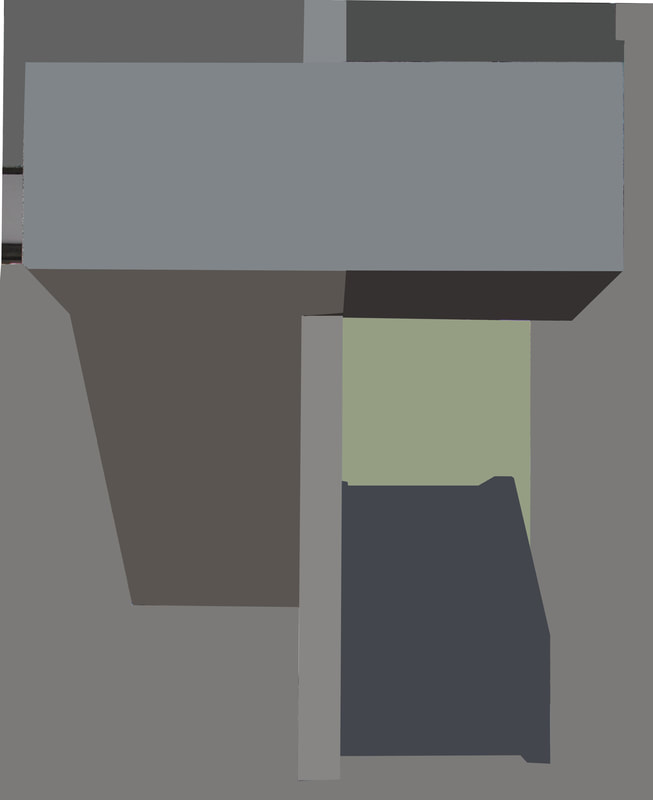
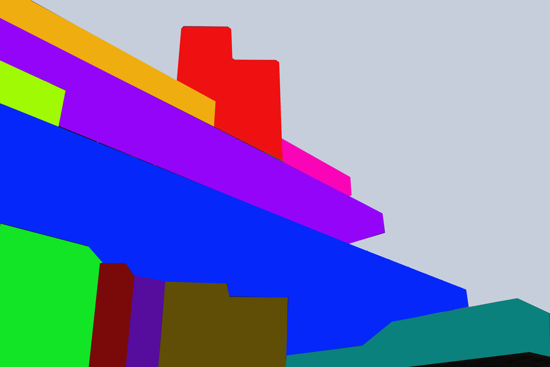
Strand 3: Simplified Pictures
For this strand I chose pictures of large scale buildings and chose to simplify them through Photoshop. By blurring parts of the picture, the focus is more on the shape and overall colour rather than the texture and small details of the building.
I chose to continue with this strand as I wanted to explore it further. This work is inspired by the French artist, Thomas Dathony.
I chose to continue with this strand as I wanted to explore it further. This work is inspired by the French artist, Thomas Dathony.
|
Original
|
Edited
|
|
|
After having simplified it.
|
|
I wanted to explore a change in colour for this strand. I wanted to make my pictures pop more in order to make them stand out more, I decided to experiment with more colours.
I ended up not liking all the colour in the picture. I felt that too much colours took away from the shadows and the details of the photo.
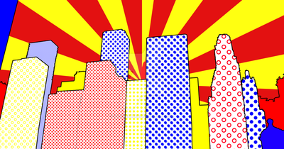
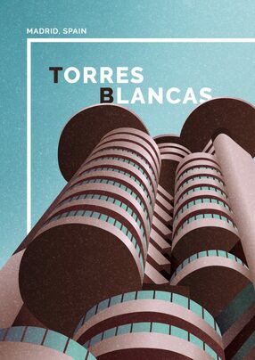
I came across the work of Eliza Southwood and 'Touchofmodern.com' (pictures below). These pictures have bight colours to attract attention. I like these photographs as the colours are bright and pop out to make an almost pop art effect.
|
|
This is my first attempt at recreating the work of Eliza Southwood. I stuck with three colours as it makes the picture look cleaner and more refined. Only having used three colours meant that the picture had more detail than my previous work.
This piece of work came out very messy as I used the quick selection tool to highlight the different parts of the photograph that I needed to shade in. Next time I will use the polygon lasso tool as it will create straighter lines and be more accurate.
This piece of work came out very messy as I used the quick selection tool to highlight the different parts of the photograph that I needed to shade in. Next time I will use the polygon lasso tool as it will create straighter lines and be more accurate.
|
|
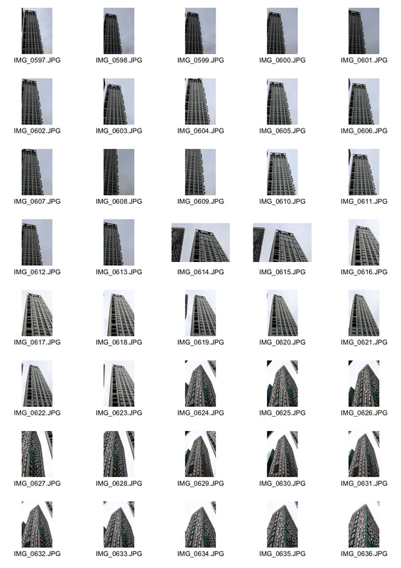
Contact Sheet
These were all the pictures I took of tall buildings to later edit.
These were all the pictures I took of tall buildings to later edit.
|
|
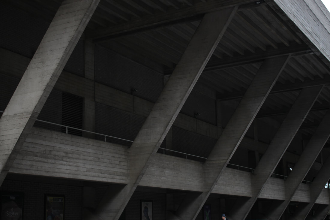
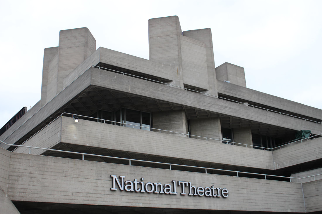
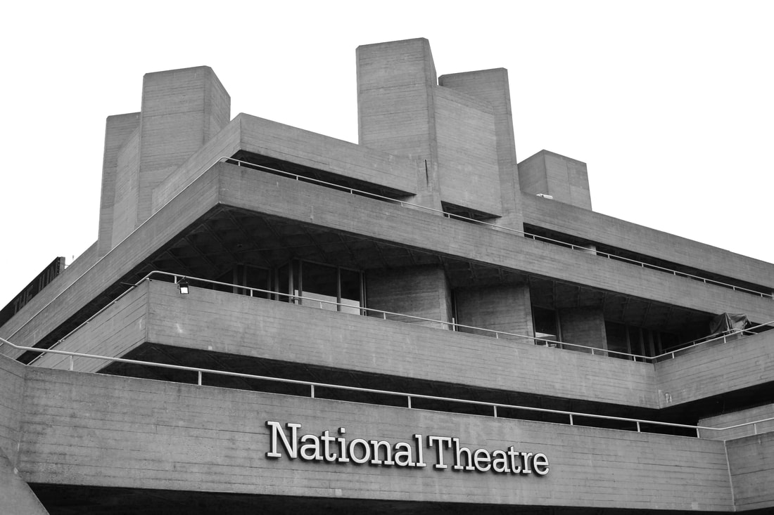
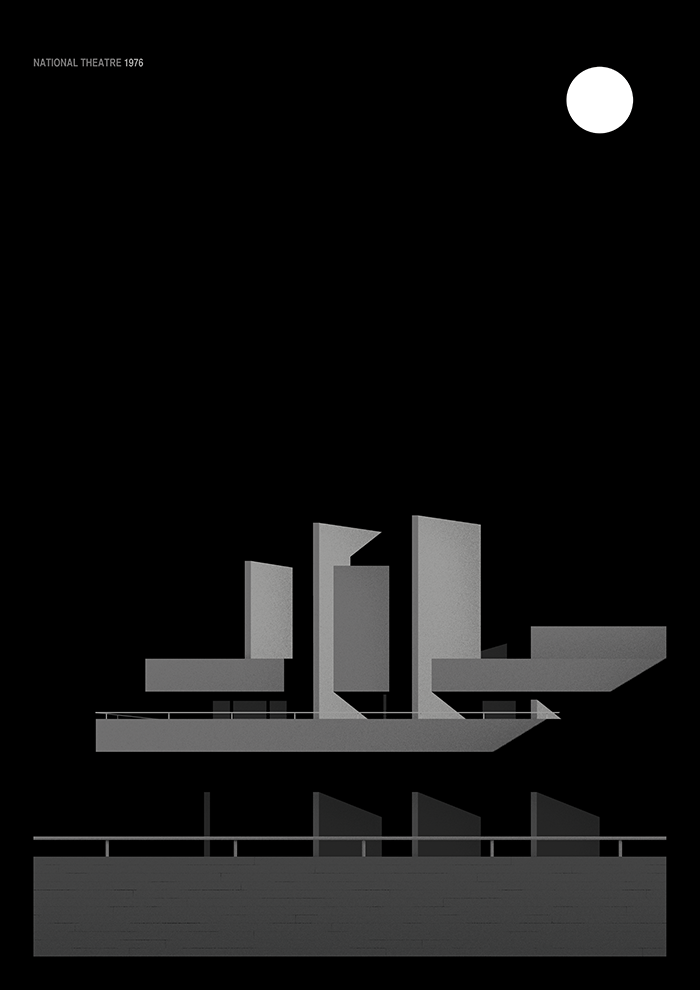
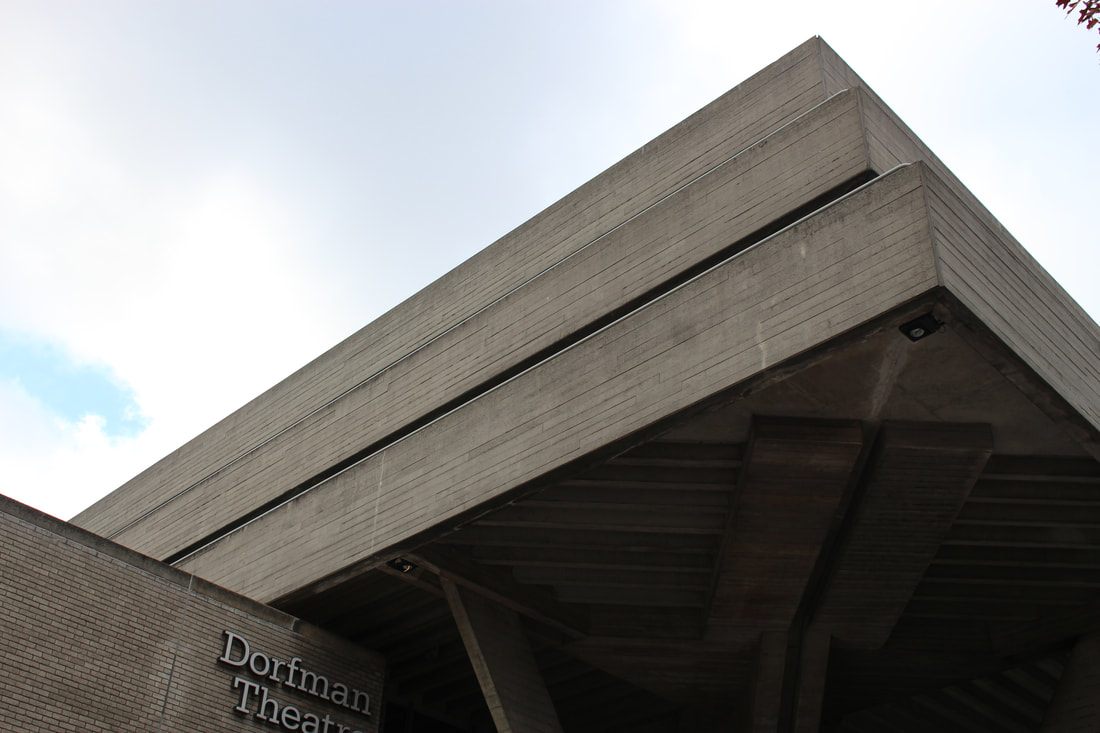
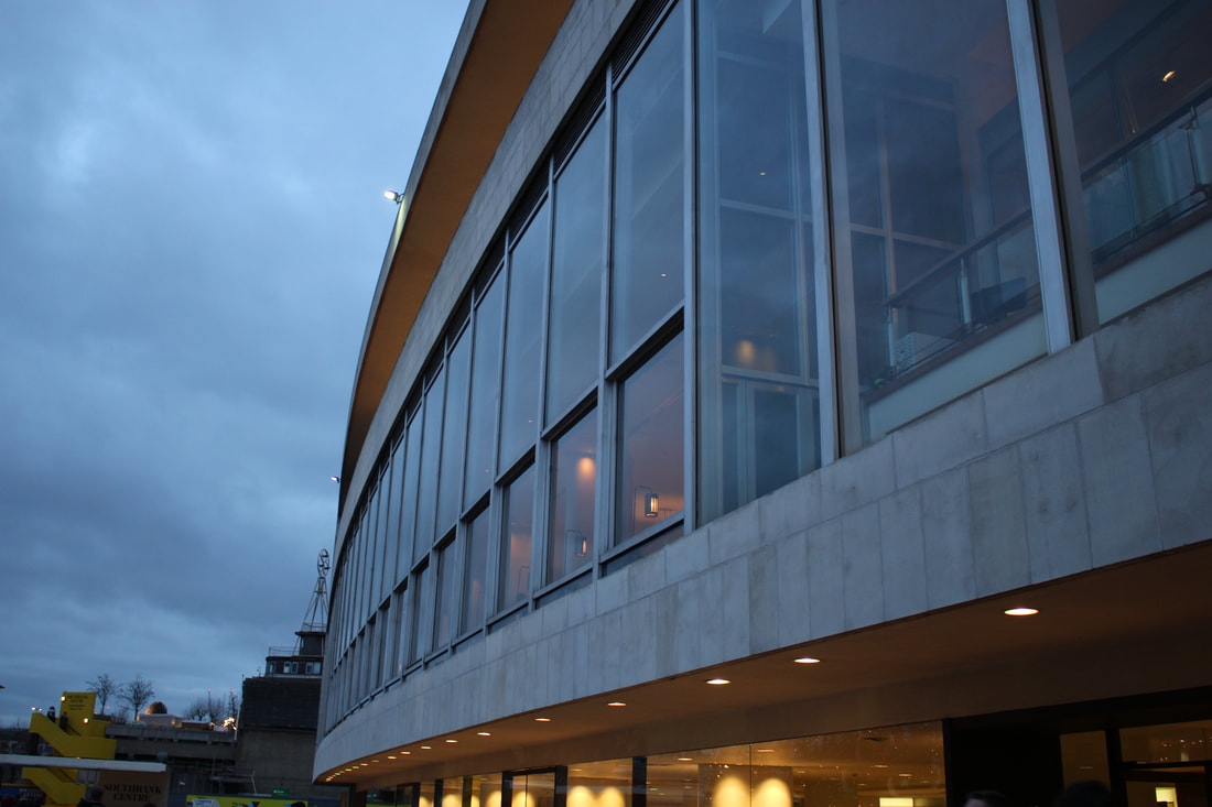
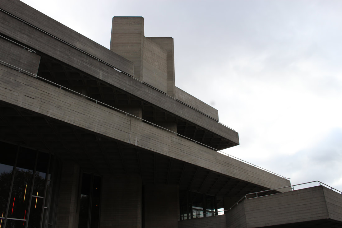
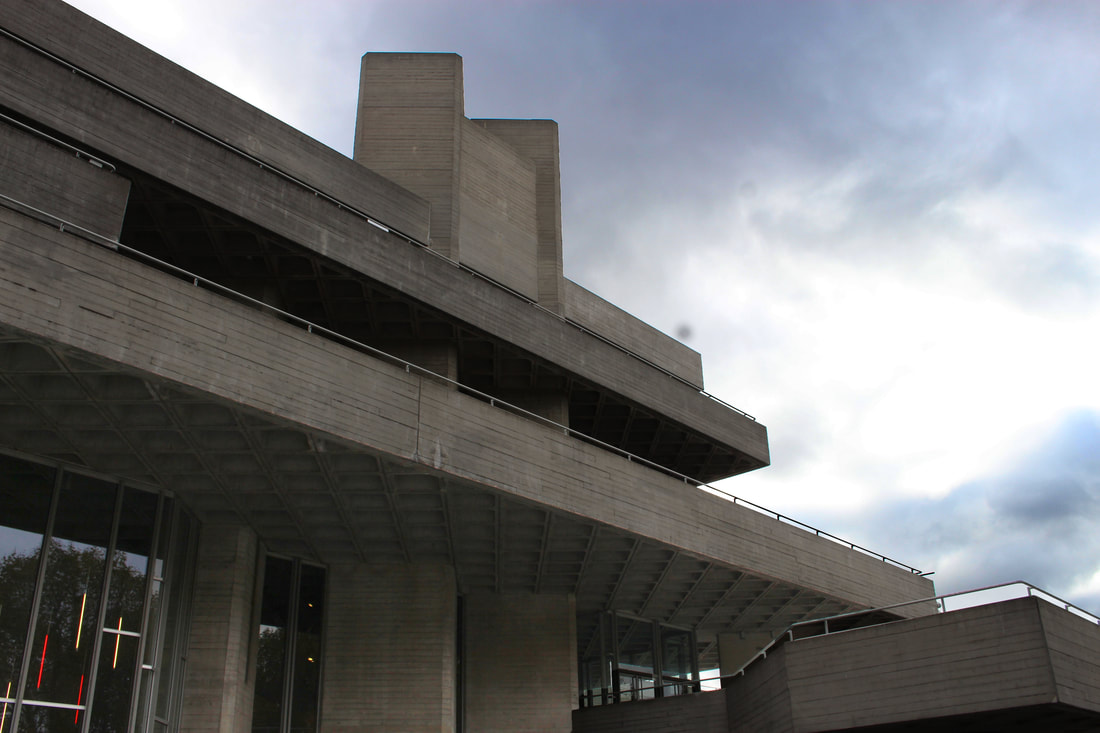
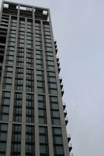
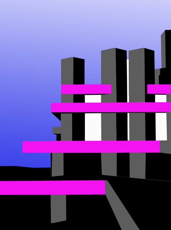
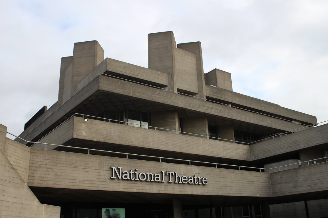
I went out again to photograph simpler buildings with more straight lines and less detail. This would result in cleaner looking pictures as there are less small details (such as small windows). I went to photograph the National Theatre.
|
|
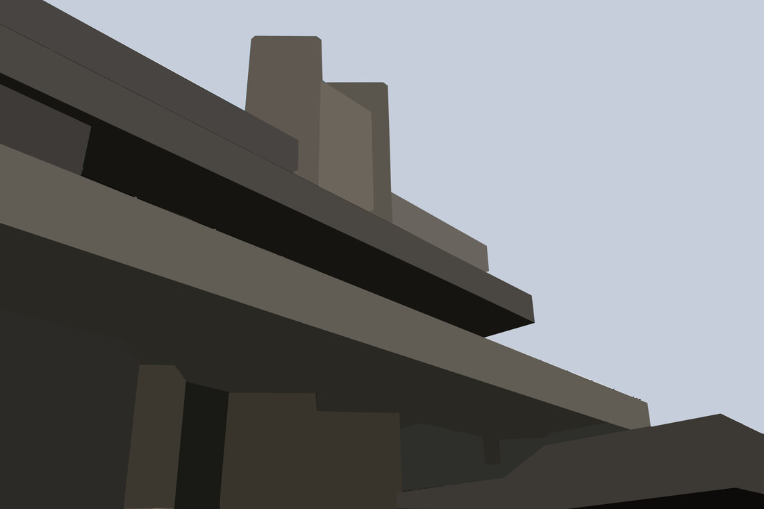
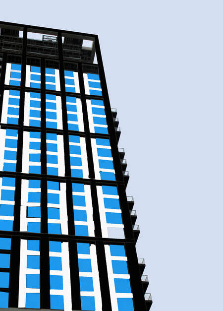
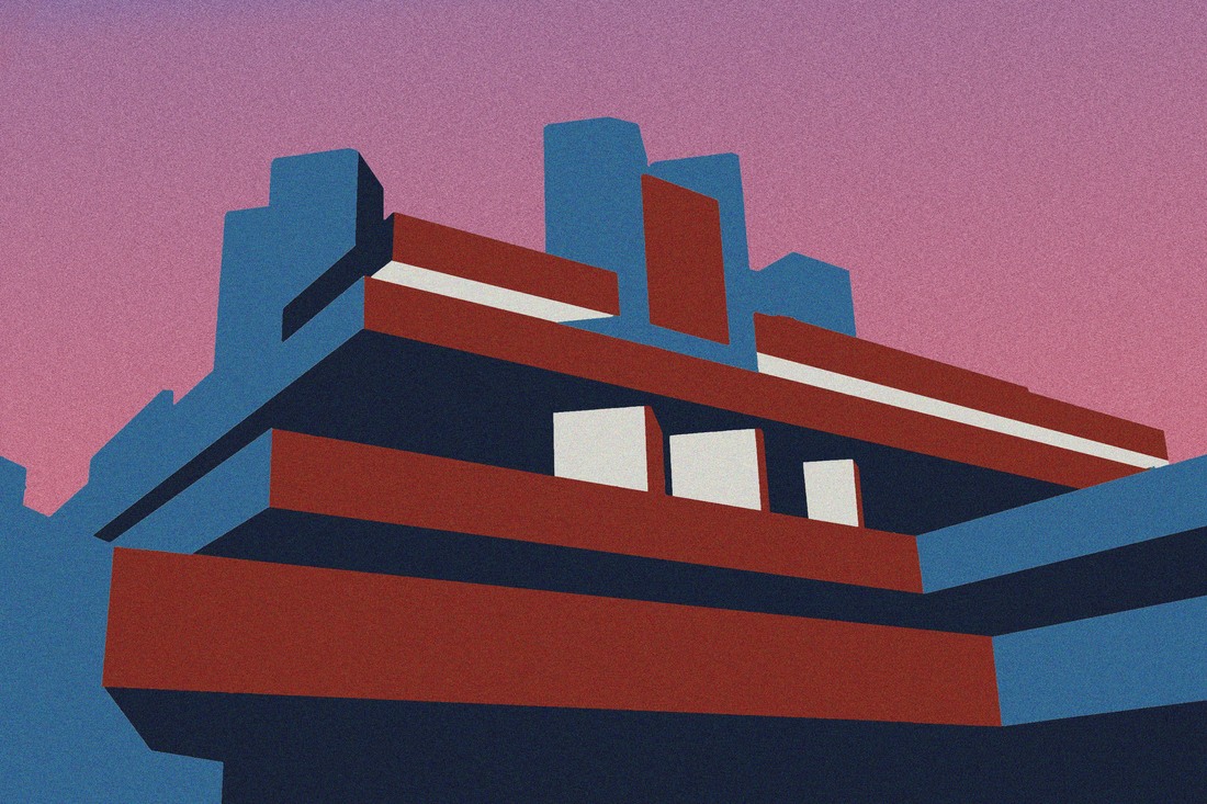
For my first attempt I used a picture which had lots of straight lines so that it would be easier to edit. Another advantage of having straight lines is that there are less details that need to be picked up which works in my favour as I only used 3/4 colours primarily. I also had a colour gradient a background to break the solid colour pattern. This adds to the diversity of colours found in the pictures.
|
|
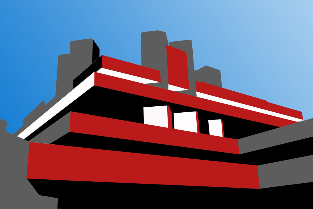
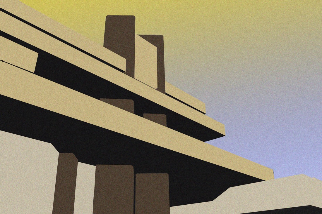
I picked a different photograph to edit where the point of view wasn’t straight on. This allowed me to show shadow more clearly (by representing it with darker shades). I also decided to use rd instead of pink as it wouldn't stand put as much.
|
|
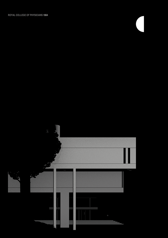
Marta Colmenero
I discovered the work of Marta Colmenero. Marta Colmenero's work had more switched off colours than my previous work. I really like this style of work as it makes it seem older. Her work also is simplified to an extent where it seems like a cartoon but also remains a realistic image through the use of shadowing in her work.
|
|
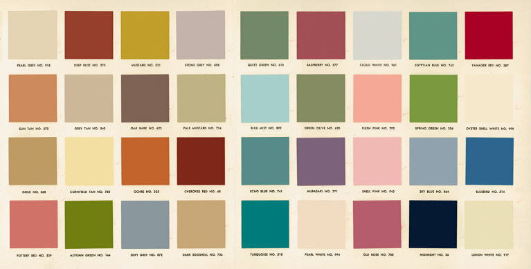
I decided to use more dull colours instead of the bold colours in my previous pieces. I looked into the common colours used in the 1950s/60s. Replacing the original colours of brutalist structures with the commonly used colours of the 1950s would link together as most of the Brutaist structures in London were built during 1950 to 1975. The National Theatre was built in 1976.
Commertial colours of 1950s
Final Pieces
For these final pieces, I added noise, as well as having old fashioned colours, to give it a more retro look.
For my first piece of work I used the colours from the pallet, however, for my second piece of work I used different shades of similar colours. I also used a double gradient (blue and yellow) (red and blue) for the background. This was because the yellow/red more closely matched the colour theme and the blue resembles the sky.
For my first piece of work I used the colours from the pallet, however, for my second piece of work I used different shades of similar colours. I also used a double gradient (blue and yellow) (red and blue) for the background. This was because the yellow/red more closely matched the colour theme and the blue resembles the sky.
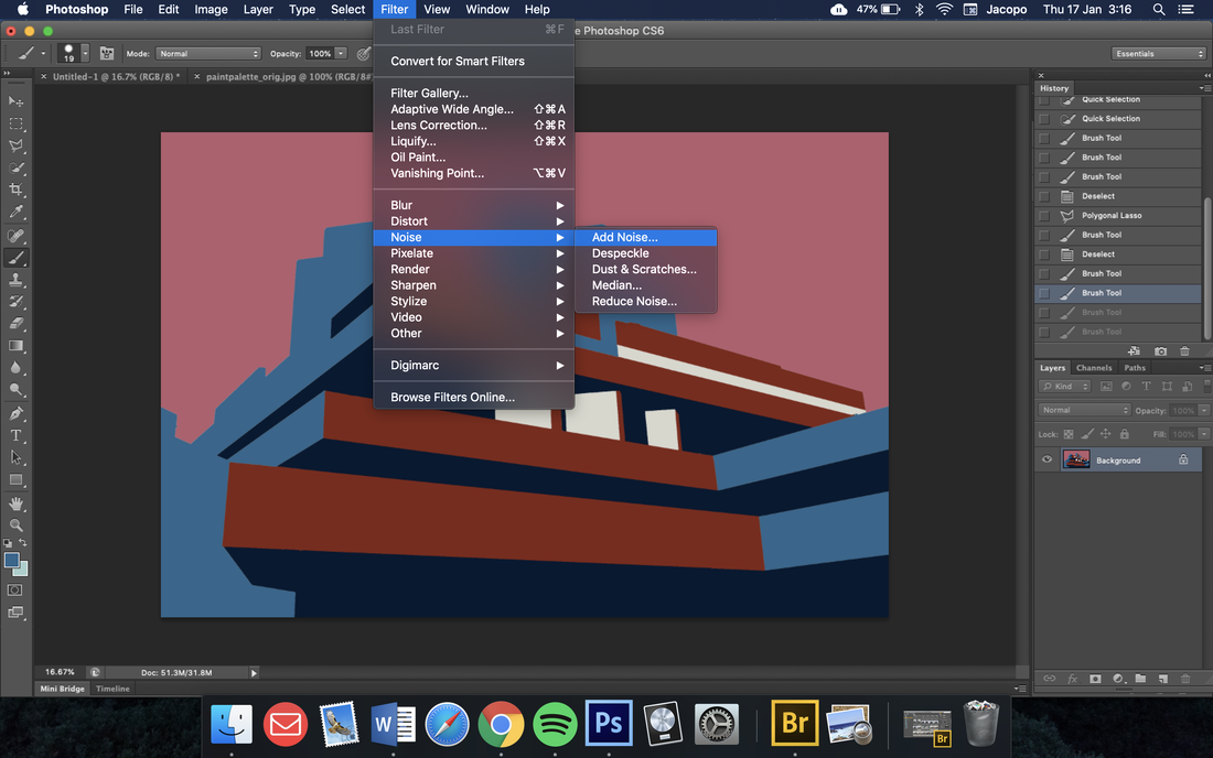
How to add noise
|
|
