Stephen Calcutt - Bus stop
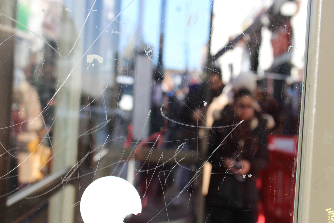
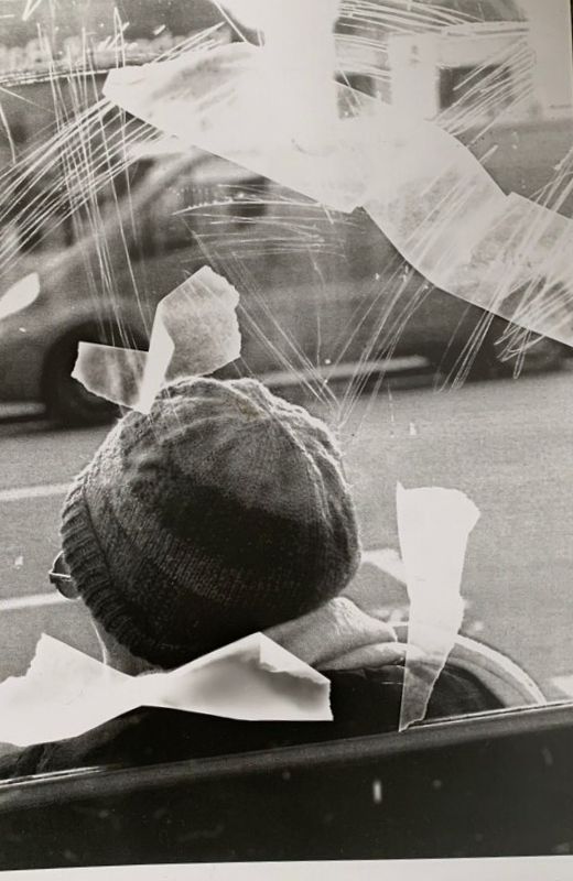
Stephen Calcutt is a british photographer that lives in Birmingham. Through his frequent encounters with scratched bus stop glass, he decided to photograph through them. Stephen Calcutt focuses his camera on the graffiti itself, therefore whatever is in the background becomes out of focus. These pictures heavily rely on colours and composition as the people are blurred and their identity is not revealed.
|
|
|
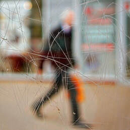
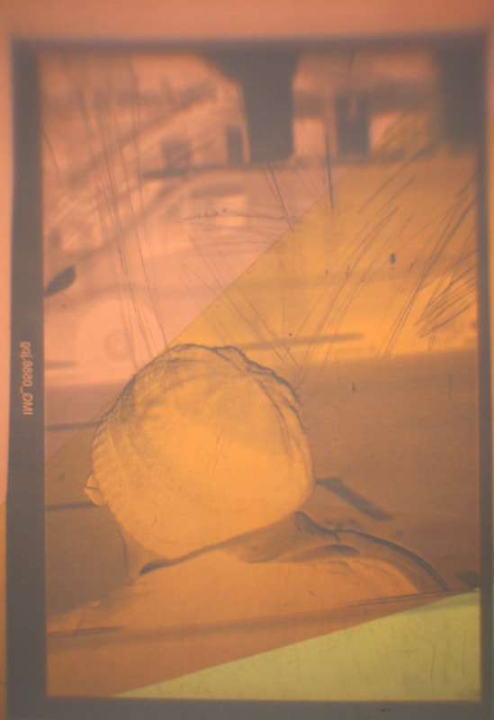
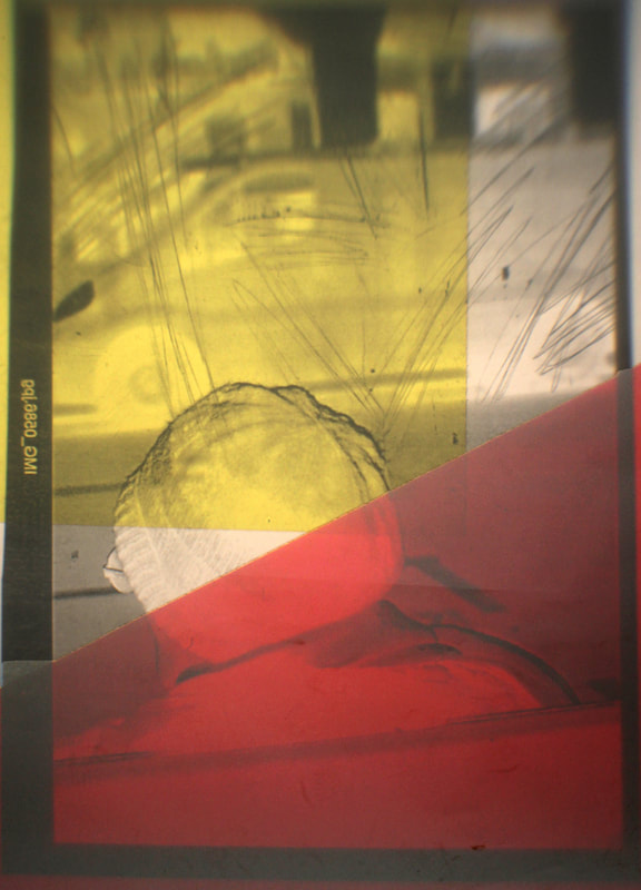
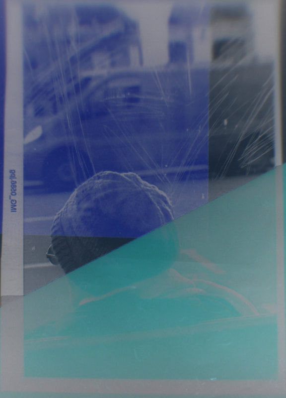
This picture is a great representation of Stephen Calcutt's work. This is because this image is focused on the graffiti, allowing the man's face to remain hidden as it is very out of focus. This image has great colours in it; the bus has a vibrant red that almost matches with the mans face. The mans hat and coat are of a dark blue/grey colour which contrast with the bright red bus. Because the image is out of focus, the artist has to have a good use of the surrounding colours to make up for the lack of detail.
|
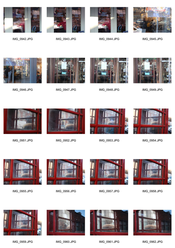
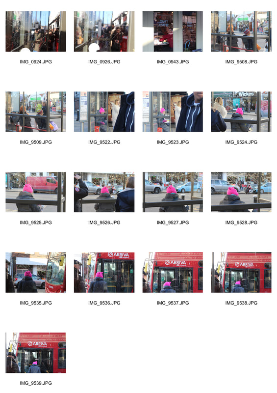
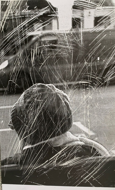
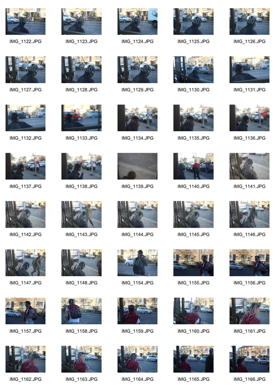
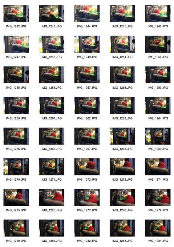
Contact Sheet of my first attempt at recreating Stephen Calcutt's work.
|
|
Best Pictures- First Attempt
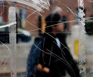
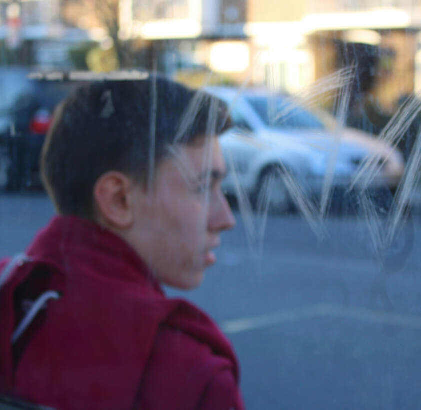
This image is similar to the work of Stephen Calcutt in the sense that the background is blurred and the focus is on the graffiti on the glass. What makes the image unique is thats behind the glass and not in focus. By choosing a location with various colours behind the glass, it made th overall image more interesting as it has a wider range of colours.
Having a smaller aperture could have allowed me to have the background (the people) more in focus whilst still having the main focus on the graffiti.
Having a smaller aperture could have allowed me to have the background (the people) more in focus whilst still having the main focus on the graffiti.
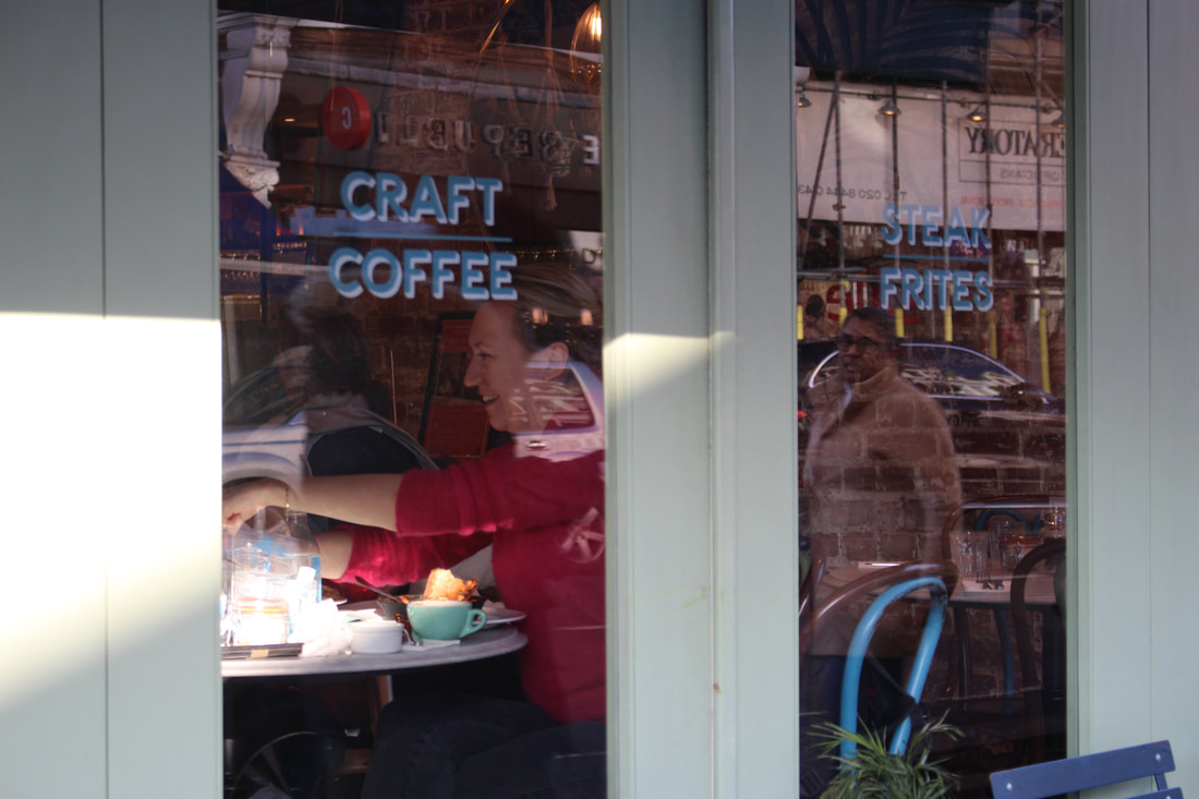
This image is slightly different from the work of Stephen Calcutt as it is not shot through a bus-top glass with graffiti, however, thiosd pictures is still shot through a window. The vibrant red of the woman's jumper is contrasted with the cool green/blue of the shops window. The picture is interesting as two people are visible but one is through the glass whilst the other is seen through the reflection. This image is slightly out of focus but not enough to hide the woman's face.
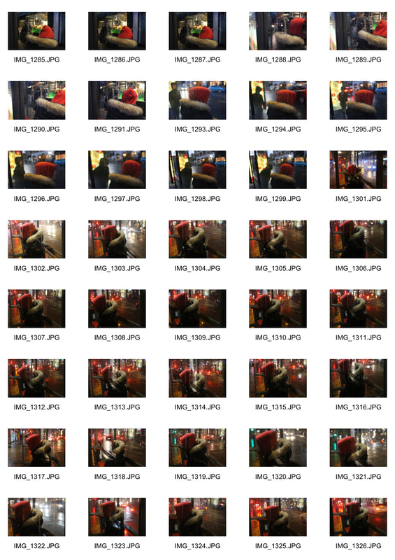
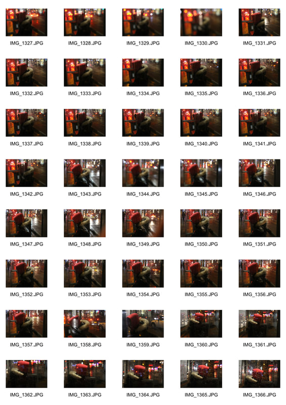
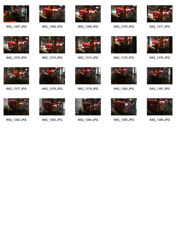
Second response.
For my second response, I focused on colours more as I wanted to create an image which had a strong colour scheme to it. To achieve this I had my exposure set a longer to make sure I captured the brightness of the colours.
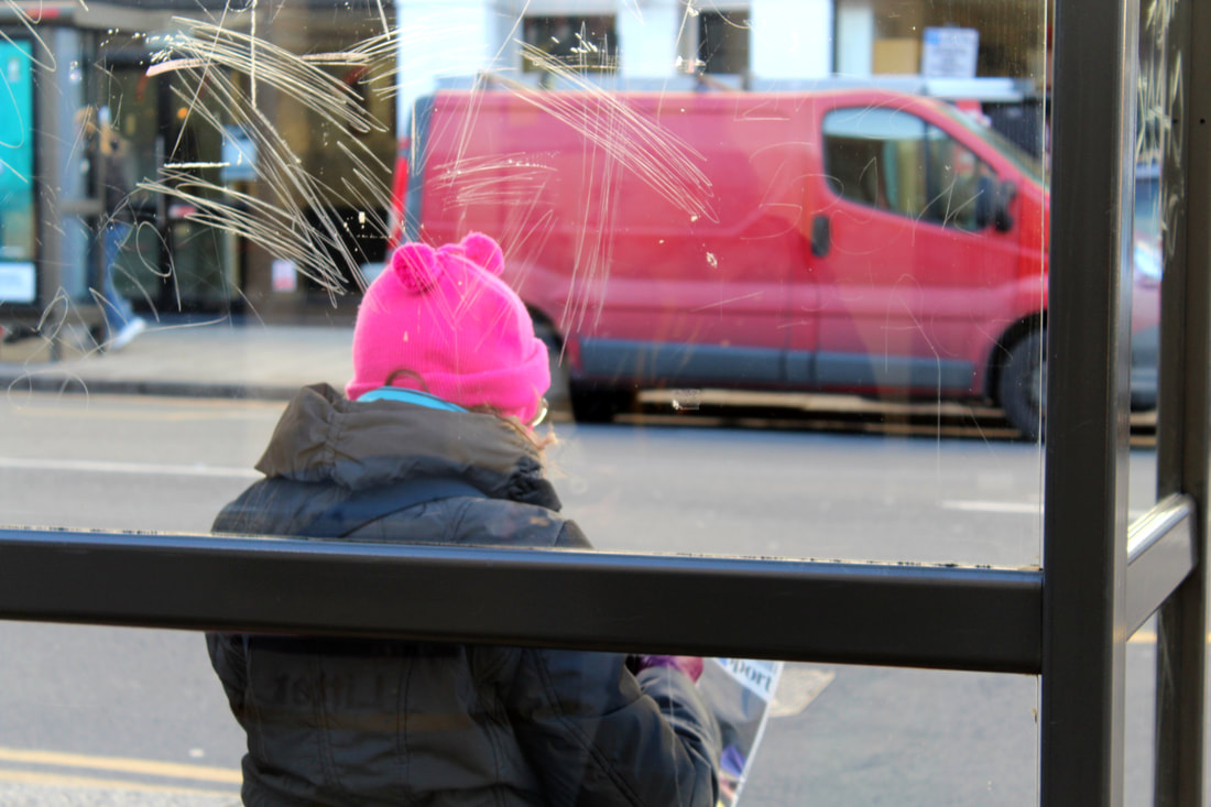
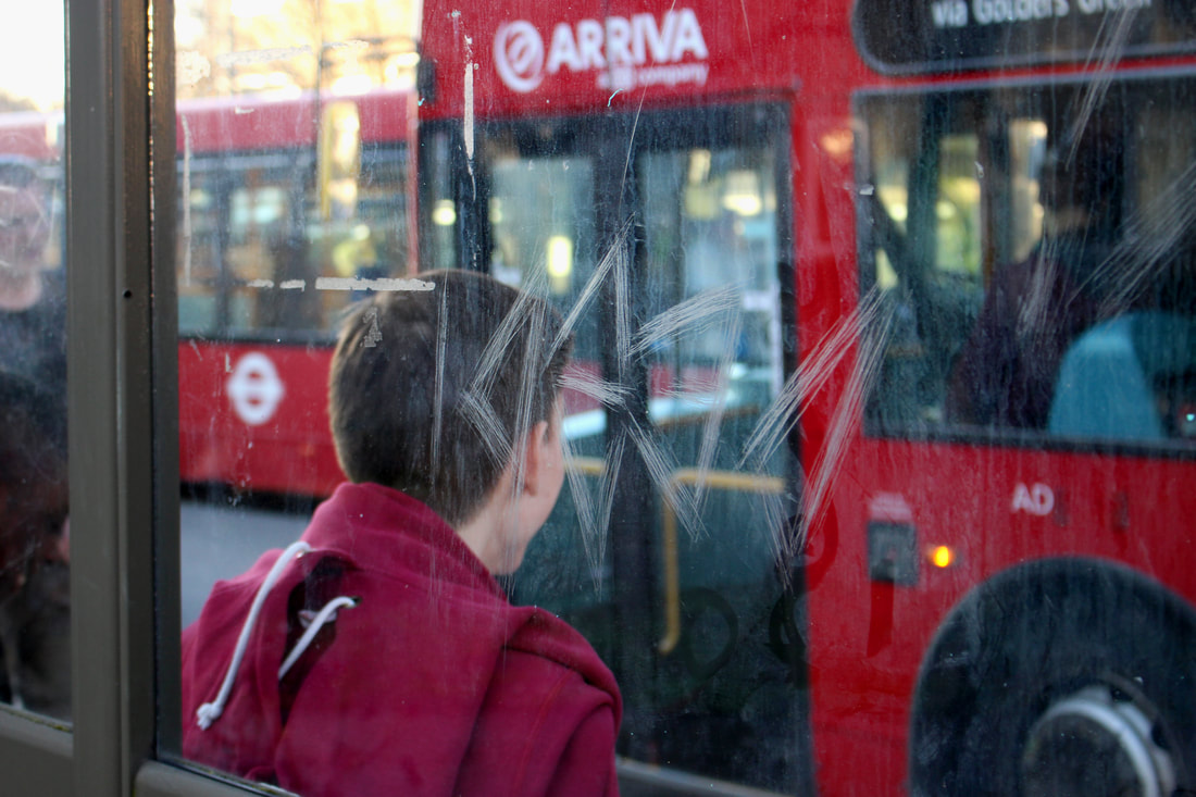
In this picture, the main focus of the image is the graffiti on the bus stop. The bold colours of the lady's hat and the red van behind her add to the colour of the image. The aperture could have been at a lower number so that the van and lady could have been more out of focus.
|
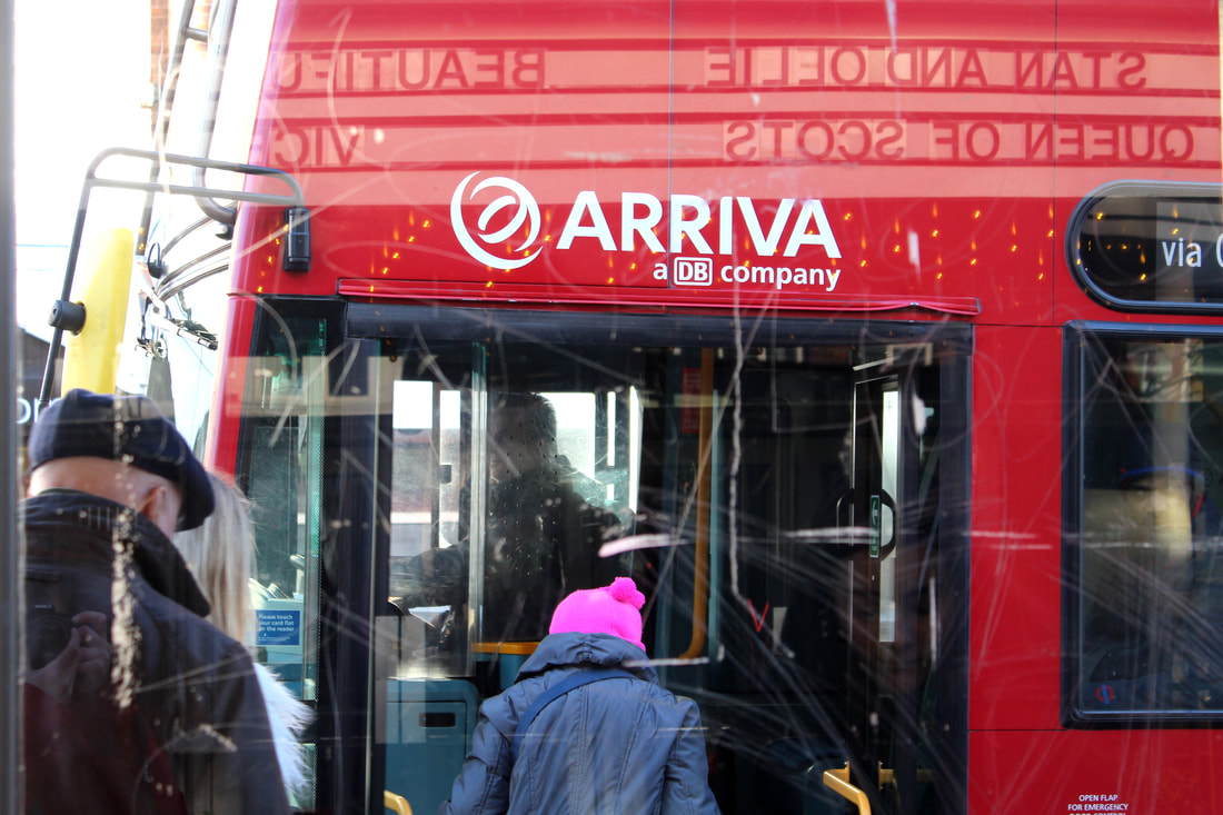
In this picture, the lady's hat also stands out with the red bus. This picture is not focused on the graffiti enough.
|
Erwin Blumenfeld.
Erwin Blumenfeld was a photographer of German origin who later migrated to America where he became a well paid photographer who worked for companies including Vogue magazine. Erwin Blumenfeld was a very influential photographer of his generation as he liked experimenting with abstract photography and videos. His work with the broken mirror inspired many photographers around the world as the idea of creating a different type of portrait appealed to many photographers.
|
|
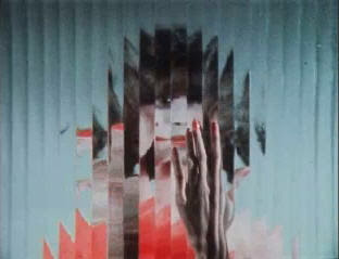
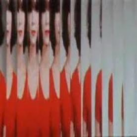
In this piece, Erwin Blumenfeld used a mirror which broke up in many different sections, keeping the portrait broken and therefore slightly anonymous. His use of the colour red is consistent, the model had a red dress, red lipstick and red nails which she shows throughout the video. One of the reasons why this work is famous is for its strong use of colour.
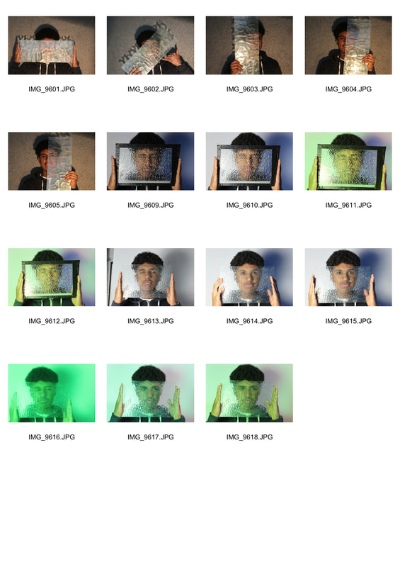
Portrait Studio Response
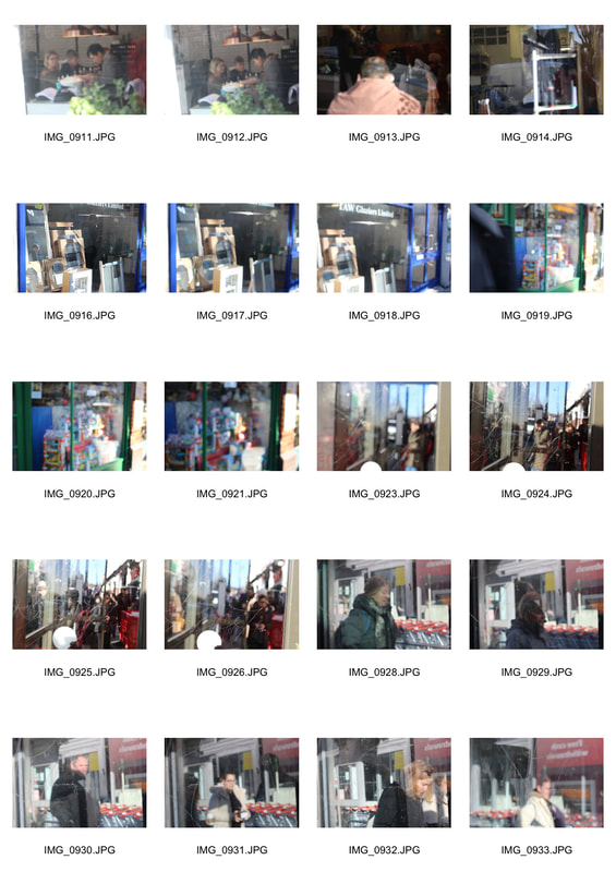
Contact sheet.
For this task, I imitated the work of Erwin Blumenfeld.
|
|
|
|
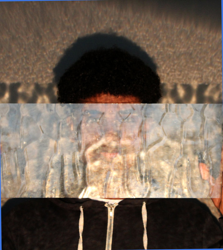
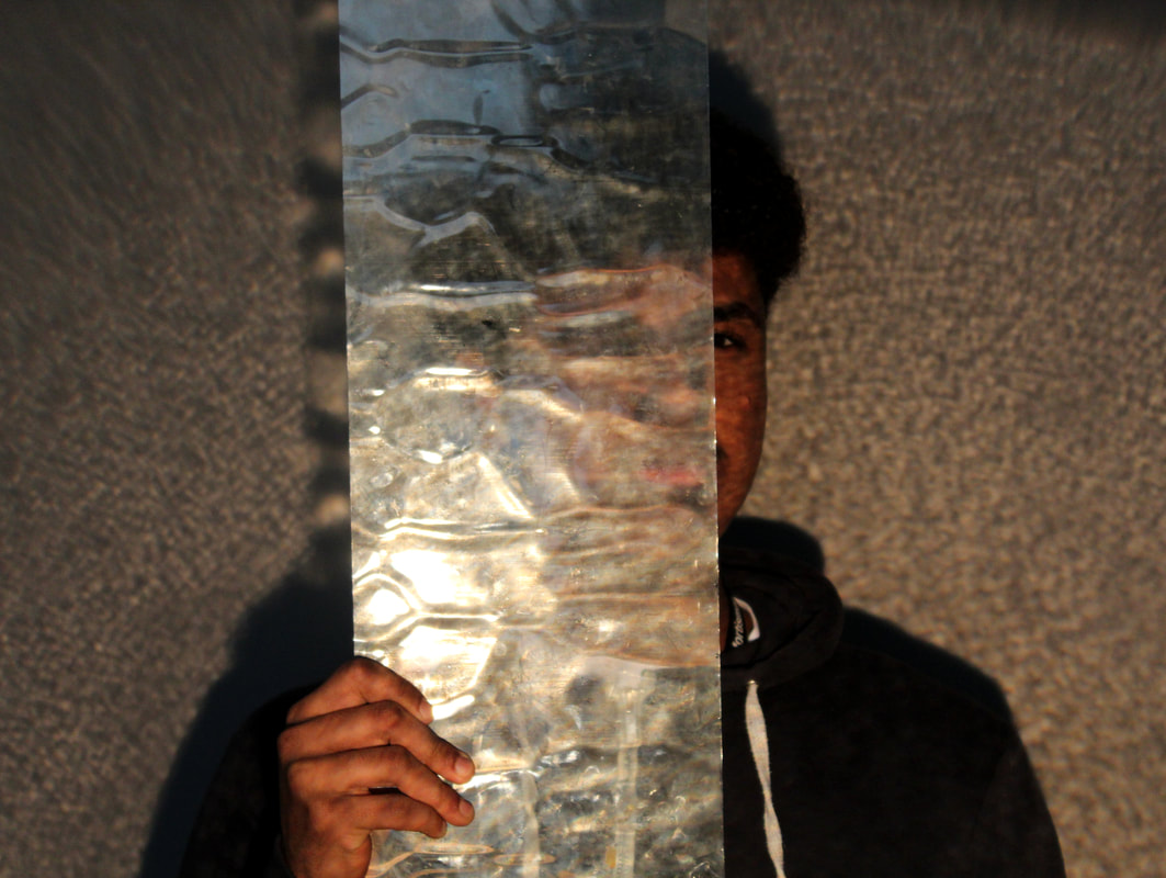
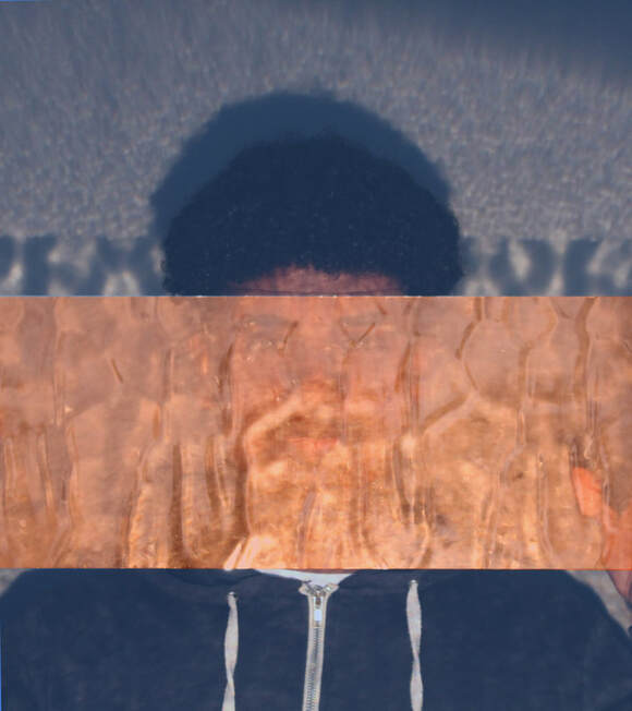
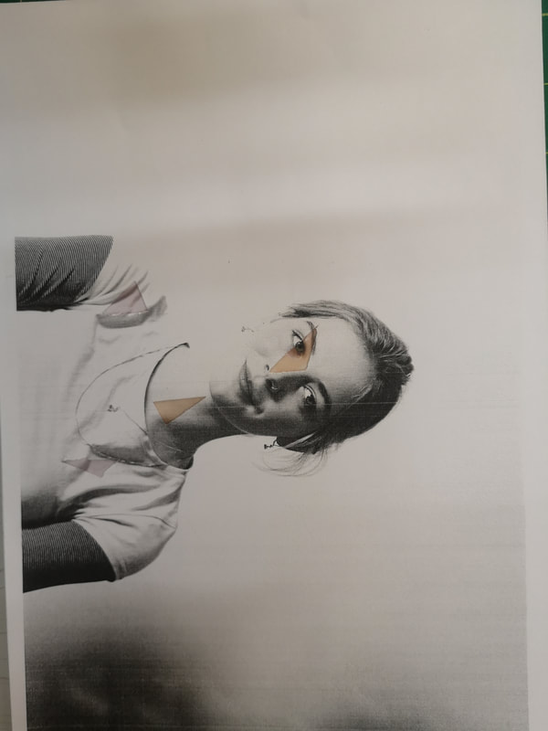
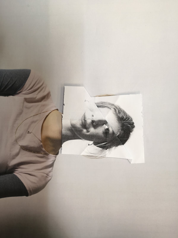
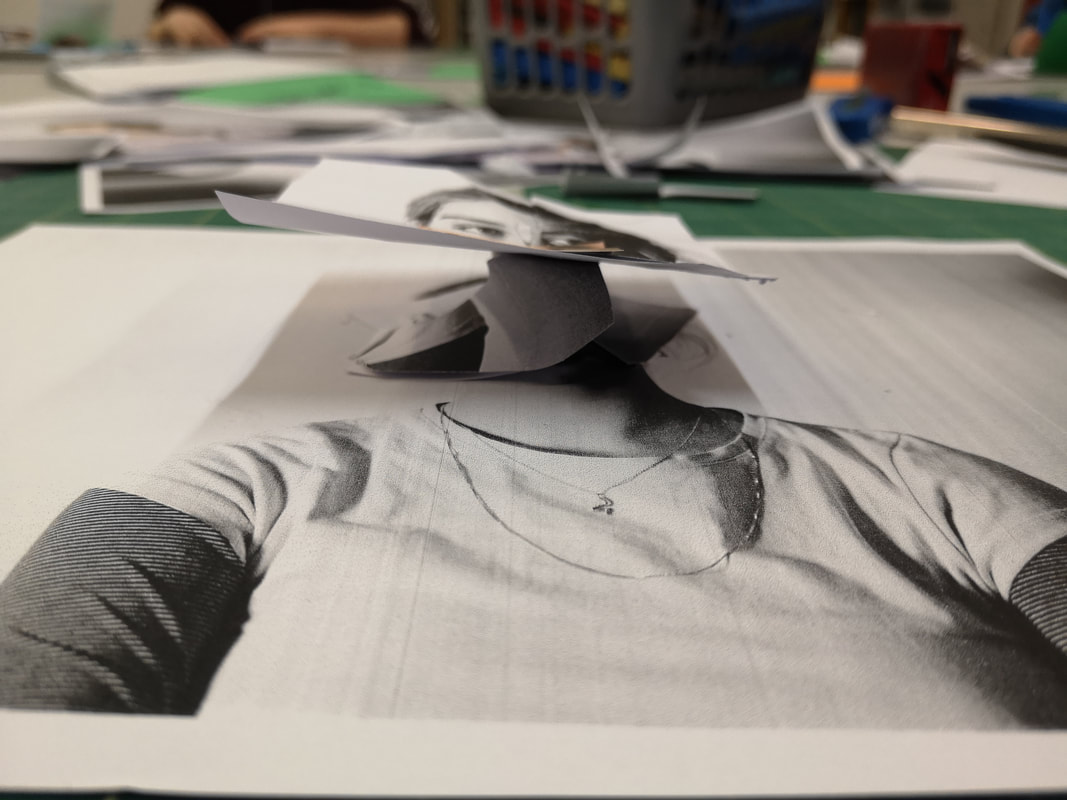
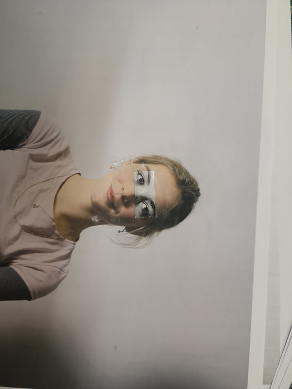
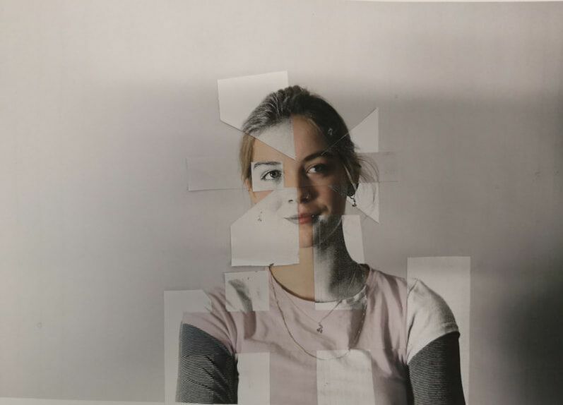
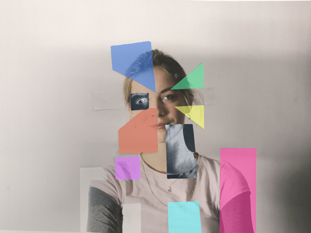
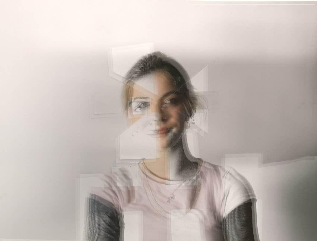
I created these images being inspired by the work of Erwin Blumenfeld. I had the model hold a mirror in front of his face but not covering it fully, this was half of his face is exposed whilst the other half is being distorted by the mirror. I also used a projector to reflect another type of texture onto the model before photographing it, this was to crate a different texture.
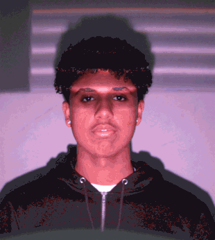
For this image, I used to change the colours of the image. By editing the photo using photoshop, the image has been altered digitally rather than physically.
I also created a moving gif of me passing a mirror through the projector. The model was also exposed to a purple light to add colour to the gif.
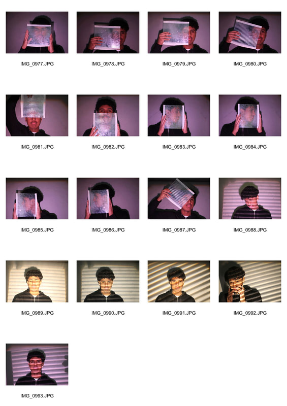
Projected
For this task I had a projector which reflected the image onto a whiteboard. I decided to cover the image with coloured paper so it would reflect onto the image to give it an abstract look. I chose colours that complemented each other and created strong lines throughout the image.
|
|
|
|
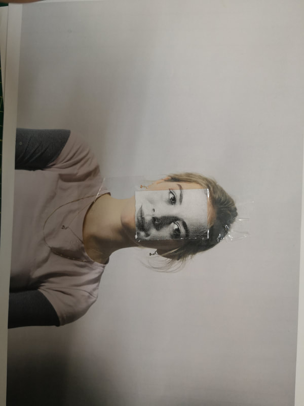
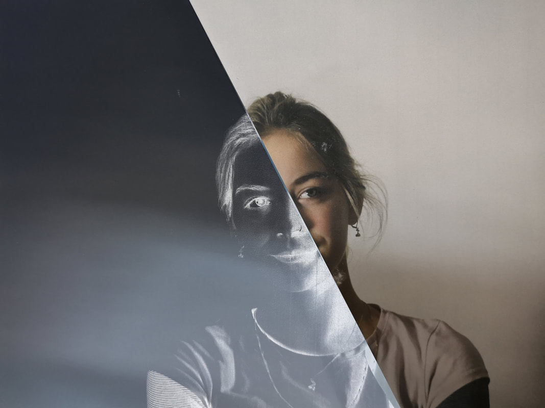
The original image is on the left, with the image on the right I inverted the colours using photoshop. I liked the inverted colours as it gives the image a darker theme with the blue and the original picture being darker.
For this work I altered the original image through different techniques in the dark room. This is a physical was of distorting the image and creating a type of abstract photography.
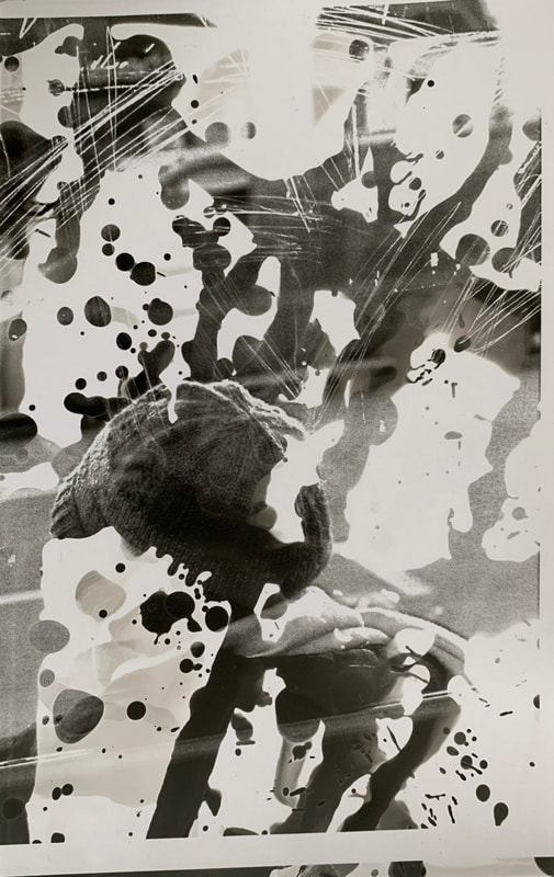
For this image, I poured bleach on the image after it had been developed. The bleach erased parts of the image.
|
For this image, I placed some sellotape on the actual image before exposing it to light through the enlarger. The sellotape left a mark as less light could travel through it and so less light was absorbed onto the light sensitive paper.
|
For this image, I scratched the image, using a metal sponge, as soon as it was developed. This effect works well as the scratching fits in well with the scratching of the bus stop at which the subject was photographed through.
|
For this image, I let the developer drip onto the light sensitive paper from a paintbrush. This was the only parts that actually developed and are exposed are the parts which the developer dripped onto. This gives the image an abstract look as only parts of the image are revealed.
|
3D Photographic Abstraction
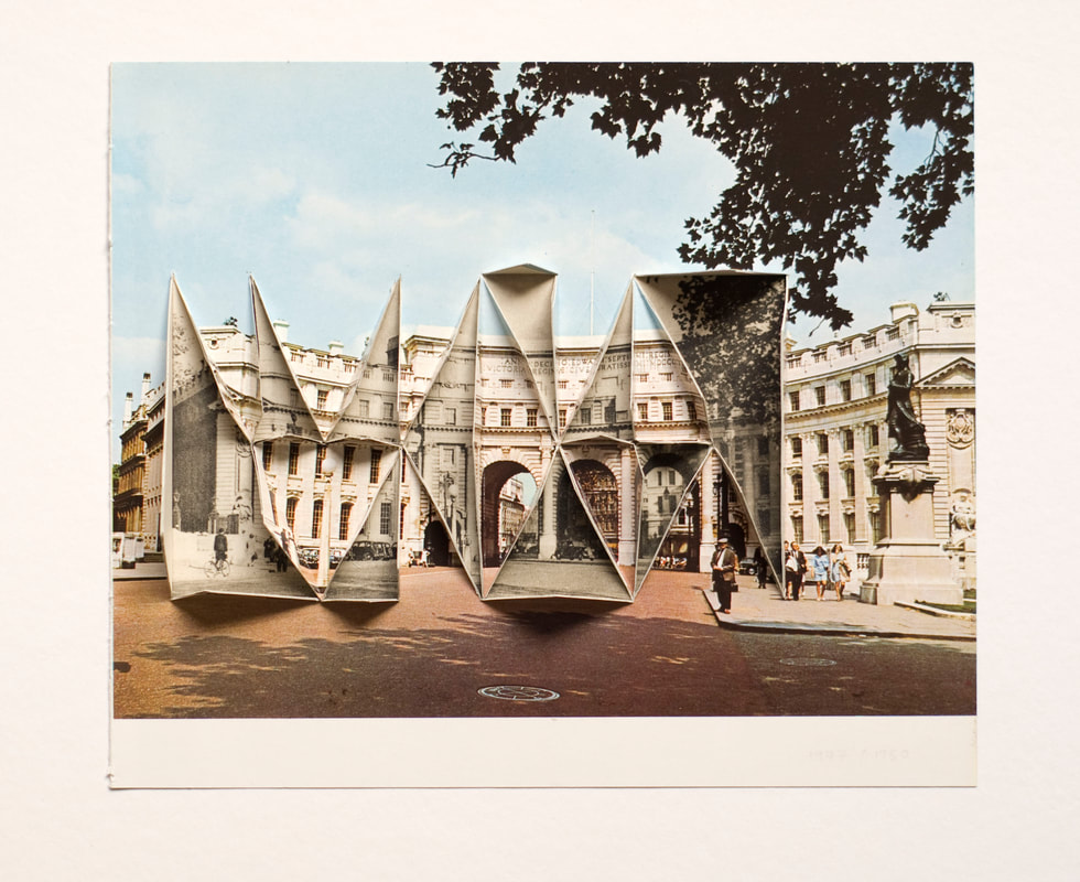
Abigail Reynolds.
Abigail Reynolds lives in St Just, Cornwall, and has a studio at Porthmeor in St Ives. She studied English Literature at St Catherine's College Oxford University. Her interest in books & libraries sparked her interest in collages which are often made from photographs of the same subject but taken at a different time and place which are then cut and repositioned to create a new image.
Her work, 'The Universal Now', is a series of collages with the images amongst them found in magazines and books.
Her work, 'The Universal Now', is a series of collages with the images amongst them found in magazines and books.
|
|
|
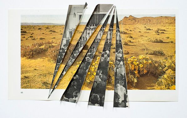
This image has a strong contrast between the bright yellow of the landscape and the dull, black and white of the second image. This image also has strong lines of the cut out of the black and white image. The black and white image is a picture of lots of people, this again, contrasts the desert with numerous people, overcrowding with complete emptiness.
|
Lucas Simoes
Lucas Simões is a Brazilian artist based in São Paulo. Simões was born in Catanduva in 1980, and moved to São Paulo in 2002, after attending Architecture school.
For this project, Lucas Simões decided to invite a group of friends to his house to tell him a deep secret. As they were about to tell their secret, Simões took photographs of them. After the photographs, Simões asked his friends if they would associate a colour with the secret, these are the main colours that he used in his work.
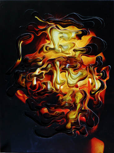
To create his work, Lucas Simões selected 10 of the portraits that he took and overlapped them to create his work. This work was influenced by his architectural design background as it involves measuring and cutting various shapes and sizes.
For this project, Lucas Simões decided to invite a group of friends to his house to tell him a deep secret. As they were about to tell their secret, Simões took photographs of them. After the photographs, Simões asked his friends if they would associate a colour with the secret, these are the main colours that he used in his work.
To create his work, Lucas Simões selected 10 of the portraits that he took and overlapped them to create his work. This work was influenced by his architectural design background as it involves measuring and cutting various shapes and sizes.
|
|
|
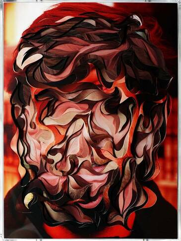
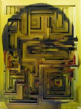
This image contains lots of straight lines. The lines are positioned in various ways to create other shapes within the picture (such as squares and rectangles). This gives the overall piece of work a clean and accurate look as the width of all the lines are the same. The image is layered so many times that the identity of the man remains anonymous. The multiple layering of the image also creates a different type of texture to the image which is not ordinary. The use of the colour yellow makes the image pop, however the yellow isn’t very bright which could correlate to the emotions he was feeling when discussing the secret. Allowing the model to choose the primary colour of the image allows the work to be more personal.
|
Comparison
Abigail Reynolds and Lucas Simões have very different pieces of work and both unique in their own way. Abigail Reynolds creates work from magazines and books primarily rather than taking the images herself. Lucas Simões however, takes the portraits of the people himself, creating work that can be seen as more personal.
Both artists create a collage in their work, in the sense that they have multiple images stuck over each other. In the pictures I selected, Abigail Reynolds doesn’t use symmetrical shapes (exept form one picture) to create her work and neither does Simoes.
Both artists layer their images which create a different texture to the images. Both artists also use colour to make their work stand out: Abigail Reynolds uses contrasting colours between the different images, such as a black and white image which is layered with a colour image, whilst Lucas Simões, uses colour to make his work stand out an gives makes the work more personal to the subject.
3D Abstraction
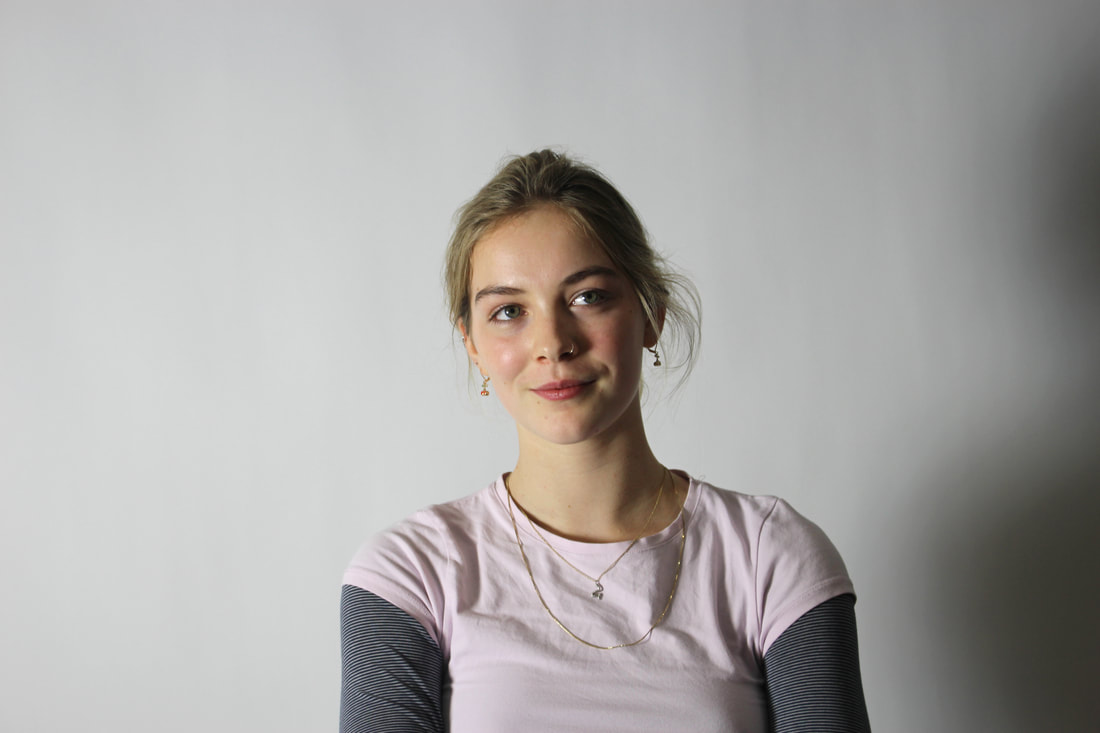
This was the original photograph that I went and Physically altered.
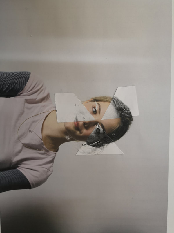
For this task I was inspired by the work of Abigail Reynolds.
For this task I was inspired by the work of Abigail Reynolds.
The elevated image was more challenging to make, this is because it had to be upright and also had to line up with the image below it.
Best Examples.
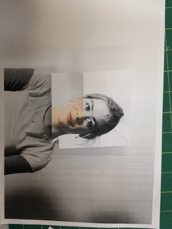
These worked best as they were the simpler ones which look more clean. The contrast between the black and white picture with the coloured one really stands out. There are also strong lines that go through the picture which divide the image well.

|
|
|
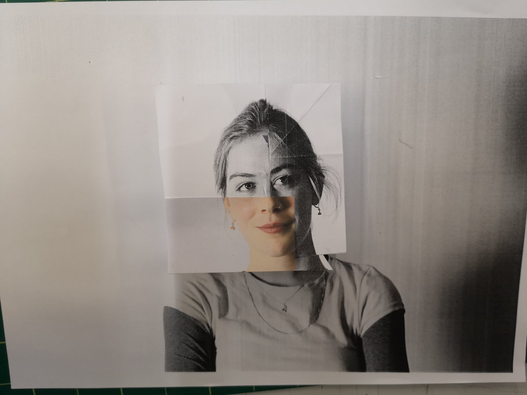
For this image, I decided to alter it with photoshop aswell as physically. Using Photoshop allowed me to add colours in parts of the photo, creating amore colourful and abstract image.
|
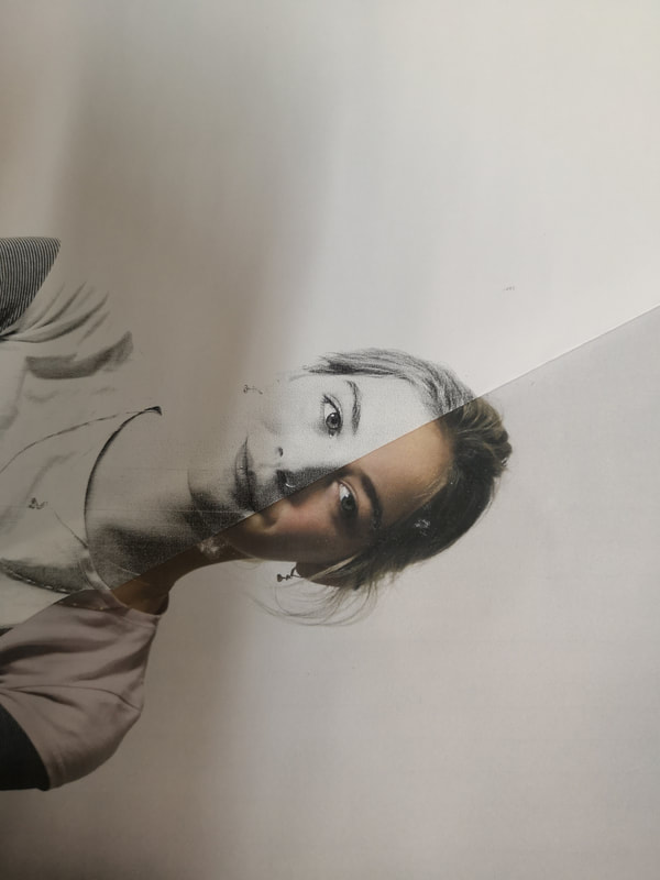
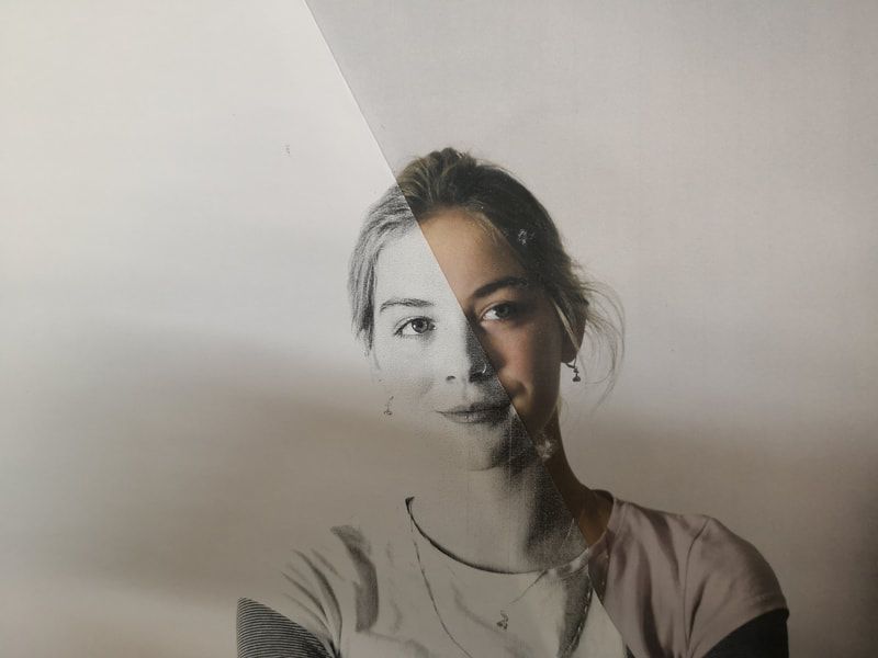
I divided the image in two in Photoshop using the Polygonal Lasso Tool. I then inverted one half of the image. This created one side which is much darker than the other which created a strong contrast. This could represent a person's personality and emotions where the dark side represents the darker emotions such as hate and sadness and the lighter side represents love and happiness.
|
For this image, I created three layers and placed them on-top of each other. I changed the opacity of each layer so you could see through to the other layers. I then moved each layer in a different direction to give the image its blurryness.
Abstraction Of Street life- Development
I chose this strand to develop as I think it is the most interesting and diverse. I enjoy trying to match the colours in the background to the people in the frame as well as the graffiti.
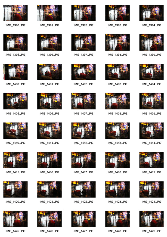
Contact sheet
Contact sheet
|
|
In this image, there is a strong contrast between the background and foreground. This is because the background has more of a darker colour scheme with grey and almost blue colours which strongly contrasts with the boy's bright red jumper and the light tone of the boy's skin. The focus of the picture should only be on the graffiti so that the background remains blurred however the focus here could have been sharper on the graffiti itself.
For this photo, there is a strong presence of the colour red. From the boys jumper to the two buses, red is the theme and main focus point of the image. Because the image is focused on the graffiti, detail is lost and so to make the image more exiting there needs to be bold colours.
Development
For this development, I realised that the pictures come out best when there is a strong colour scheme behind the graffiti. I went out and tried to photograph lights, cars and buildings that matched the subject’s outfit. I also had my aperture as low as I could so that the background could be as blurry as possible with the main focus of the image only being on the graffiti.
|
|
|
|
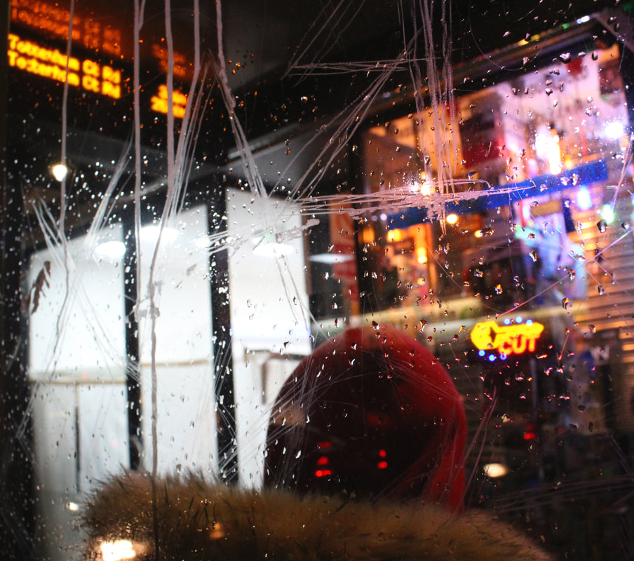
This image has a strong red pattern, from the boys hood, to the blurred lights of the car, to the bustop bench and even the lid of the street bin. I cropped the image so that a higher percentage of it would contain some form of the colour red.
The image lacks a strong graffiti scratching on the bus stop on which the focus could have been on.
The image lacks a strong graffiti scratching on the bus stop on which the focus could have been on.
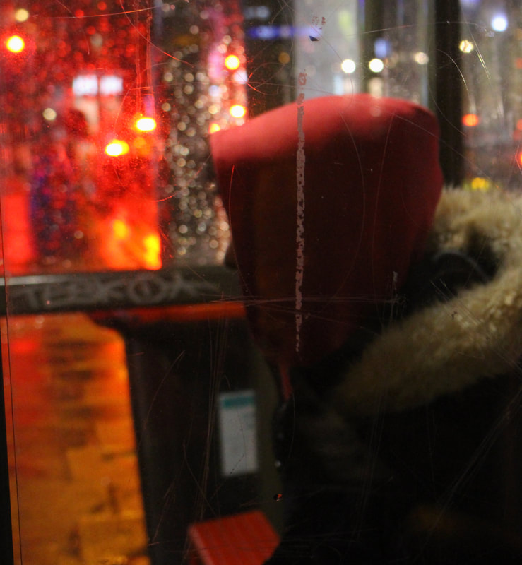
I found that this image works really well as it has a lot going on in the background. The lights from the shop reflect the colour of the boy’s hoodie and so does the reflection on the glass of a car’s red lights. This image is focused both on the graffiti and the raindrops which are both in focus. Having raindrops in focus allowed for a sharper photograph whilst still maintaining the background blurred.
Development
For this development I found that what makes the images interesting and different whatever is behind the graffiti. How the colours of the background combine and work together is also a big part. The things that work best are neon lights from shops and bus stops as they stand out even when put of focus. Going to shoot at night also helps as there is that increased contrast between the lights and the darkness. I decided to go and take photographs at a bus stop with a shop behind it as it gives additional light and contrast to the image.
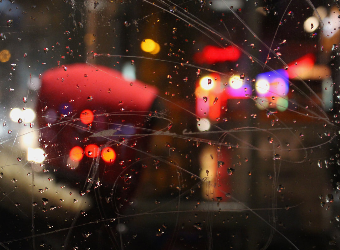
Final piece
For my final piece, I made sure that there were lots of lights behind the bus stop to give the image more colour. I went to shoot at night so that the darkness made the neon lights from the shop stand out more. The lights of the shop and the lights of the bus times all follow a similar colour to the boys hood. This creates a strong colour scheme which highlights all of the red or yellow details of the photograph. The image is focused on the graffiti and so with a high aperture of f 5.2, the background is blurred to draw the attention on the graffiti and raindrops. The image also divides in two as the bottom left hand side of the image, there is an empty shop with nothing but white light which contrasts with the adjacent shop which has lots of colourful lights. This divides the bottom half of the picture with emptiness and over lighting.
The boy’s face also remain anonymous as he is turned around and so it adds to the sinister look of the photo.
The boy’s face also remain anonymous as he is turned around and so it adds to the sinister look of the photo.